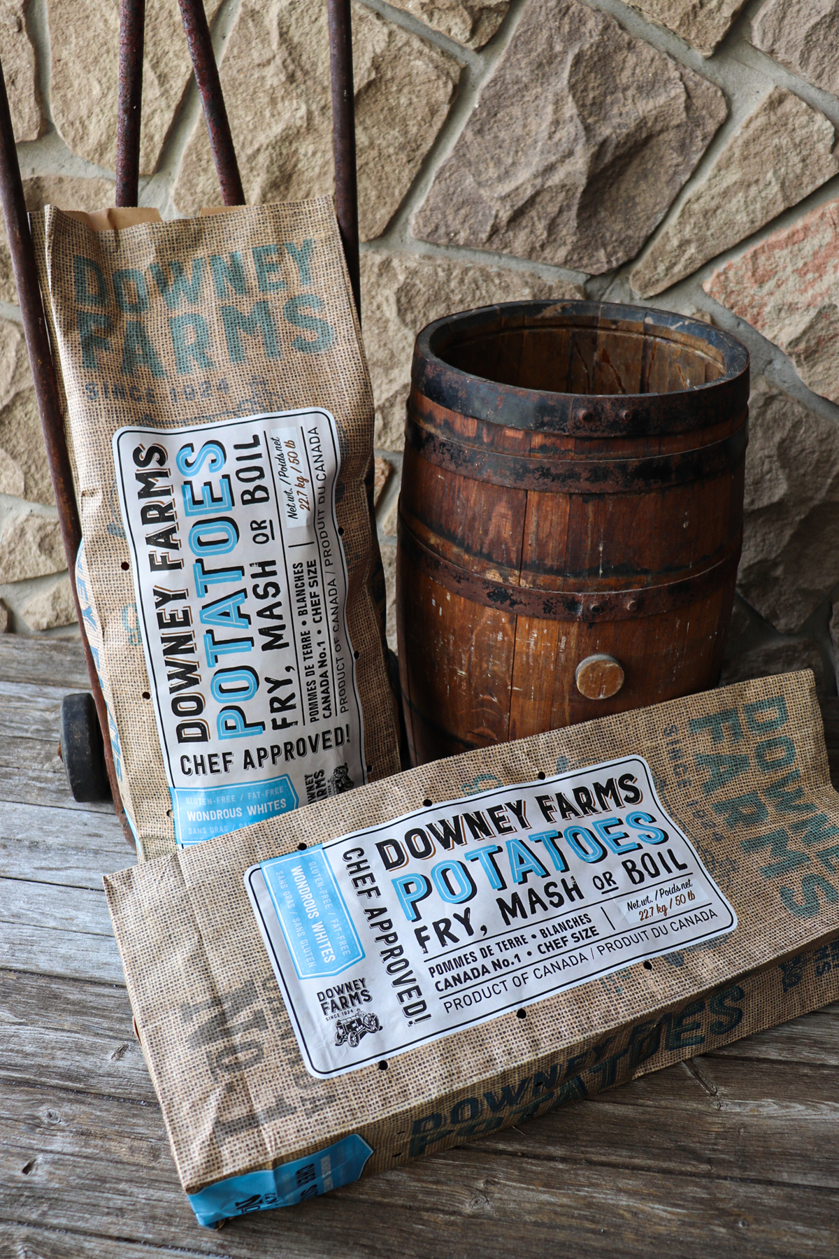
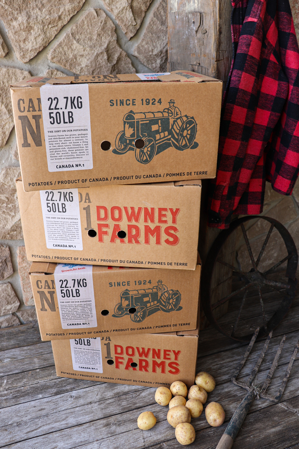
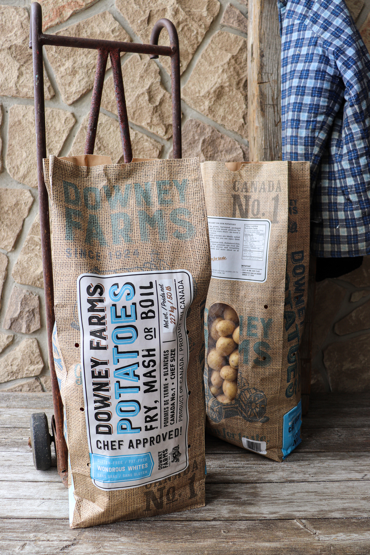
Breathing new life into the potato vertical doesn’t exactly sound thrilling, and yet, the rebrand for Downey Farms Potatoes is both contemporary and charming. By producing the bags using a paper that looks like burlap, the designers pay homage to how consumers traditionally experience potato packaging but with a sustainable twist. The typeface used throughout the design has a 3D feel that’s classic and timeless, while the illustration of a farmer on a tractor is pure kitsch (which we’re totally here for).
A Rebrand That’s In The Bag.
The Downeys have grown, harvested, packaged, distributed and marketed potatoes for over ninety years selling to consumers, retailers, processors, restaurateurs and institutions.

As a fan of our previous work of their Organic line, Mr. Downey asked us to develop a synergistic look for their parent brand, Downey Farms.
We knew these products needed to look as timeless and natural as possible. They are, after all, potatoes — so what better way to package them than in a potato sack? This look has been done to death with coffee, but surprisingly we didn’t see much if any burlap used by their competitors. Continuing with our heritage-inspired nameplate, we added usages to the simple typographic design to help the less savvy customer.
We also thought a bit greener this time around, switching all the bags to paper. Besides being cheaper to produce, paper also absorbs moisture and provides a dark environment to ensure longer shelf life. Plus, to provide better taste and less waste, we replaced the bag’s non-recyclable netting with simple air holes for optimum freshness, making the bag 100% recyclable for the first time.
The roll-out also included non-consumer facing 50lb bags and shipping boxes. As these are typically done on the cheap with little branding, we were more than happy to continue with the look and feel — establishing a more consistent look across all points of contact.