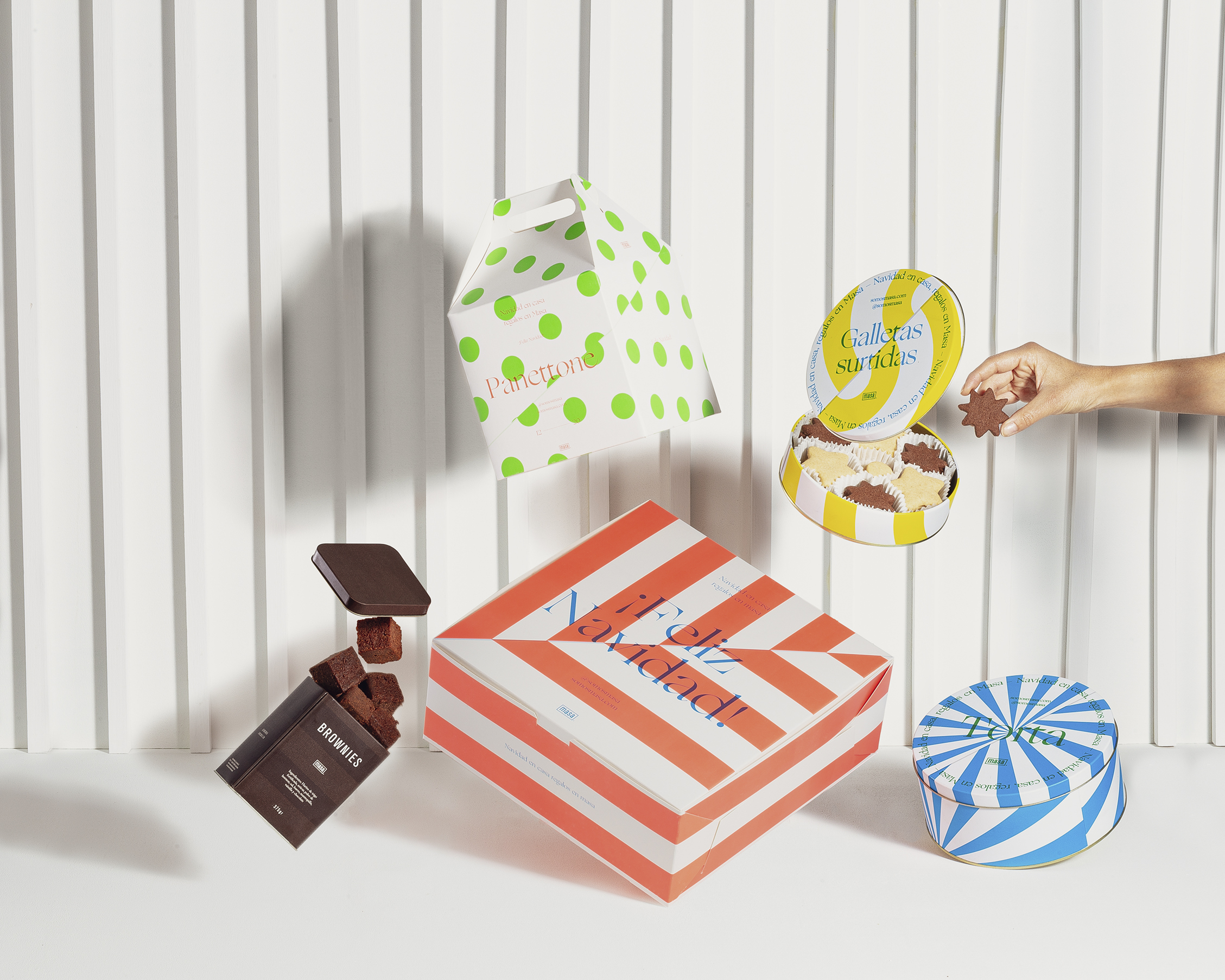
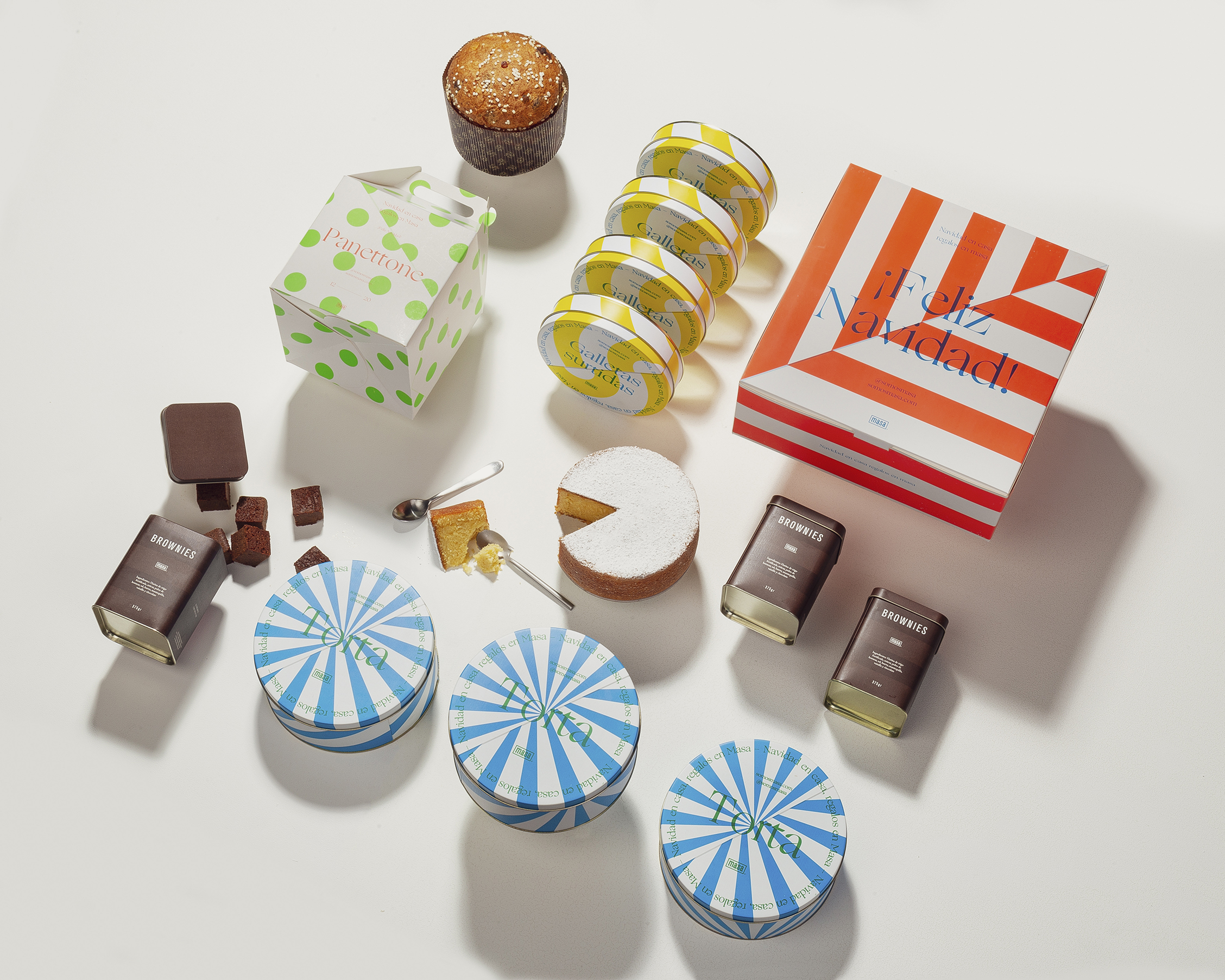
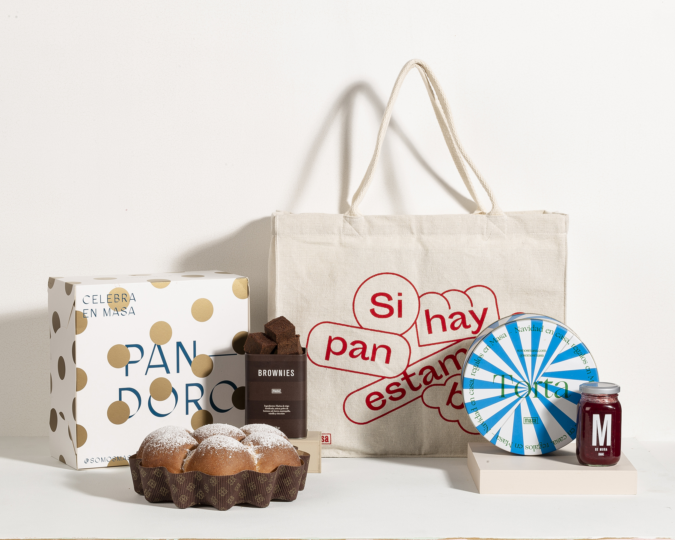
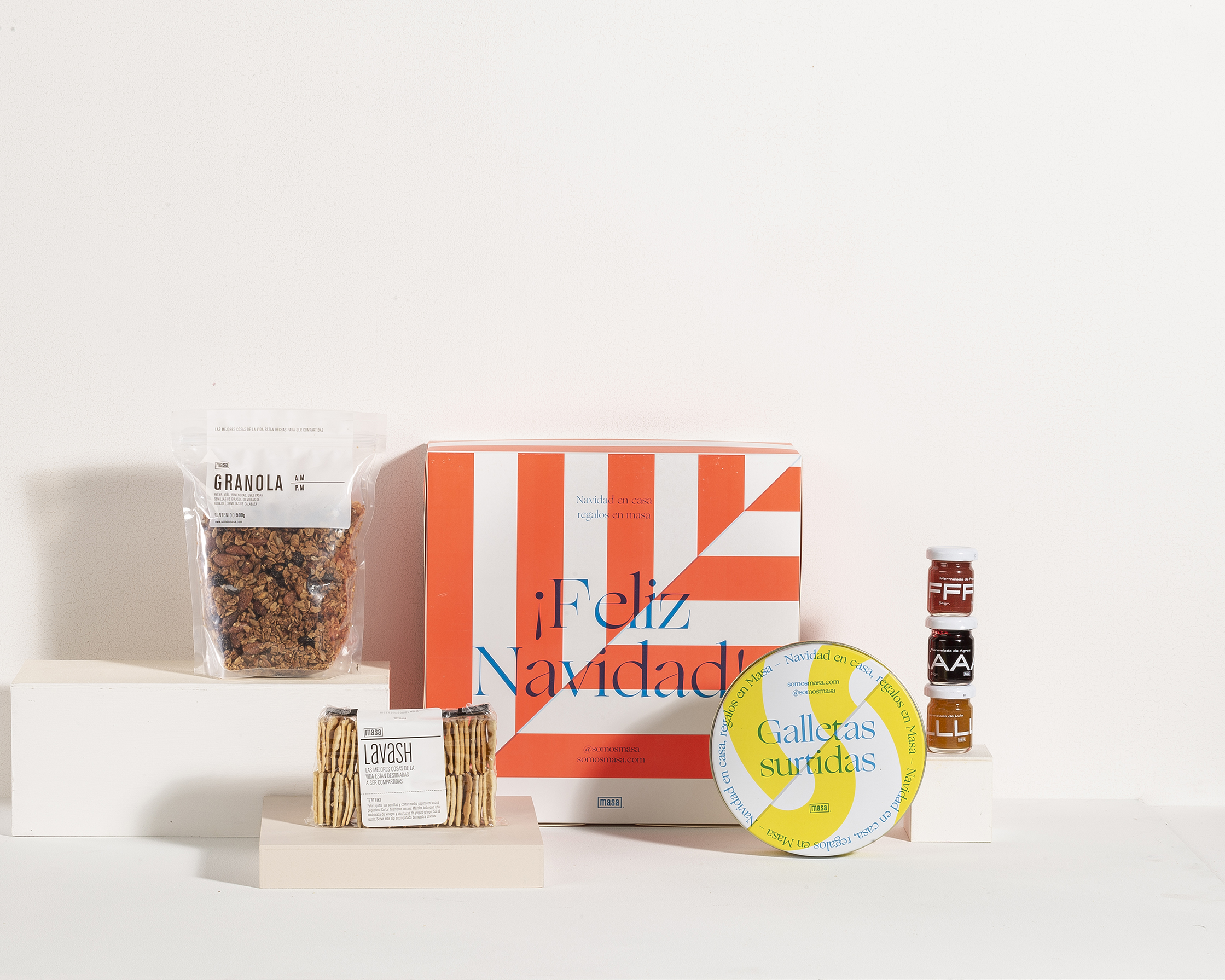
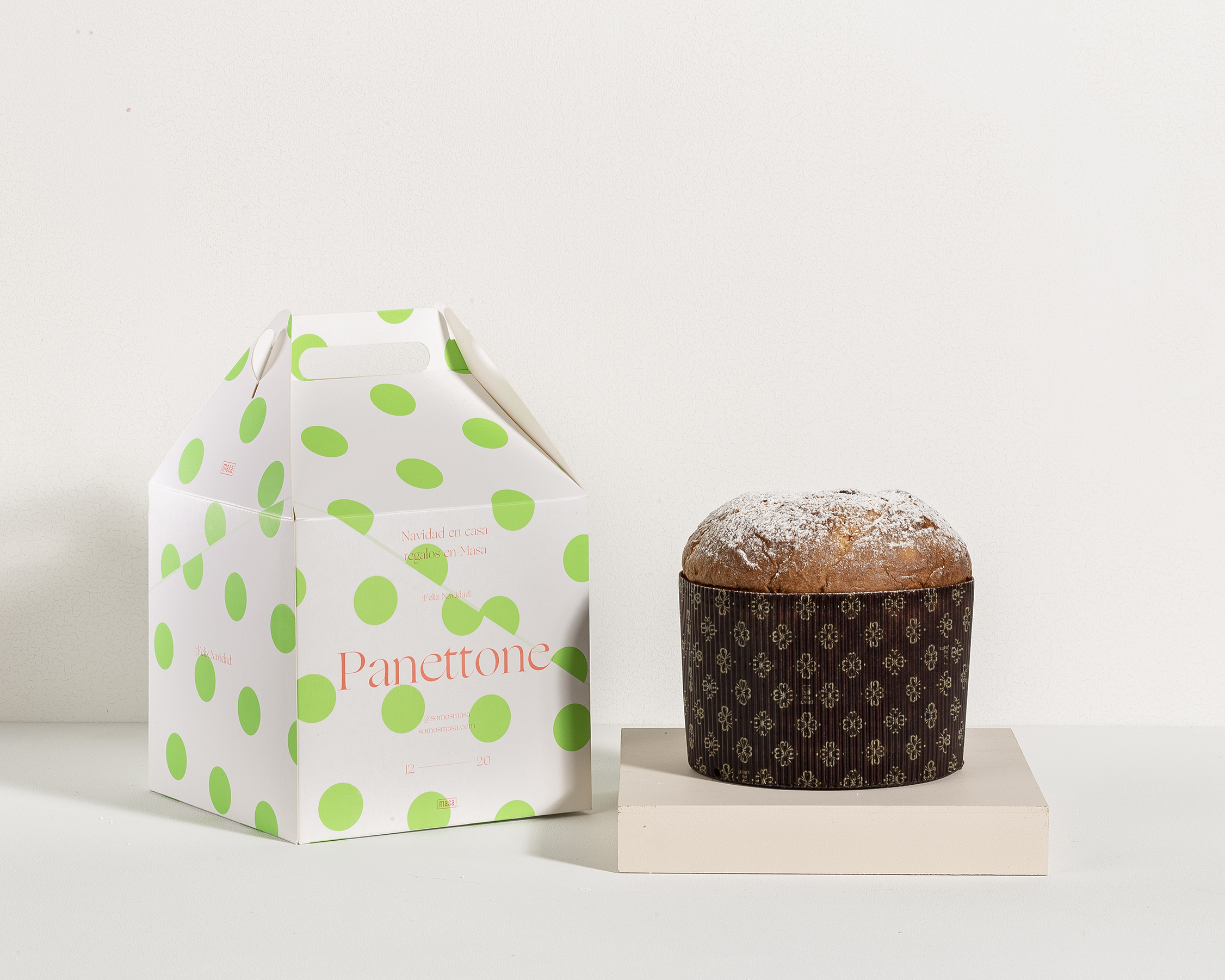
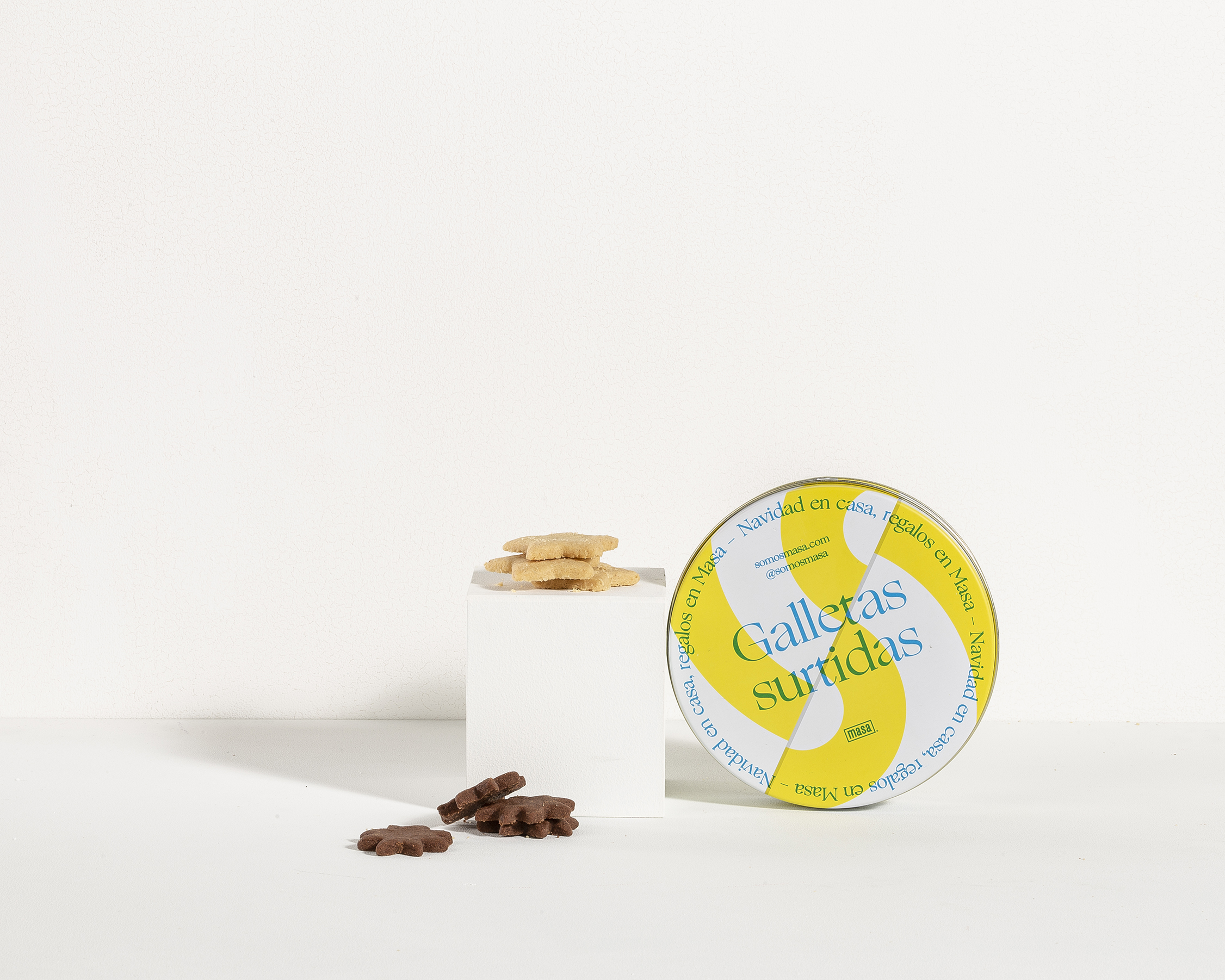
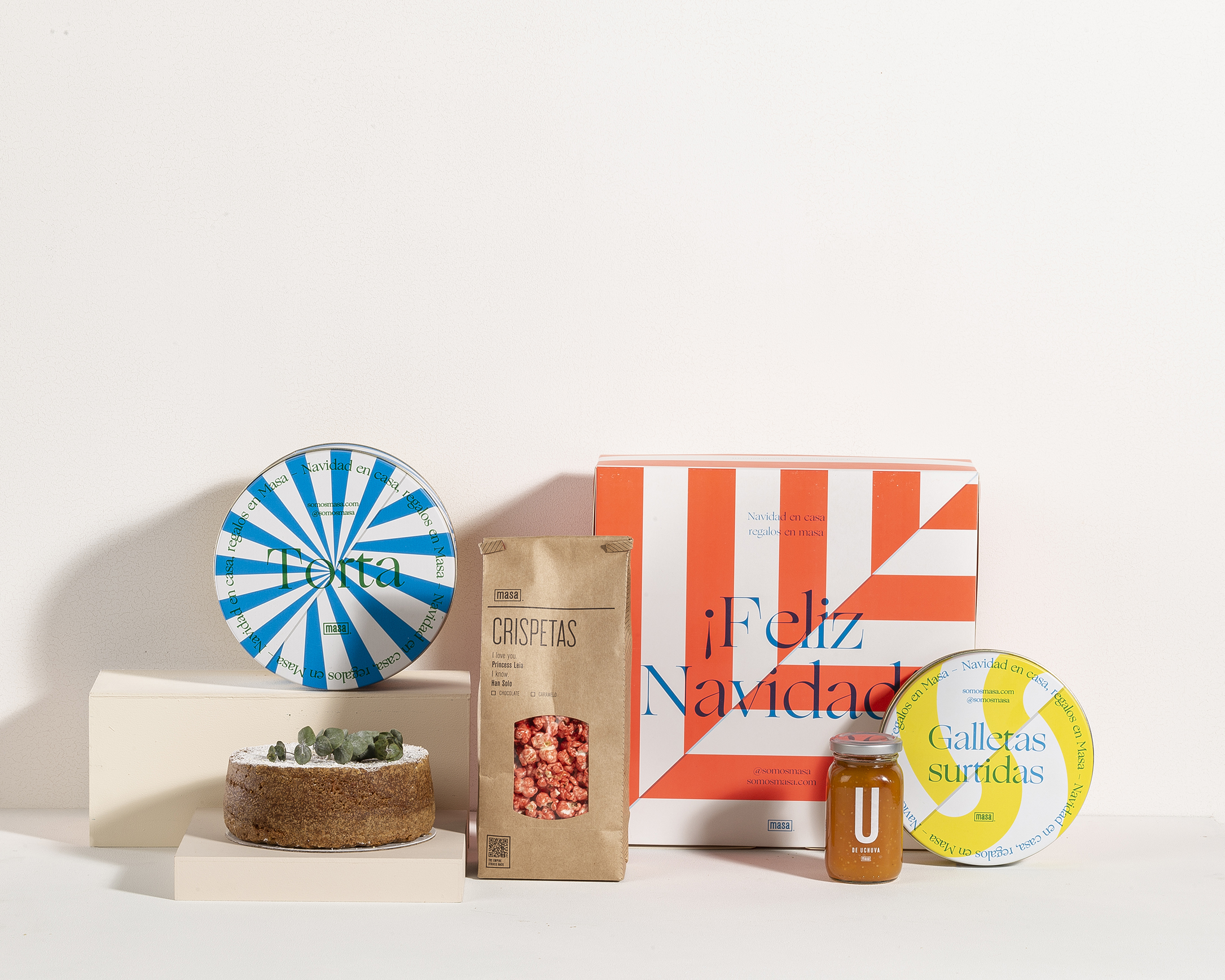
Jettisoning a more traditional Christmas palette, the designs for Masa’s holiday packaging helps bring some vibrant energy to an otherwise shitshow of a year. Utilizing a chic and modern serif typeface to let consumers know what comes in each package, every variant has its own color scheme and pattern. From lime green polka dots to a blue and white pinwheel pattern, these designs allow Masa to instantly stand out from the crowd.
After a complicated year we brought some color to brighten up the end of the year. We decided not to use the traditional Christmas colors for the season’s packaging. Instead we decided to use phosphorescent colors that are very bright and vibrant. Together with overprinted typography, the packages surprise on the shelf and generate a different visual to celebrate a traditional season.
