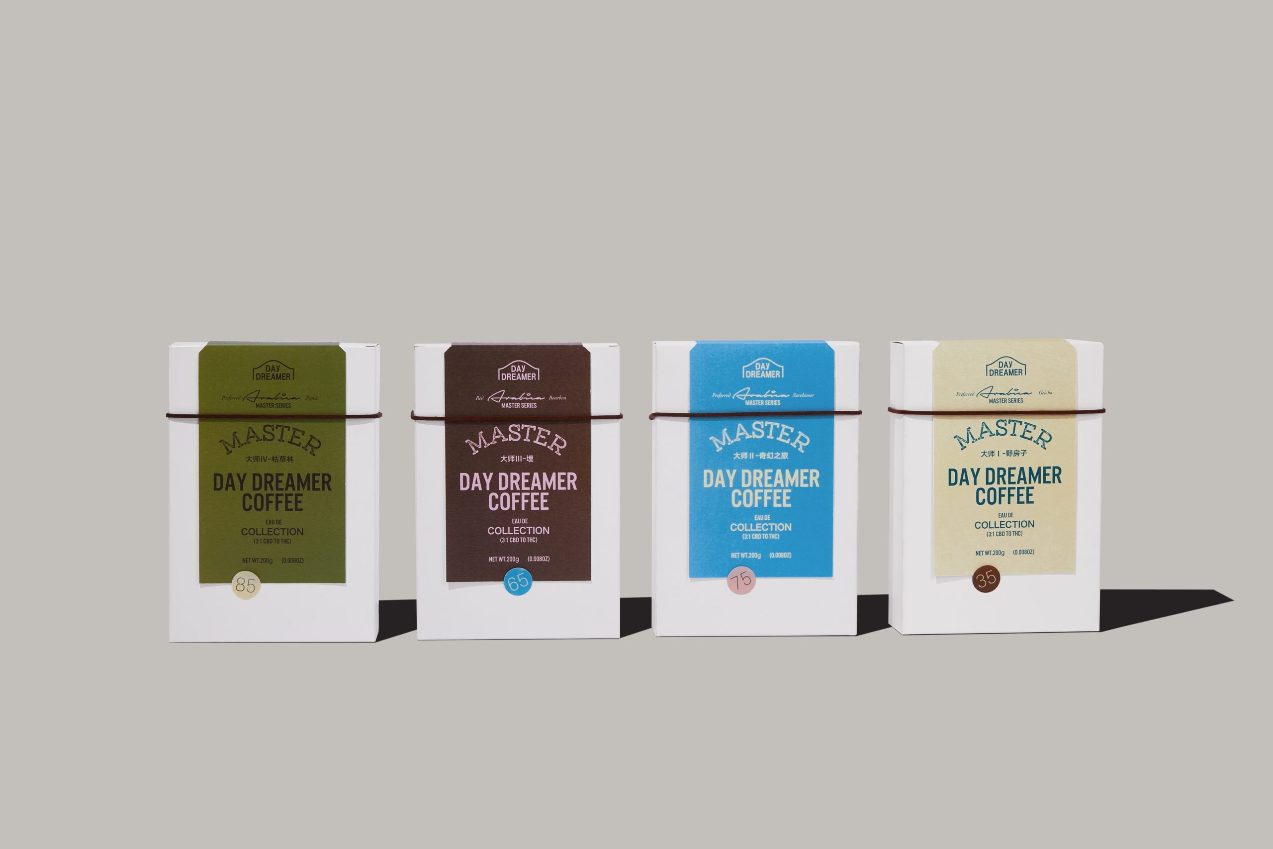
The packaging for Snowline, a Hong Kong-based fruit coffee brand takes elements of minimalist design and injects beautiful gradients into the brand identity. The result is a subdued, but incredible brand system that would fit perfectly on any pinterest board or any pantry.
Snowline is a light fruit coffee brand for young people, located in Hong Kong, China. In this brand identity design, I only utilized color and geometry to create a simple expression. The gradient color represents the flavor of coffee, while the white hexagon echoes the brand name, and the number of hexagons represents the concentration of coffee.
