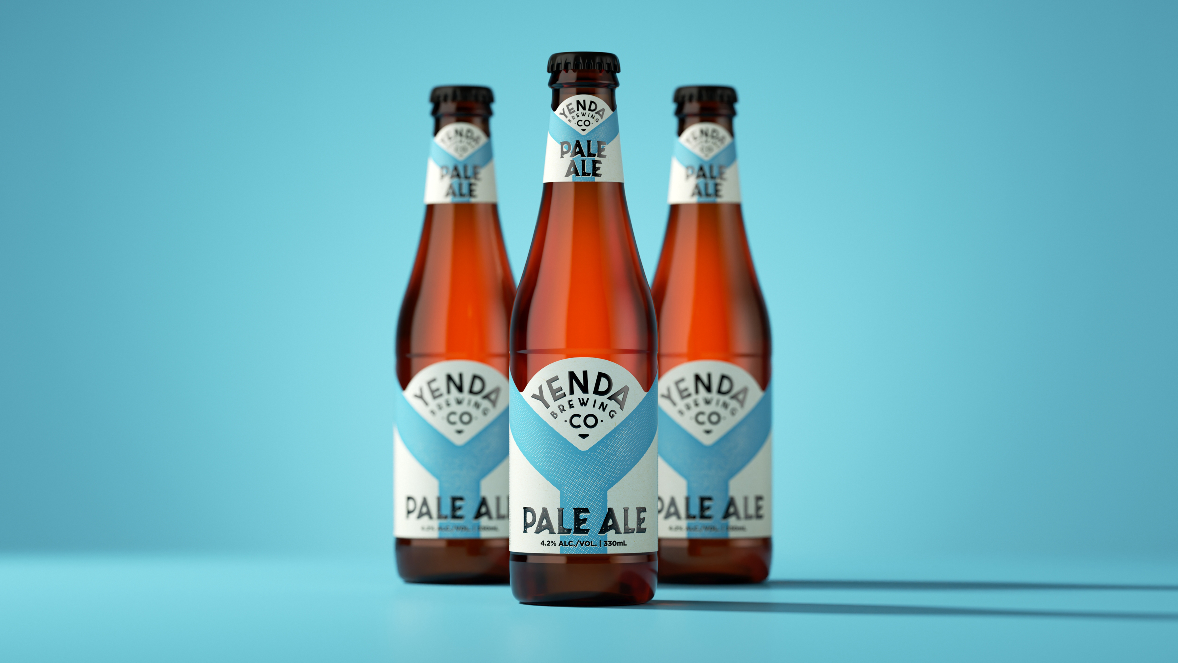
Yenda Brewing company is establishing itself firmly in the craft beer space. Utilizing a bluejay blue, the label makes a large Y the focal point of the design. The approachable, serif font has a distinct country feel, making the brand feel friendly. Yenda gives off the neighborhood feeling that you’d be able to order a bottle at any local pub. Sometimes, you want something comfortable, and Yenda offers that in spades.
Coca-Cola Amatil was at a crossroads with the Yenda Beer brand as the craft market exploded, leading to the brand getting lost on shelf. We were engaged to revolutionize the brand and drive more of a mainstream craft positioning. The packaging needed to work hard and jump out on shelf while also establishing a number of visual assets that could be used over various touch points moving forward.