In a move towards inclusivity, including transgender and non-binary customers, sanitary products brand Always announced they will redesign their packaging, removing the Venus symbol long-used to represent the female gender. This comes after repeated requests from the trans community for inclusivity.
The decision to redesign Alwaysâ packaging to be more inclusive happens months after fellow Procter & Gamble brand Gillette weighed in on a different social issue, male toxicity, encouraging fellow men to stop inappropriate behavior, including bullying and cat-calling.
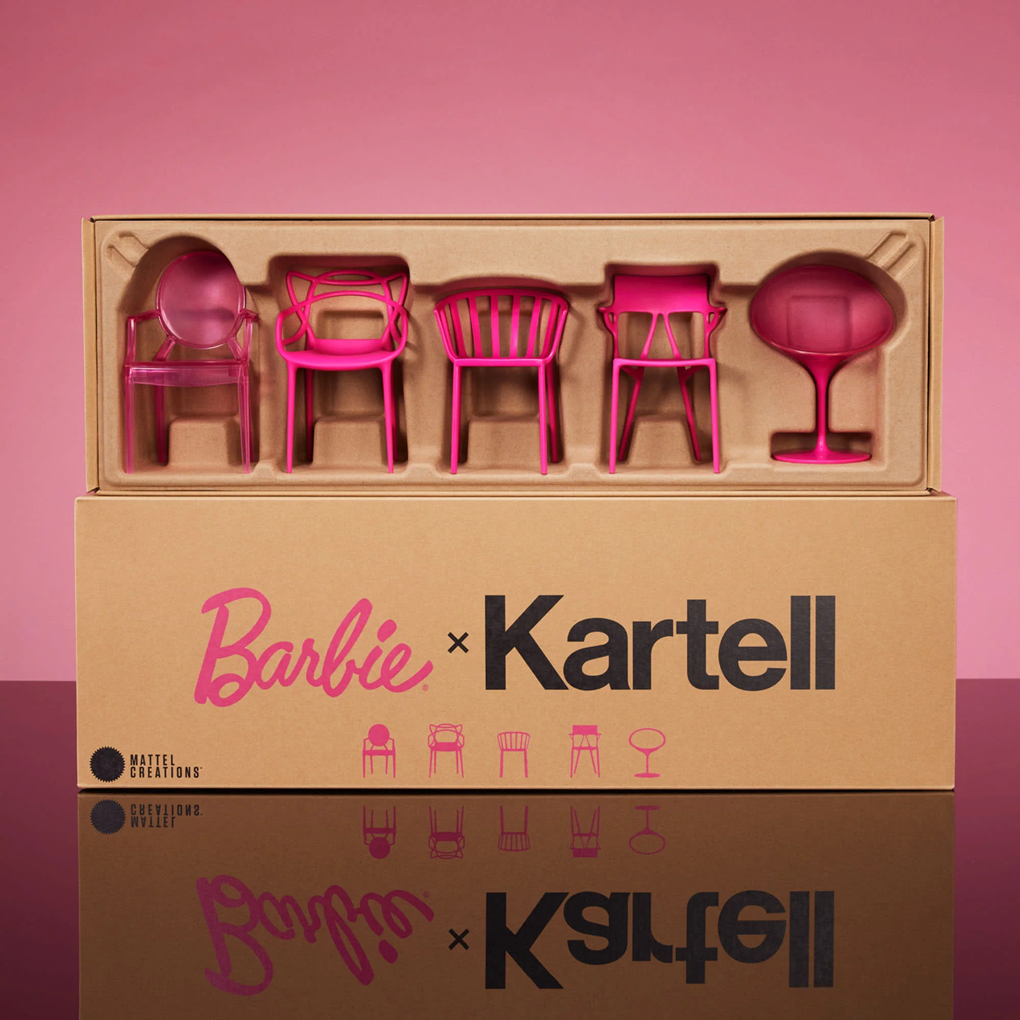
The announcement comes as more companies and brands make changes to be more gender-inclusive, like Mattelâs new doll line Creatable World, historic London theater Old Vic remodel which turned restrooms gender-neutral, and United Airlines changing their ticketing system to be more inclusive for nonbinary passengers.
