
If you had told us that a fermented tea made using a symbiotic culture of bacteria and yeast (a SCOBY) would become one of the fastest growing beverages on the shelves, we would have said, “Sure, and someday there will be driverless cars and Grey’s Anatomy will be a rudderless, canceled ship without the likes of Katherine Heigl darkening their towers.”
Well, here we are. Fermented beverages. Who knew!
Kombucha sales in 2017 soared to $556 million, a clear indication that fermented and alcohol-free beverages are enormously popular with consumers and that they’re not going away any time soon.

But with rising demand comes an even greater need to stand out on the shelf. And that’s just what LA Brewery did when they recruited Here Design to conceive their packaging and branding.
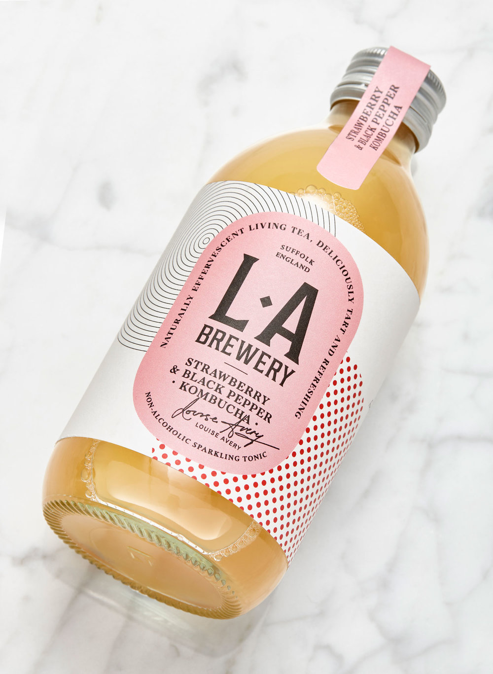
“We want our kombucha brand to look comfortable amongst alcoholic drinks in bars and restaurants, as well as soft drinks to bridge the gap of what to drink when you are not drinking,” says founder Louise Avery. “This is one of the reasons we arrived at the name LA Brewery.”
Louise also wanted to demystify the fermentation process that goes into making kombucha, something she was keenly aware of as she experimented for two years, foraging for many of the ingredients that would eventually make their way into her recipes.
“She brought us all mothers of our own which we nurtured and then flavored with whatever we fancied,” says Here Design Creative Partner Kate Marlow. “Louise was very polite about our experiments, but I don’t think any new flavors will be generated by Here Design.”


“From the beginning, this project was about Louise,” says Here Design’s Strategy Partner Tess Wicksteed. “She had a local brand in east London called ‘Lois and The Living Teas’ and had published a wonderful book about Kombucha. She wanted to make a delicious tonic, one that would appeal to first-time drinkers.”
Here Design immersed themselves in the world of kombucha—it’s all part of a process the studio revels in as they get to familiarize themselves with the client’s vision. They even started brewing their own kombucha.
“We always wanted to call the brand L.A Brewery because it’s a shorthand of Louise Avery’s Brewery,” adds Kate. “The notes on the pack are literally lifted from her brewery notebooks, and the ‘not too nerdy’ diagrams are representative of the real science behind the fizz.”
“I am very drawn to scientific diagrams detailing the process of distilling spirits such as whiskey and wanted to do something similar,” admits Louise.

Informative and intimate, the notes lend a personal touch to the visual system they designed across the range of teas. “It’s Louise’s voice really,” says Tess. “She’s one of those people who are at once incredibly knowledgeable about her subject and a lovely warm confiding person. She’s always letting you into her secrets, and that’s what we wanted to the brand to do too.” She’s right. The notes on the bottles are not only human and inviting, they have an analog, back-to-basics feeling that lets the consumer into Louise’s fantastical underground laboratory that produces raw, living fizzy wonders, albeit in an utterly approachable manner.
The audience they wanted to reach was always key. They needed to talk to kombucha drinkers who were already in the know, as well as soft drink lovers who were looking for beverages made with less sugar. The problem was that there were too many options on the market that were solidly in the health camp, or that they instead veered towards the cartoonish and crunchy hippie camp.

“None of them look like real mass market contenders,” says Kate, “but Louise wanted everyone to benefit. It’s a viable alternative to much less healthy fruit juices and should communicate to everyone, not just an elite group.” Above all, they wanted to make something grown up, something that clearly indicated the category had gone mainstream.
They did this by turning to visual cues in the craft beer world. “We played with the craft beer aesthetic, matching it with uplifting and vibrant color palettes that represented the three different kombucha flavors,” says Kate. “The background patterns show an abstraction of the mother culture colliding with an abstraction of the key flavor.”

They also wanted to make an appeal to diversity and open-minded cultures. “We used the idea of multiculturalism as our starting point because it’s a very succinct way of describing the actual product,” says Tess. “Fermentation breeds multicultures. By drinking Kombucha, you are literally opening your body to otherness.
“It’s a philosophy we affirm. We think openness to otherness is good for you in every way.”
“You can’t get a more positive brand positioning than that,” adds Kate.
LA Brewery could potentially leverage that sunny brand positioning into even more purchases. By 2020, sales are projected to reach $1.8 billion, and with their vibrant branding, it’s no stretch of the imagination seeing Louise’s creations stake out the global market.

And really, it’s not such a terrible proposition, considering we’ve all had our own personal struggle with home-brewing kombucha which, while fun, resulted in overflowing SCOBY hotels and rapidly-declining fridge space.
Better to leave it to the professionals like LA Brewery.


