

Studiomax Design created the colorful packaging for Calusa Brewing and their range of beers.
“It started with establishing Calusa’s brand identity, which includes a subtle nod to the Native Americans who inhabited Florida’s Gulf Coast. They were fierce, intelligent people who had a tremendous respect for water and Florida’s natural resources.”

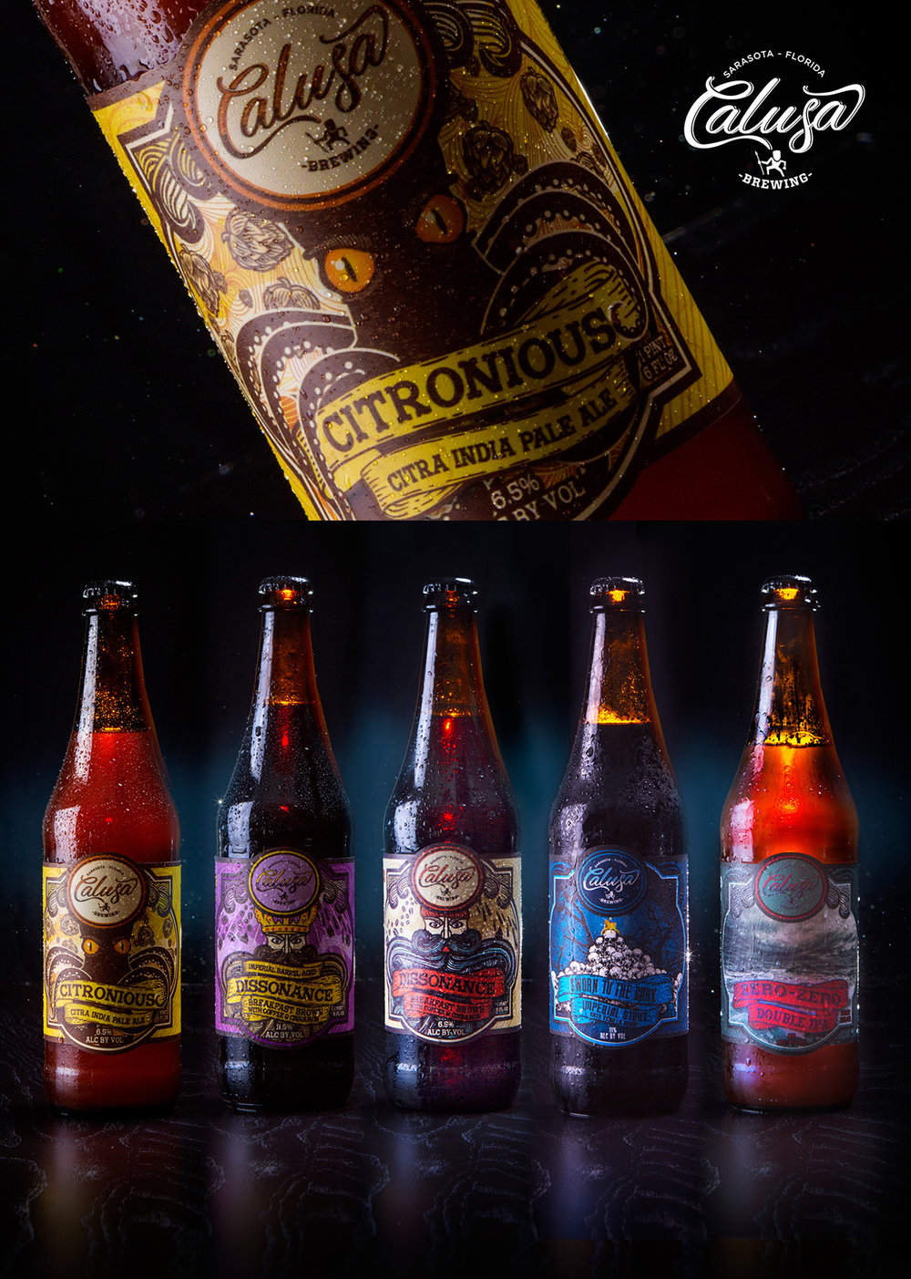
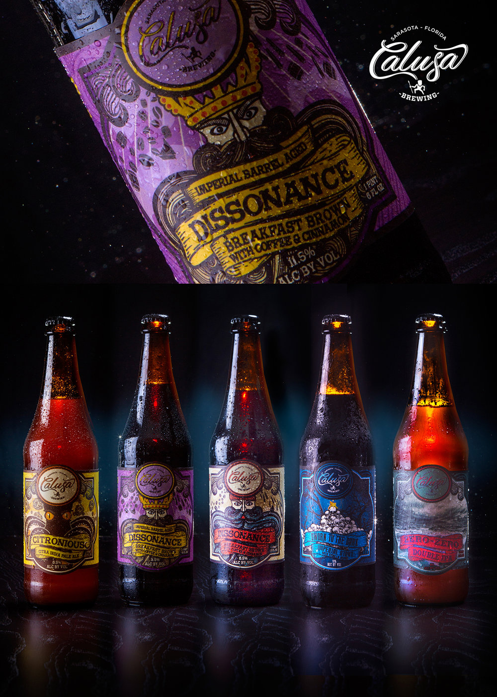
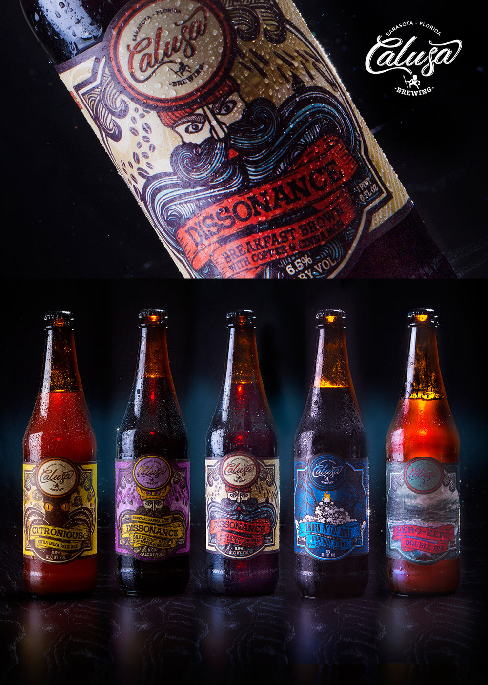
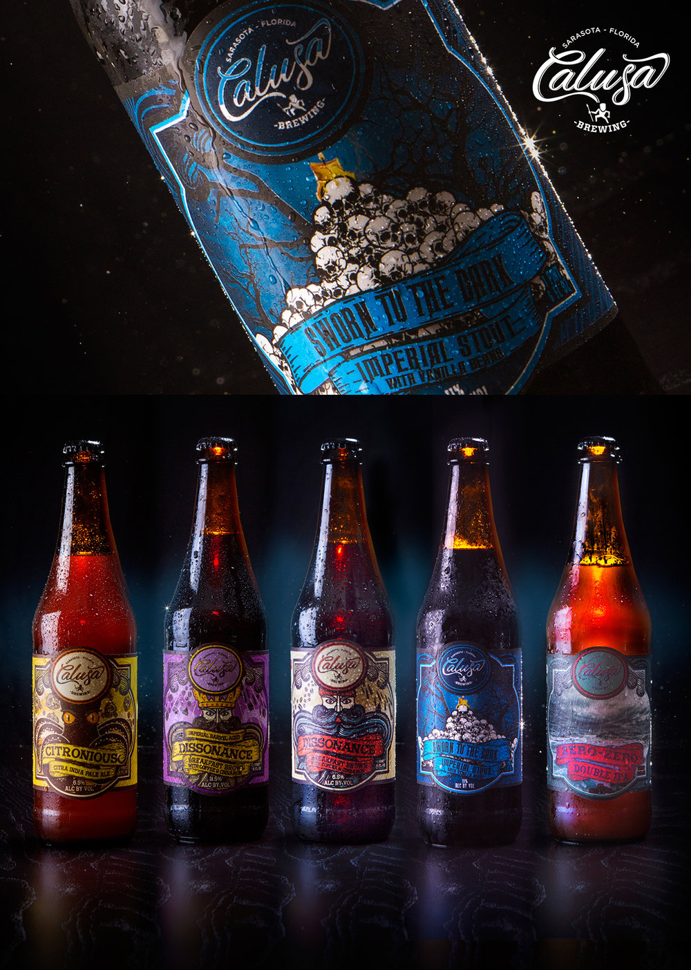
“The series of bottle labels are scenic illustrations that are each uniquely focused on the beer style and its ingredients, while ensuring that a cohesive system is in place to properly brand Calusa on the shelf.
The first in the series was their signature Citronious (Citra IPA), in which we illustrated an octopus to keep the water theme flowing and balanced out the citrus flavors with the use of orange eyes.”

Agency: Studiomax Design
Creative Director/Partner: Max Blevins
Art Director: Nelani Palomino
Account Director/Partner: Jeff Rutti
Location: Tampa, Florida


