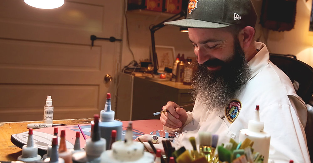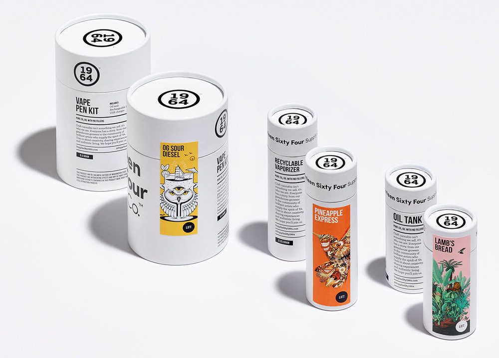
What better way to design for a product’s packaging than to use it first? That was exactly the idea One Twenty Three West had with 1964 Supply Co. cannabis products. Wanting to give consumers a feel for the experience before they even bought it, the agency instructed illustrators to use a selected strain and design the label from there. We spoke with One Twenty Three West to learn more about how they selected the esteemed illustrators, worked with them (even in locations where cannabis isn’t legal), and more.
Watch this video to learn more about the illustrations of 1964 Supply Co.
Walk us through the design process that you went through for this project.
One Twenty Three West: The client was a new cannabis grower and supplier looking to rise above the ‘stoner’ brands that dominate the market. We developed a name that reflected the history of cannabis (THC was first isolated in 1964) and a positioning that appeals to millennials (a supplier of experiences).
The numeric logo is largely inspired by a traditional seal of quality. The logo and branding elements were intentionally kept bold, simple and black and white, to complement—not conflict with—the illustrations.
Almost all of the pieces were custom die-lines, created to allow best access to see the product, while balancing legal restrictions (tamper proof sealing, for instance), with details like making the packaging smell-proof, resealable, etc.
We peppered textural elements throughout the series of packaging—soft-touch finishes on the paper, blind emboss logos, perforations on flaps—all part of creating an unexpected experience.
In total, we produced over a 100 different pieces (boxes, jars, stickers, baggies, tubes, etc).
What was one of the biggest goals you set out to achieve with 1964 Supply Co. packaging and how did you accomplish it?
One Twenty Three West: For the packaging, we wanted each illustrator to experience the product and create the art for it while under that influence. One of the hardest things with an idea like this is getting the product to all of our illustrators—Joe Wilson for instance is in the UK, where the product is very much illegal.
What instructions did you give to illustrators to ensure you got a design that was eye-catching and indicative of the product?
One Twenty Three West: We sent a sample of a different cannabis strain to each illustrator, asked them to use the product and then interpret the strain in their unique style. The idea being that a customer could look at the range of strains and see which one is right for them, through the artwork.
We had each answer a series of questions about themselves, their experience with cannabis, with the strain we sent them and about the art they created. We also had them video the creation of their art. This became web and social media content used at launch.
How did you choose which illustrators you hired and how did you mesh everyone’s unique style under the same brand?
One Twenty Three West: The budgets were reasonable, but not huge. We were able to work with respected illustrators around the world, have them self tape their process and answer supplied questions. The objective was a brand that was beautiful, appealed those who appreciate the arts and new experiences, and to give people a visceral understanding of the effects of each strain, through the packaging alone.

What was the most challenging part of this project?
One Twenty Three West: A big part of the design challenge for this project was simply that standardized, government regulated packaging hadn’t really been done before—we were entering a new market without a lot of clear rules or regulations.
If you could pick one aspect of the finished design that you like the most or feel especially proud of, what would it be and why?
One Twenty Three West: Our favourite part was working with the illustrators, and the final illustrations that resulted. This was more of a fine art project than a design one—illustrators had free reign to be as creative and interesting as they could be. Most of them had never had this much freedom, and they all over-delivered.
Share one lesson that you learned while developing the finished product.
One Twenty Three West: Don’t be afraid to fail. This was a very ambitious project, with a lot of illustrators all over the world. We had tight timelines, small budgets and a lot of unknowns. But we believed in the creative idea, and keep going despite the obstacles.


