

We love this fun concept for Slow Drop, a cocktail syrup brand. The drips and colors of the syrup provide for an eye-catching design that accurately represents the product. Stas Neretin came up with this clever and contemporary design.
“Slow drop is a series of syrups for making cocktails. I kept two goals in mind when working on the packaging: to show the viscous nature of the syrup and make the bottle part of the interior.”

“Bottles often get a lot of attention in bars and get showcased on a wall. In such cases they stop being just packaging but also become a significant part of the interior. I noticed that most of the time syrup bottles look out of place and don’t fit within refined interiors. I decided to make syrup bottles that look as good and polished as spirits.”
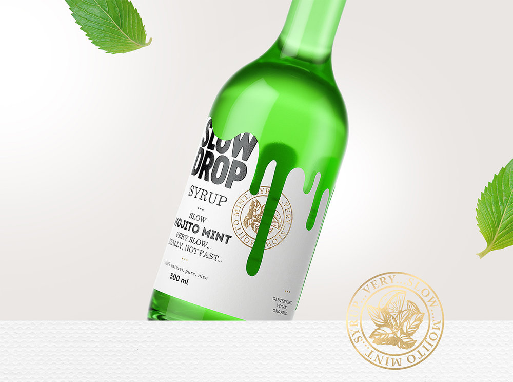
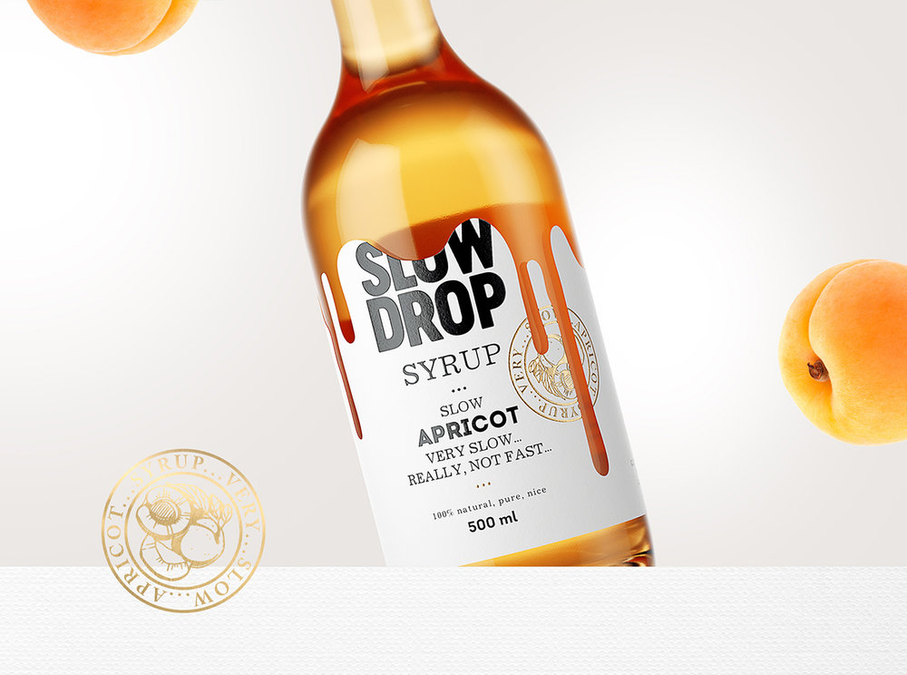

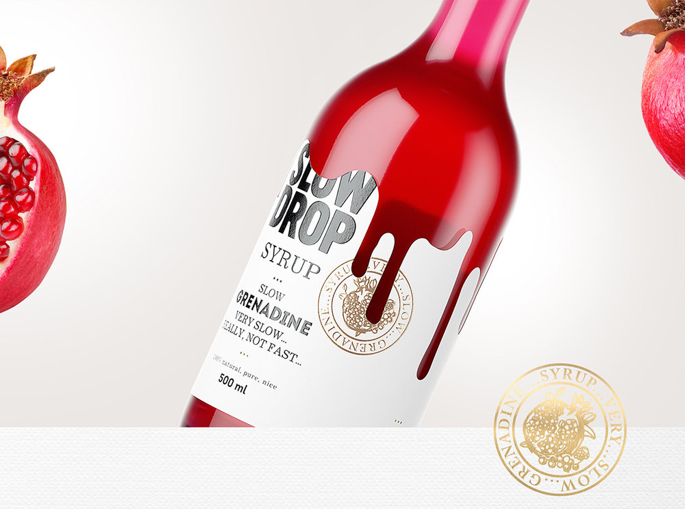

“The naming and packaging of the syrup represent the nature of the liquid inside — sweet, viscous, and flowing. The key approach for the packaging was the shape of the label that is reminiscent of a syrup drop flowing slowly down the bottle. The color of the syrup inside gives a good contrast to the label and makes it stand out.”
“Different tastes are presented on golden prints with an image of the key ingredient while the syrup colors speak for themselves. Label decor gives the bottle a posh touch but the text on the labels bring the seriousness down and creates a nonchalant relaxed ambience to enjoy an evening sipping a cocktail. Slooooooowly…”


Designed by: Stas Neretin
Location: Moscow, Russia


