
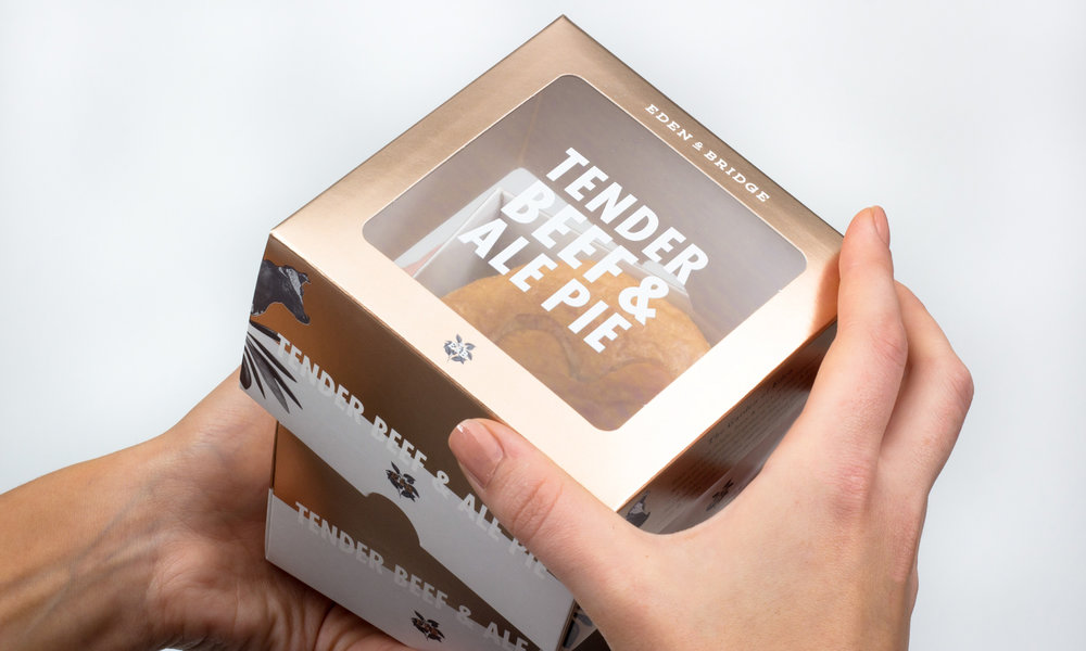
Pie for dinner? Yes, please! Eden & Bridge is a line of savory meat pies that come in mouthwatering varieties like succulent chicken and truffle or tender beef and ale. Fable&Co. developed the packaging for these luxury pies that give a whole new meaning to comfort food. A cutout on the top of the packaging allows consumers to peek inside at the delicious pie, and finely shaded images of some of the ingredients appear at the edge as if they were popping out of the pie. Foil adds an element of sophistication, while the large text indicates that the pies are packed with intense flavor. Fable&Co. Needed to create a lavish brand with packaging that would give the consumers a memorable experience and promote the true extravagance of Eden & Bridge.


“Our clients location ‘Edenbridge, Kent’ inspired us to in our pursuit for an impeccable name & narrative for which to shape this unique identity. ‘Eden’ meaning delight, finery & luxury is more commonly famous for the paradisiacal garden in which Adam & Eve lived. Is is often said that the Garden of Eden is marked by four beautiful rivers, adjoining together, enabling the vast virility & fertility of this area of unsurpassed natural beauty.”


“Following the design of the primary work marque & logo asset we set about considering the look & feel of the packaging graphics. Inspired by the natural balance of nature coupled with the serenity of the Garden of Eden—represented through the simple, eye catching, symmetrical graphic device. We introduced monotone iconography/imagery to effectively differentiate the product variants within the range. On pack messaging relating the Eden & Bridge brand story was devised to encourage an emotional connection with the brand. It was important to create something truly unique that was both commercially & conceptually effective within premium retail environments. Luxury & exclusivity were paramount to stimulate the consumer experience of the brand, this was achieved through the careful consideration of graphic & structural packaging design along with stylish & sophisticated print finishes.”

“The production of the packaging began with a delicate cold foiling process to the flat sheets. These were then carefully overprinted with the design before being die-cut & creased. Digitally printed window film was produced & applied using a pick & place gluing technique to ensure the typography aligned. Ultra thin magnets were added to the inside of the sleeve flaps, as well as the inside of the sleeves themselves. The lids, bases & sleeves were then glued ready for the delicious pies to be inserted.”


