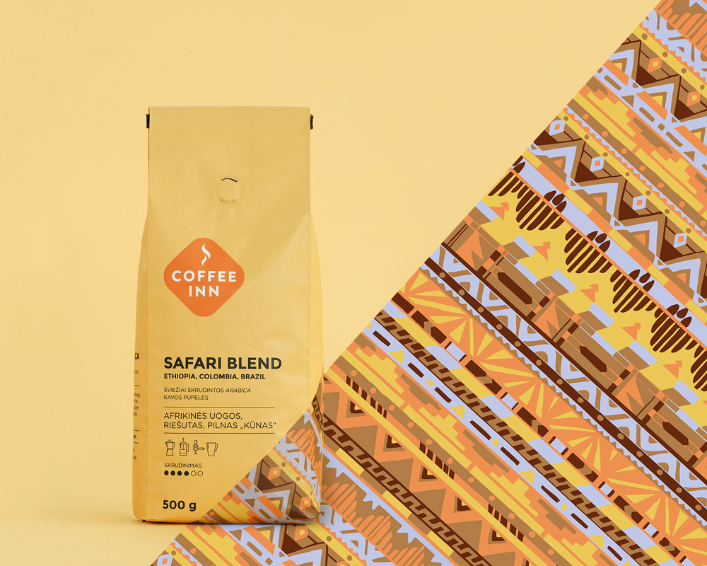
Coffee Inn customers were only taking their coffee out, failing to see that the store also sells beans there. Lithuanian agency étiquette developed packaging for their single origin and blended coffee, differentiating each one while unifying the different beans under the brand.
“SOLUTION: Make the packaging stand out in the cafe. Communicate that it’s an original product by Coffee Inn, roasted in-house. Separate blends and single origin packages from each other. Show recommended method of preparation and a hint of taste on the packaging.”

“Ethnic patterns on the packages were created collaborating with illustrator Elena Mayagrafik. The goal was to convey ethnicity without directly referring to certain cultures. The result is an original, authentic fusion of patterns.”
The patterns on Coffee Inn Coffee incorporate a bit of the bean’s origins and also giving the brand a bit of an eclectic, lively appearance. Patterns are instantly noticeable, and an array of colors helps the bags of coffee to stand out on the shelves in the coffee shop and also to stand out against other brands. The font is a basic sans serif that appears modern and approachable, and small dot icons quickly indicate the intensity of the roast.