
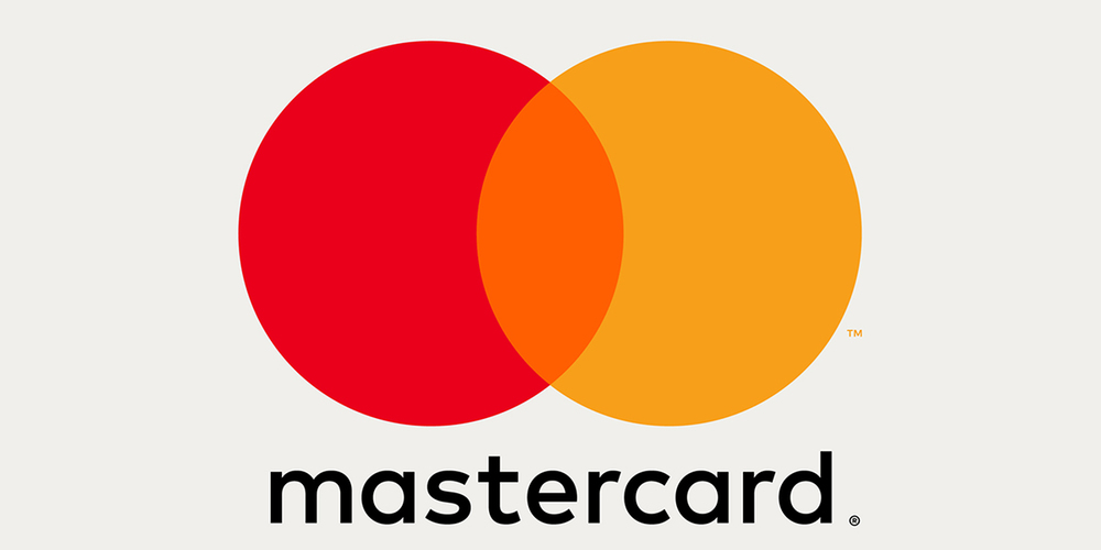
For the first time in 20 years, Mastercard unveils a new logo and brand identity. Designed by Pentagram, the new look will be seen in the hands of customers come fall, along with a new digital payment app called Masterpass.
The new look is modernized and simplified but not far from the original design. Since the logo is recognizable globally, keeping certain design elements such as the interlocking circles, yellow and red colors, the company’s name, was pertinent.


“The MasterCard logo is recognized universally,” Rajamannar tells Adweek. “There are 2.2 billion cards that carry the MasterCard logo. There are tens of millions of merchants worldwide that carry the MasterCard logo at the point of sale. The key for us is the equity in that logo—we have to leverage that going into the future.”

The new redesign features the word “Mastercard” written in lower case with its name rendered in a font called “FF Mark”. Placing the name on the outside of the interlocking circles gives the logo a cleaner look that reads well in small sizes.


“We wanted to signify that the card is just one type of payment,” Rajamannar said. “With the evolution that is happening [in digital payment], the card is no longer the most important element. We wanted to de-emphasize it, and so we’ve taken away the capital letter C.”


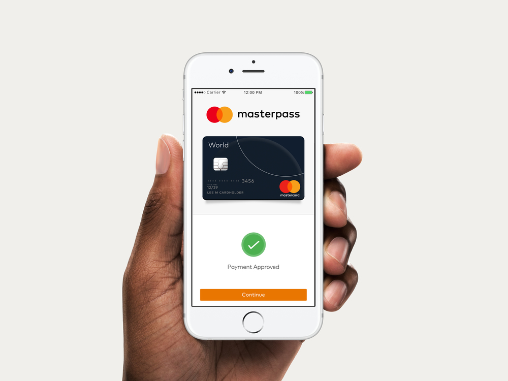


The look will appear on everything from credit cards to billboards, with circles and arches playing a prominent role.


Designed by Pentagram
Country: United States, United Kingdom, Germany


