

The classic American ice cream we all know and have grown to love has a new look just in time for the summer. Designed by Pearlfisher, the new bunny-earred logo finally does the brand justice and immediately gives the packaging a modernized look. What was once photographs of a mountain of ice cream has become adorable illustrations and bright colors ready for Pinterest. Large tubs of this chilly dessert are now packaged in clear containers, allowing the swirls of chocolate and caramel to shine through.
Whether you a full-grown adult or child, this redesign speaks to all ages and brings out the playful side in all of us.
“Beloved, all-American ice cream brand Blue Bunny approached Pearlfisher to visually revitalize the brand in a modern and unexpected way. At its core, Blue Bunny is a playful and lively brand. The new design reflects this by visually imbuing Blue Bunny with moments of fun and delight.”
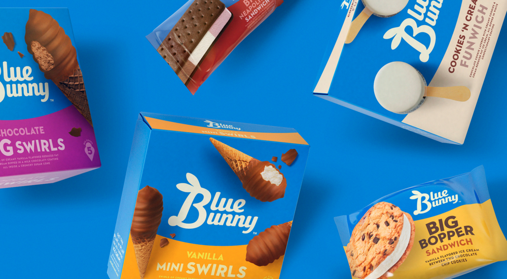
“The new hand-drawn logo takes the shape of a bunny, cueing simpler times. It can now stand alone as an iconic playful equity to represent the brand. It was central to our strategic approach to preserve the color blue for the brand – after all, the color is in the name. The fresher, more appetizing hue reinforces Blue Bunny’s point of difference as the most delightful choice. The resulting design enriches the brand’s heritage by infusing it with a distinct sense of fun to forge deeper connections with consumers.”

Before


Designed by Pearlfisher
Country: United States, United Kingdom, Denmark


