
Phoenix Organic Drinks has been at the heart of the organic revolution, creating quality liquid libations since 1986. What started as a revolution, has grown into a much loved brand with a fridge full of firsts.
But with an influx of organic challengers entering the market and a shift in cafe and consumer needs, Phoenix set out to reposition themselves as the market leader and engage a new generation of loyal fans. We were fortunate to work with Fly, the lead creative and strategic agency for Phoenix in delivering some fresh organic goodness.

The previous logo had evolved incrementally so that the word “organic” was eventually not integrated into the device and was so intricate it was hard to use across the growing portfolio of communications. The word mark felt too industrial and not reflective of Phoenix’s fluid and creative attitude. While not part of the original brief, we felt that to ensure Phoenix built on a strong foundation, we approached the logo as part of the packaging redesign.

The new logo gives the brand more flexibility when presenting itself in multiple contexts. ORGANIC is the centre point of the brand, with NEW ZEALAND being supportive to the core PHOENIX word mark. The three components of the logo can easily be deconstructed and reconfigured to translate stronger across all communications. An unusual approach, where brands are often defined by slavish guidelines. We also removed any unnecessary cliched design cues. We don’t need a green logo to speak to organic or natural cues. Consumers are smarter than that.


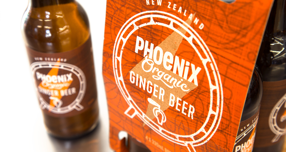
The previous packaging used a flat circle of colour to differentiate flavours. We wanted to tell the story of Phoenix’s rise from challenger brand to leader brand. We still remember back in the early days when Phoenix Ginger Beer was made in barrels, in a Ponsonby garage and if over fermented would explode. Phoenix Ginger Beer is still produced in batches and still delivers that unique gingery, throat tingling explosiveness. These stories, developed by Fly, became inspiration for the packaging designs. We developed bold, graphic devices, overlaid with simple white line work and screen printed textures to bring an element of attitude and style. Curious Design led the charge on helping shift Phoenix into a new school “organic” aesthetic. It’s no longer about green leaves and hippy references, but simplicity, clarity and quality.


Designers: Monique Robins, Curtis Walker, Lynne Richardson
Creative Director: Nigel Kuzimski
Strategy: Fly Creative
Designed by Curious Design
Country: New Zealand


