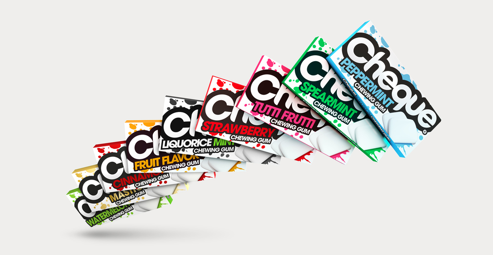
Never run out of gum options with Cheque Gum! These delightful packs that come in a variety of flavors got a much-needed redesign from Design Happy.

“With plans to introduce new flavours, Cheque Gum seized the opportunity to overhaul their image. Focusing on the MENA market, Cheque wanted to be the gum of choice for a younger, hipper audience and create shelf impact in a very busy and colourful category. We refreshed the brand from top to bottom with a more youthful and iconic approach. The logo was angled and bursts out of the confines of the box making use of the format and massively increasing shelf standout in a busy market. Bold colourways add energy and zest into the overall designs really pop as a range.”

The old design for Cheque Gum feels retro to the point that it’s outdated. Colors feel stale and it’s hard for the consumer to truly get a sense of the brand. The new look, though, is energetic and modern, instantly grabbing someone’s attention in a grocery store aisle or at a quickie mart. Every package has the same layout, and colors change based on the flavor. Colors are bold and bright, expressing a youthfulness and excitement that the old packaging lacked.


