
If you like your drinks strong and smoky, then check out Glen Oak. This craft beer from Oak Master uses natural corks to give the drinks aromas and oak characteristics. Brandsummit developed the packaging, creating a visual identity worthy of such a one-of-a-kind drink.
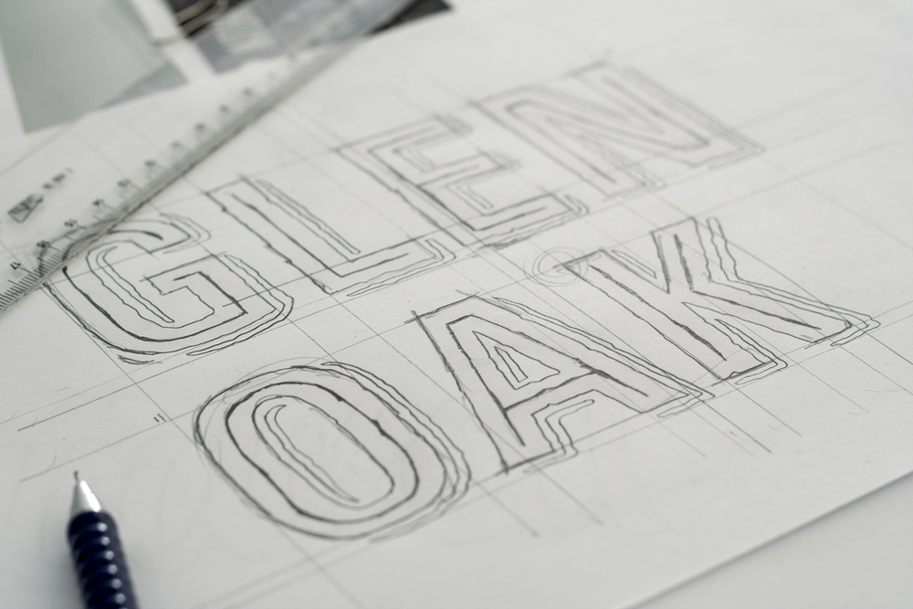

“Our design proposal consists of displaying, in a simple way, both the natural origin of raw materials, as the process of brewing through an orderly scheme of icons and lettering. This synthesis of elements stand out over a stunning dark bottle of 75cl through the white ink screen printing on the glass. The simple and elegant combination, along with the sobriety of the colors, makes this a gourmet beer intended for foodies.”
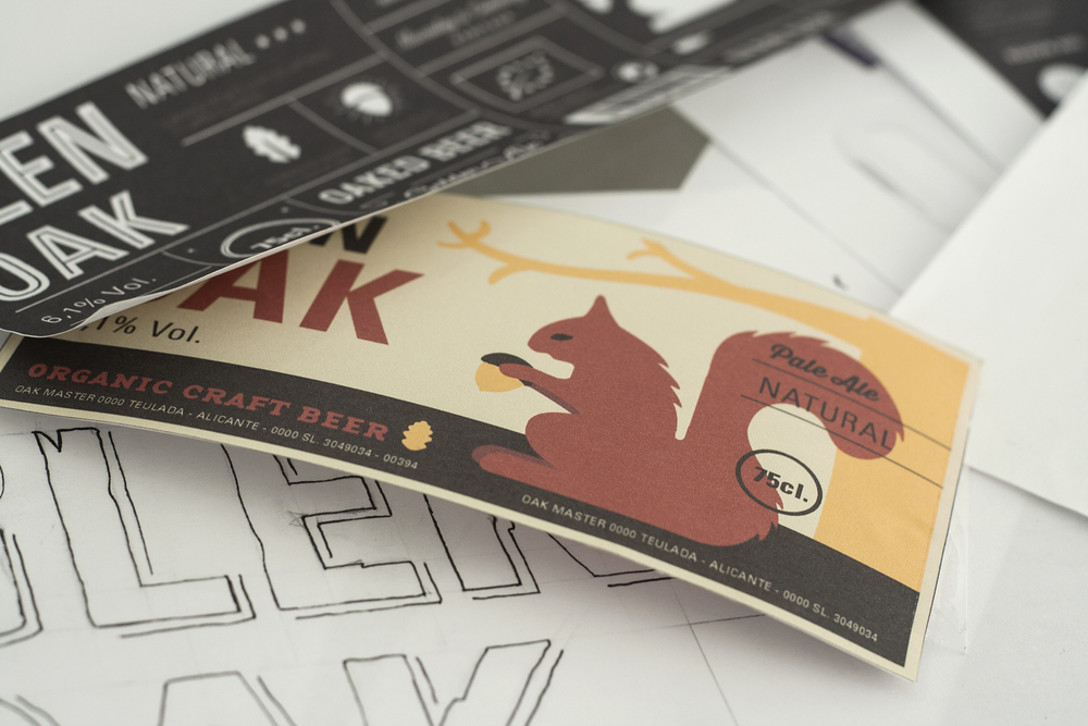
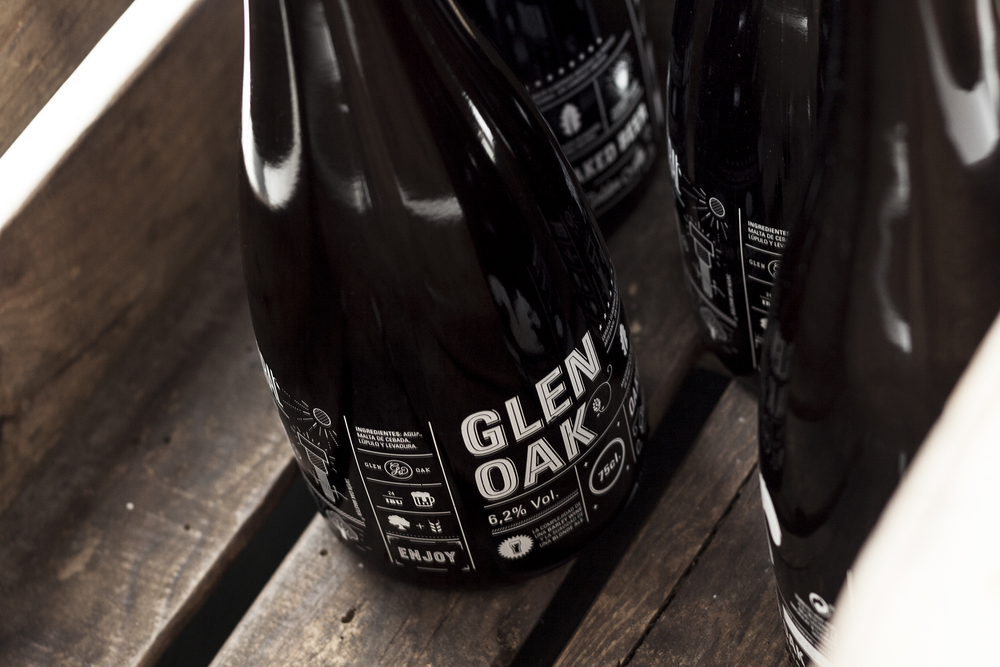

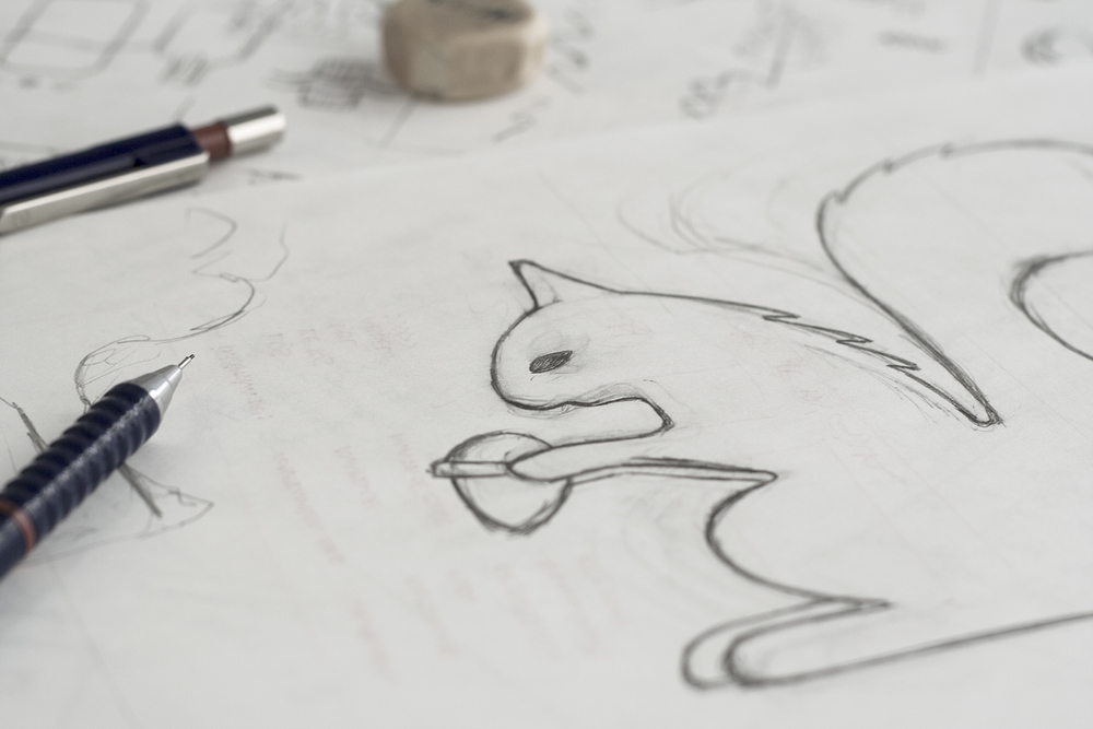
Glen Oak’s label is a beautiful combination of graphics and a variety of texts, giving it depth while making it lively and fun. Information is broken up into smaller spaces on the label, making it easy to locate what you need to know. White text pops against the dark bottle that speaks to the bold flavor of oak in the beer—even the cork is pitch black. Small illustrations, like that of a squirrel or full beer pint, add in some humor and playfulness.


