

From Ireland, with love. For over 40 years, The Burren Perfumery has produced small-batch, high-quality natural cosmetics. Inspired by the beautiful natural scenery of the Burren, a region of southwest Ireland, moodley brand identity designed lovely, honest packaging for the family business.


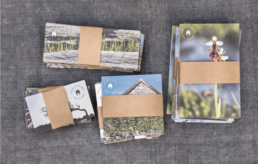


“Based on the flora and the breathtaking nature in the Burren, moodley brand identity developed a packaging design that presents The Burren Perfumery like it is: self-confident and just genuinely natural. The six scent families give the product range – from body lotions to soaps and creams – a clear structure; the subtle, natural colors appear as discreet eye-catchers, proving that natural cosmetics cannot only stand out with their contents, but also with their looks.”


The Burren Perfumery is clearly a brand that is proud of its heritage, featuring images of the Burren on the labels. Each product has a coordinating dreamy pastel color, eliciting warm and happy emotions. The font is a classic choice that looks almost like it was written by a typewriter, emphasizing the brand’s long history and pride in its tried and true cosmetics production. Overall, the packaging embraces a gentle simplicity which is then reflected in the pure and natural ingredients used to make each item.


