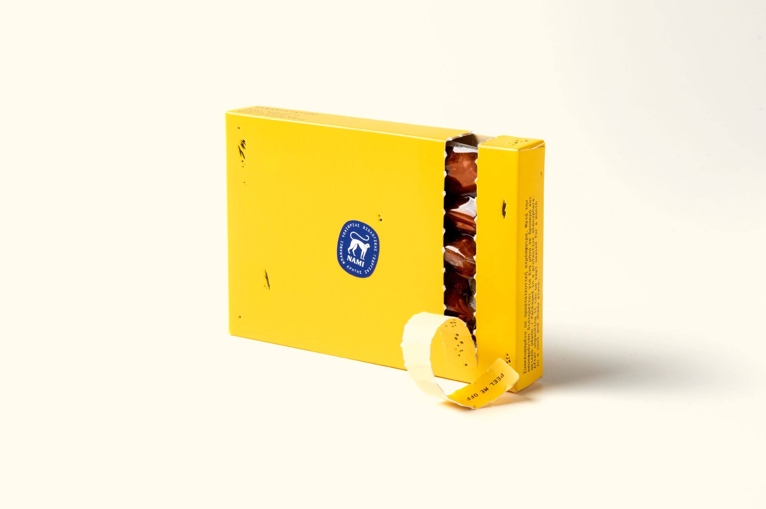
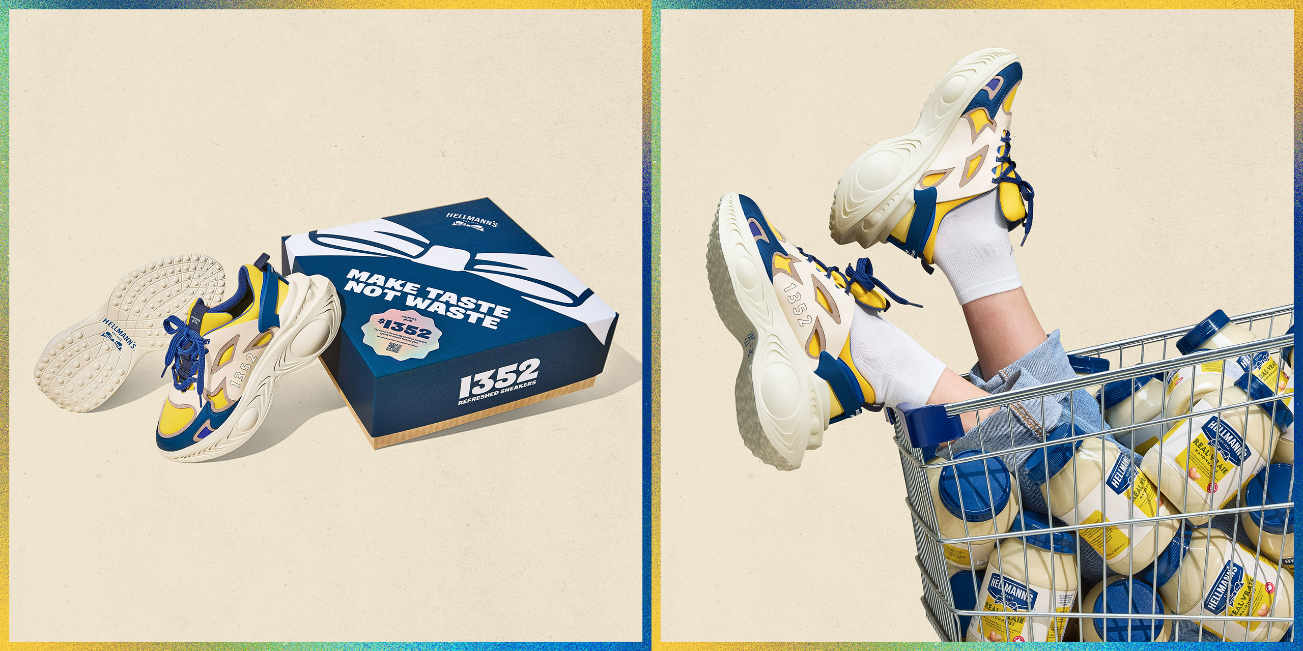
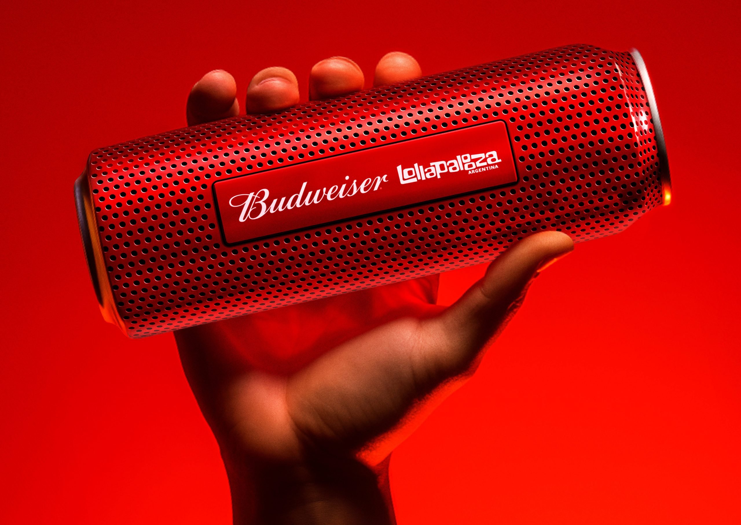
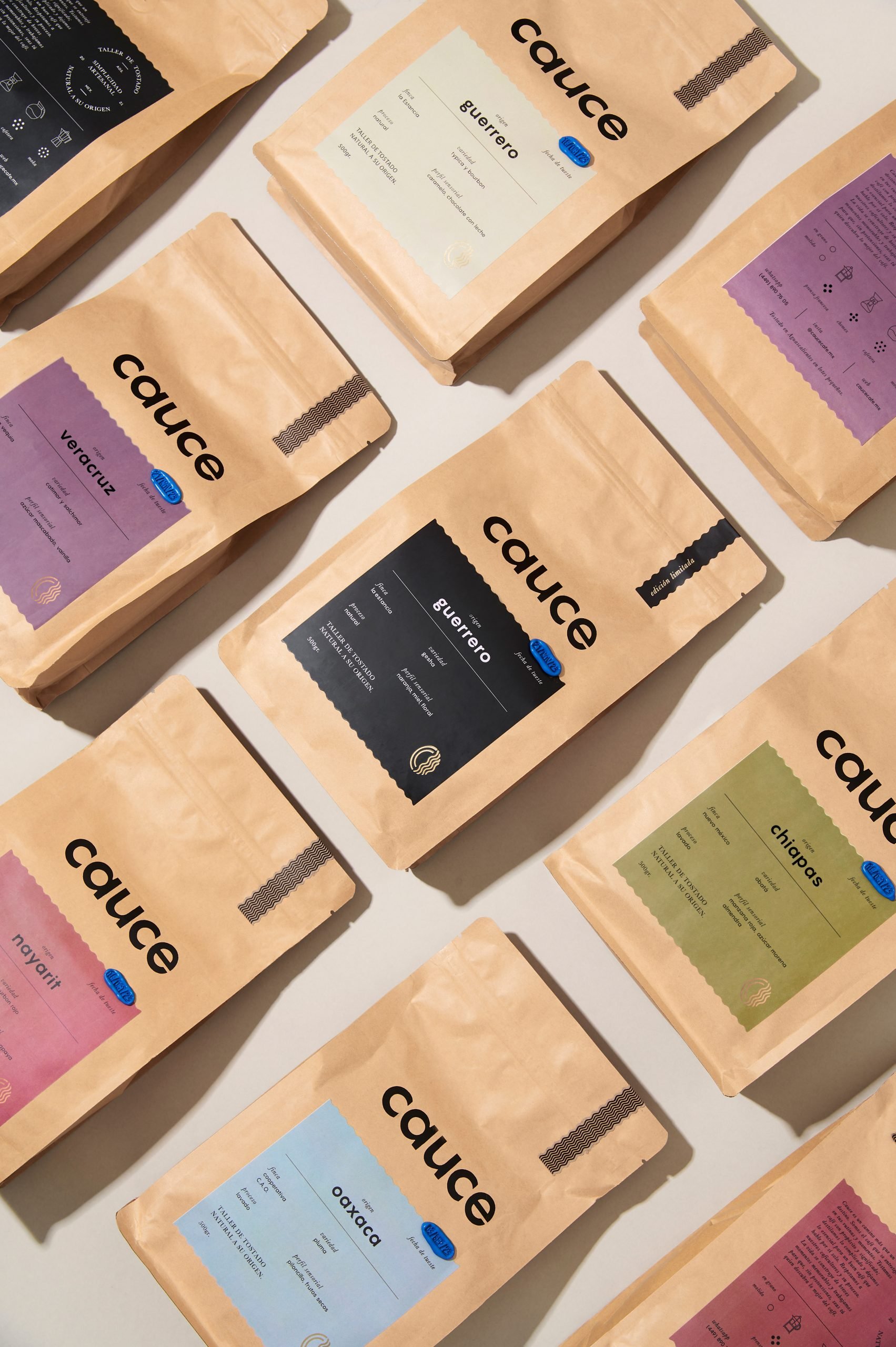
Monochrome extraordinaire. The brand identity and packaging of Matà, a range of craft American Pale and Belgian Blond Ales, has been designed by Italian agency WMAT:IT to surprise and delight. The design is inspired by beautiful typography – a common trait in the branding of craft beers. The use of one color screen print gives the packaging a sense of sophisticated taste and modern – supported by the choice of the gracefully shaped bottles.
A memorable design, in its simplicity, that stands out and grabs the consumers’ attention. Bravo!
Web editing: Funnel
