

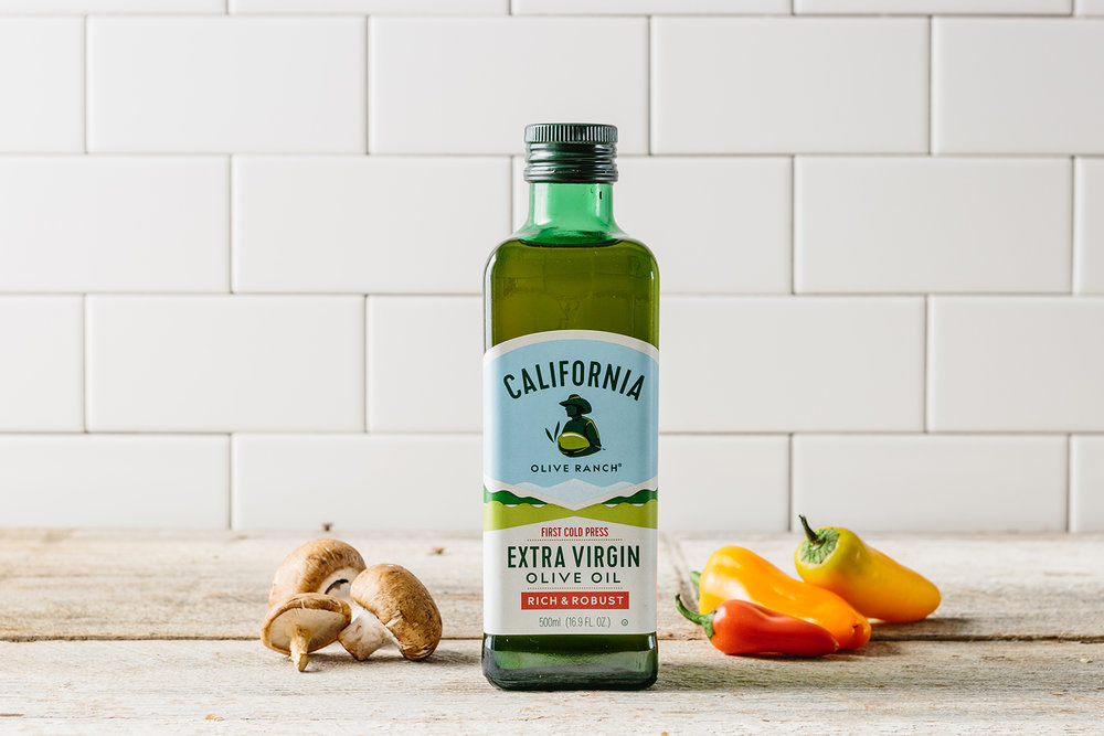
Design Womb, a Chicago based agency was met with the task of redesigning the identity and packaging for California Olive Ranch, which is the #1 brand of domestically produced extra virgin olive oil in the United States.


“The new packaging design feels fresh, Californian, and is somewhat rooted back to the original labels to avoid confusion with loyal customers. To achieve this we designed a modernized interpretation of the rancher icon for the logo and carried over the existing color palette with subtle updates that feel vibrant and welcoming. The strategic use of a secondary color palette and special effects such as a gold foil, metallic ink, embossing, and premium papers helps draw a line between different product price points and keeps the branding cohesive.”


“California Olive Ranch’s market share rose over 20% within the first 6 months of the new label and packaging launch in early 2016. The olive oil is sold at over 20,000 stores nationwide, including national retailers such as Target, Whole Foods, Costco, Kroger, Mariano’s, Meijer, and more. You can also find their sample olive oil in Xela packs served in first class flights on JetBlue Airline.”

Agency: Design Womb
Photography: Kimberly Hasselbrink
Creative Director: Nicole LaFave
Location: Chicago, IL


