5 Questions with Ayra Peredo
by Theresa Christine Johnson on 12/08/2016 | 5 Minute Read
Can’t stop won’t stop. Every week we bring you The Dieline’s Top 10 packaging projects and articles to inspire and boost creativity, but why stop there? Our 5 Questions With series allows us to sit down with the best of the best here on The Dieline and dig deeper into these fascinating projects, from the design process to the biggest challenges. Today we’re chatting with Ayra Peredo, the Canada-based designer behind the Fiasco Winter 2016 Collection.
1. Walk us through the design process that you went through for this project.
We wanted to create a design that would resonate heavily with our loyal fan base, so we started the process by researching what had done well for our collections in the past. Our seasonal collections are always an exciting release for our fans, so we felt we had a responsibility to create a special design. The design process was definitely a team effort—the marketing team and I sat down, discussed what direction we wanted to go in and brainstormed themes and symbols that we would possibly want to see on our label. We also had to discuss what visual aspects of our brand were integral for brand recognition and needed to be a part of the design. I created three different designs for the labels, each iteration displaying different directions based on our initial concept. I presented this to the marketing team and we picked apart what we liked about each design, deciding which attributes were the most successful, and then I integrated them all into the final design. Of course, with everything we do, we also presented it to the rest of the team to gather feedback and an initial reaction.
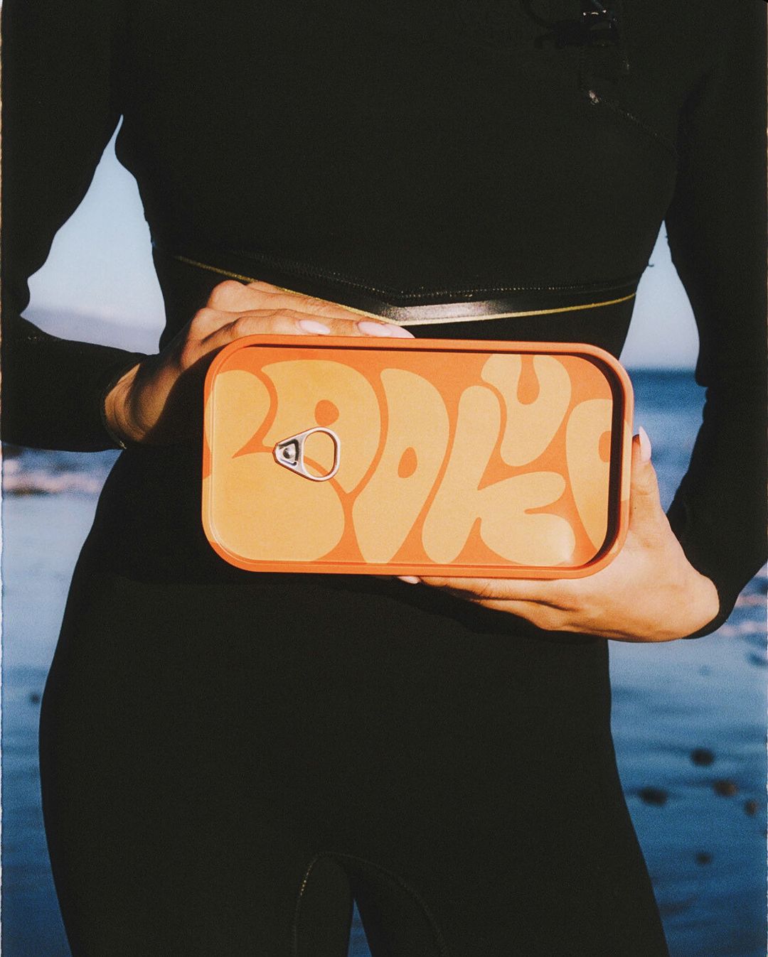
2. What was one of the biggest goals you set out to achieve with this packaging and how did you accomplish it?
One of the biggest goals we wanted to achieve with the release of this collection was to create a design that our fans would be excited to share, especially with our #FiascoAtHome campaign. We felt this was accomplished by creating a design that was approachable and resonated with our fans (and of course, was photogenic). The feeling of the holidays approaching was definitely something that our fans were vocal about and sharing with us on social media. It always feels like an accomplishment seeing our fans interact with the product and talk about how they love the packaging.
3. What was the most challenging part of this project?
It was definitely challenging creating a design that would be special to our fans while still retaining brand consistency. This was my first major project working for Fiasco, so I was still in the early stages of adapting my style to the brand’s. There was definitely a challenge in balancing unique with recognizable.
4. If you could pick one aspect of the finished design that you like the most or feel especially proud of, what would it be and why?
We love the collection as a whole. Each of the individual labels are great on their own, but seeing all the colours and animals come together as a collection during our product shoot, and on shelves now, was an especially proud moment.
5. Share one lesson that you learned while developing the finished product.
One lesson I learned while designing labels are the importance of having another set of eyes look over your designs—with product design there are so many small things that need to be considered and looked at. Not only that, but receiving feedback and constructive criticism is always necessary to create the best design possible.