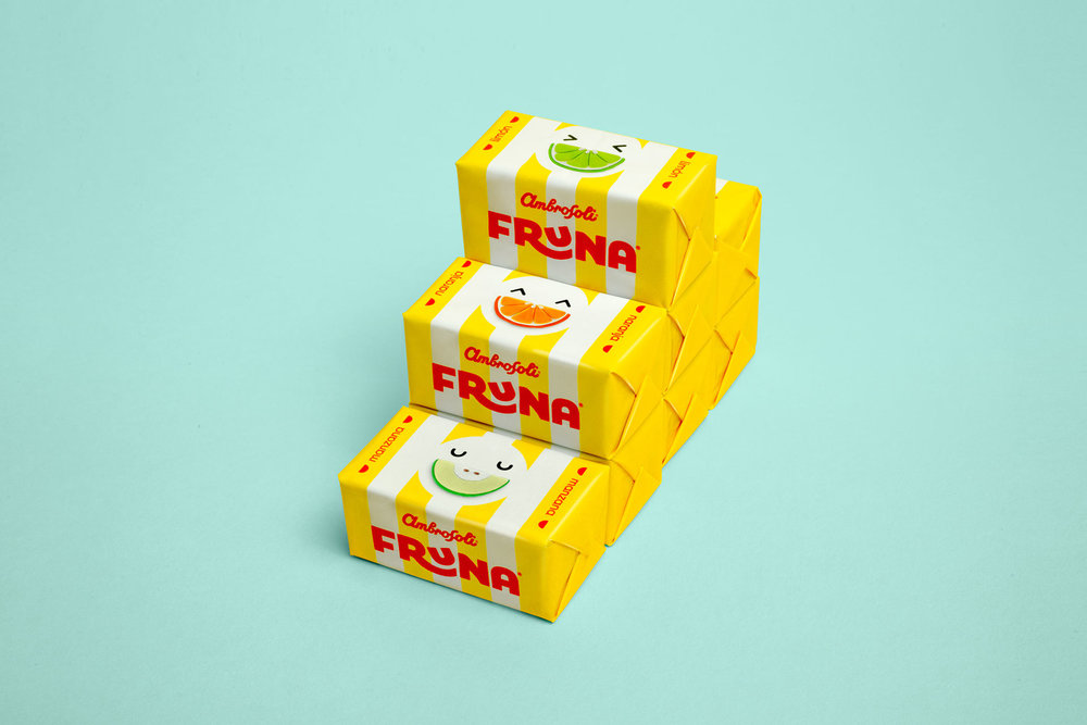
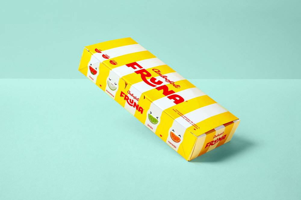
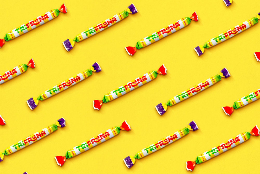
Candy never looked so sweet. Brandlab developed the new packaging for Fruna, a beloved candy brand in Peru. The result is bright and fun with just a hint of pop art, and it appeals to both kids and kids at heart.

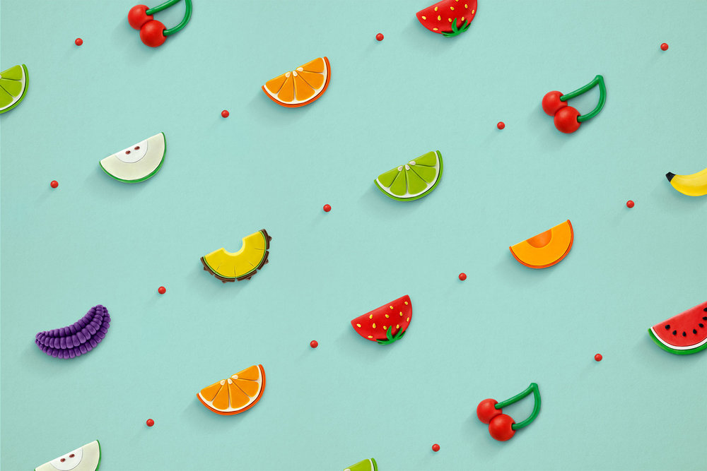
“Fruna is the oldest and most loved soft candy of Peru. It had its best moment in the 80’s following a series of commercials that had a highly sticky jingle: the ‘Frunacatoinga,’ which was based on the main characteristic of the product, its taffy texture. ‘Frunacatoinga’ is rebound and jump. This was the inspiration for the great challenge of redesigning Fruna. We rescued what made the brand shine. We created an identity by returning to the iconic colors and elements of the brand, we illustrated the fruits by modeling plasticine, which gives Fruna a more modern, sweet and fun appeal. The final result, a very strong identity, with a very playful logo, current, but above all, a visual identity that respects the essence of the 80’s brand.”

Fruna packaging relies on a cheery yellow and crisp white that instantly stands out on the shelf. The brand name is written in a jolly, thick font, and the “u” rests playfully on the tail of the “r.” Flavors are imagined into crescent shapes that then act as the smile on the individually wrapped candies. Bright colors help to indicate the different varieties and also tell consumers that this is a candy with some serious fruit flavor.


