
The 6th, a design studio from Milan, Italy has come up with a unique design for an olive oil from Punton Di Leone, a farm in Tuscany.
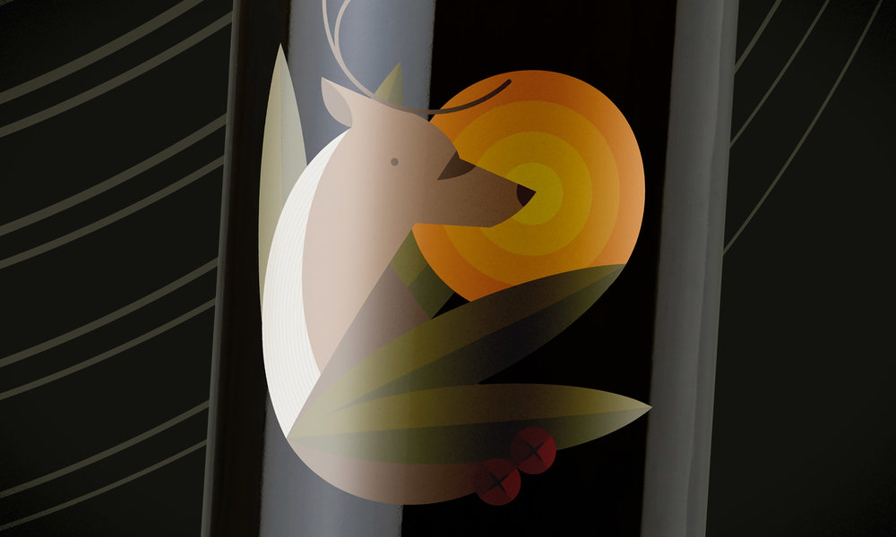
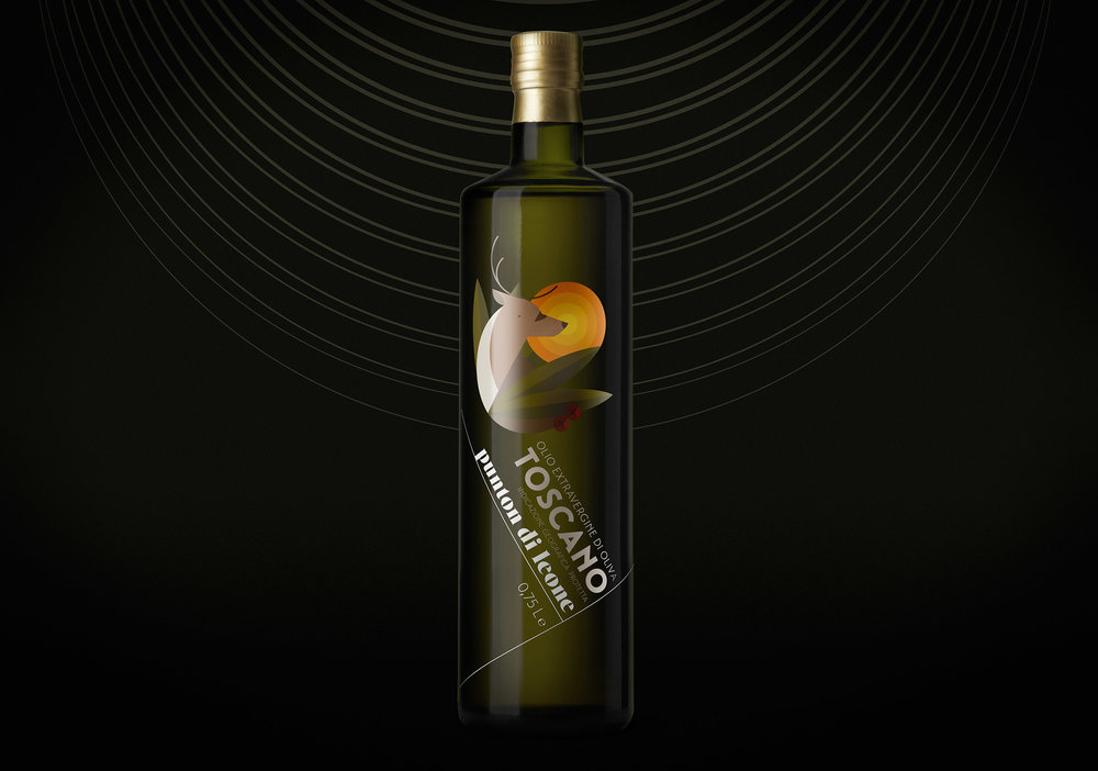
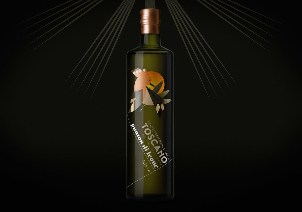
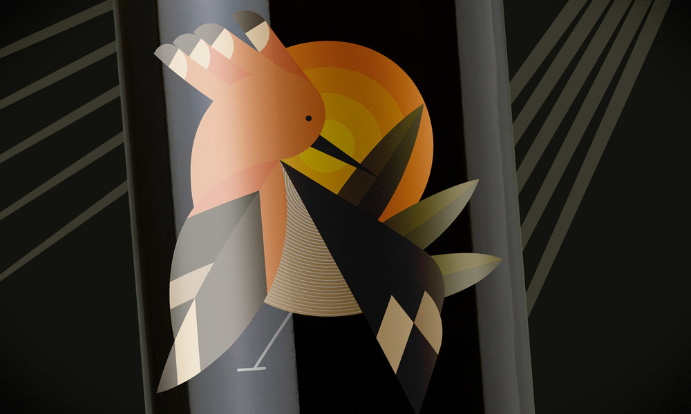
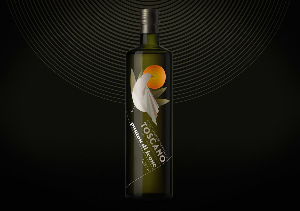
One wouldn’t necessarily associate fun flat-style illustrations with olive oil bottles, as instead typical olive oil illustrations are filled with vines and other organic patterns. This design is different, as it actually pays tribute to the wildlife that inhabits the surrounding areas of the farm.
“The total respect of nature (plants and animals living inside Punton property) is key to producing very high quality extra virgin olive oil, which has gained an endorsement from the official consortium of Tuscany.”
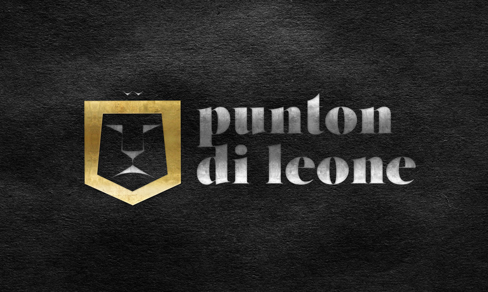
“The production has a set of four labels, and all the animals represented in the labels (turtledove, porcupine, hoopoe, deer) are typical of the area of Scansano. The lion in the logo comes directly from its name, ‘Punton Di Leone’ which means ‘peak of the lion’.”

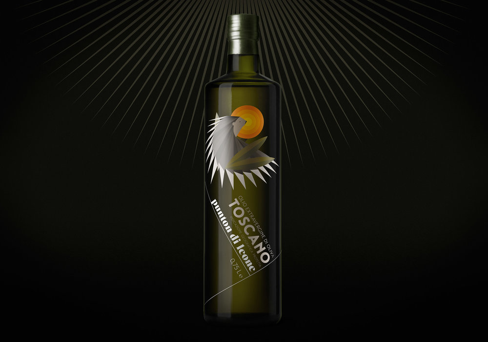
Each of the animal illustrations on the bottles are made up of geometric shapes, which helps add an unexpected quality to the olive oil. At the same time, the muted color palette unites the illustrations with the overall earthy and organic quality of the product itself.
The angled type and logo are reminiscent of Swiss-style design and help guide the consumer’s eye to the product.


Client: Punton Di Leone
Design Studio: The 6th
Creative directors: Emanuele Basso, Elena Carella
Graphic designers: Emanuele Basso, Antonella Manenti
Illustrator: Antonella Manenti
Location: Milan, Italy


