
These might just be the most captivating matchboxes you’ve ever seen. Designed by Keap and Objectify, the set is intended to be part art object and part print series. Intended to pay homage to New York City and Keap’s fragrances that are inspired by Japanese matchbox art, they also feature this Japanese proverb on the side: “It is useful to first see the spark before the fire.”


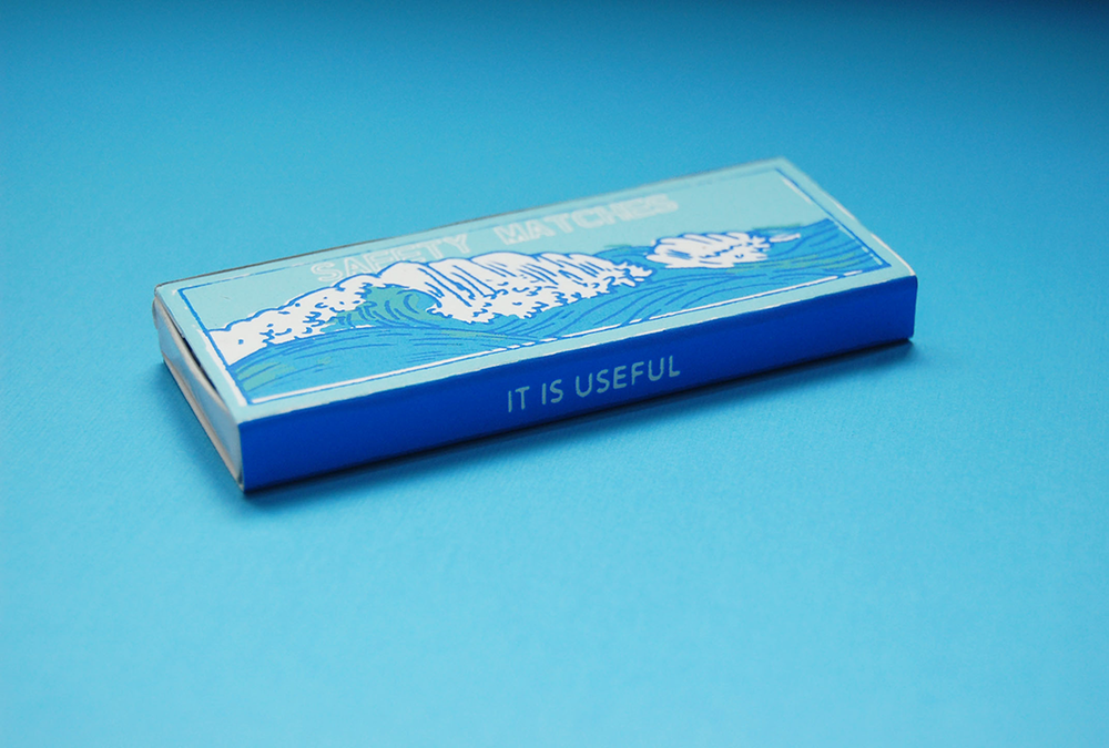


Each matchbox has its own color palette and illustration, all done in the same style. It gives a unique personality to each one that provides a journey for the consumer. The traditional illustration styles are juxtaposed with a modern font, and bright, saturated colors make it energetic and bold.


