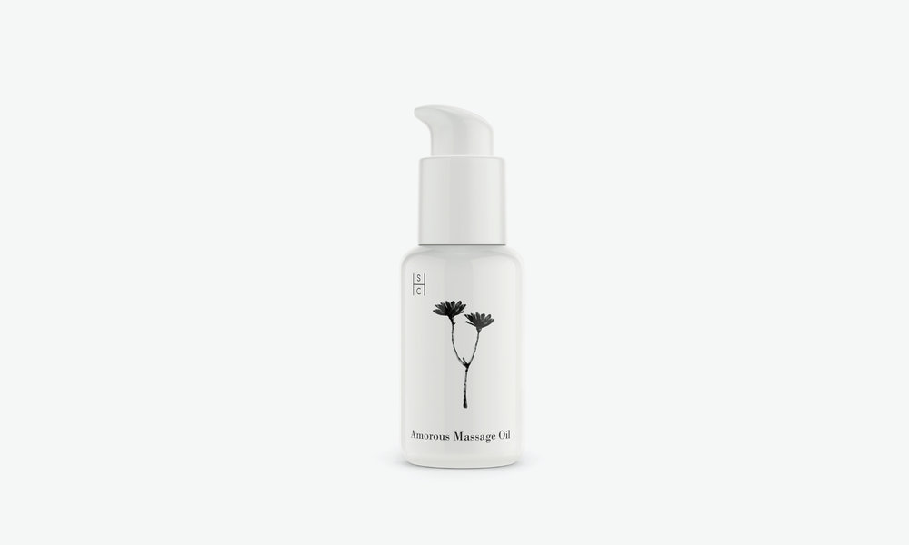
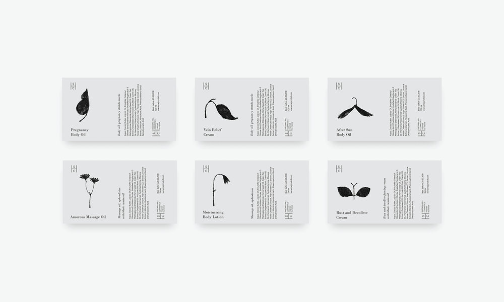
Snejana Hill Cosmetics are a line of lotions, creams, masks, and oils inspired by nature. Suprematika designed the packaging to celebrate the pure ingredients used in each product, highlighting all its natural goodness.

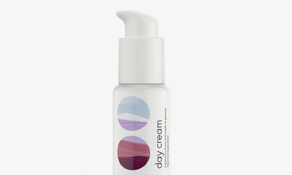
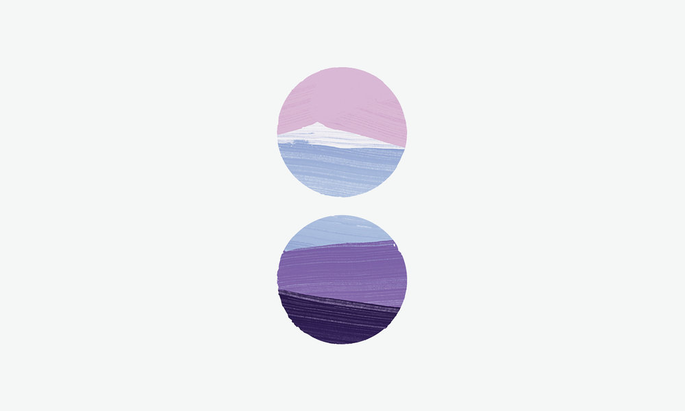
“The logo and packaging for the cosmetics, which 90 percent of the ingredients have prefixes ‘Organics’ and ‘Bio.’ Line called ‘Inspired by nature’ and is literally dedicated to nature objects, that inspires Snejana to create her cosmetics. [‘Inspired by Kyoto’] are assembled by hand near the Japanese city Kyoto and Mount Fuji.”
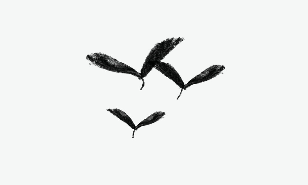
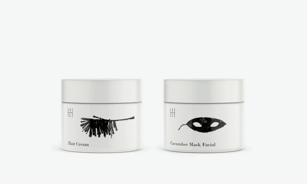
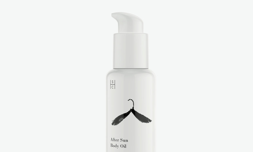

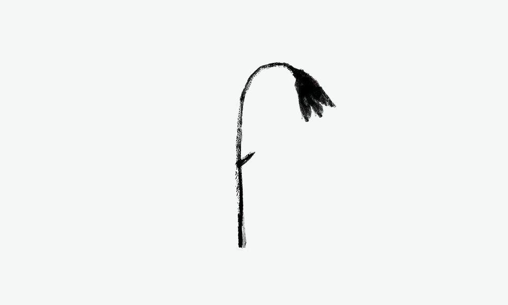
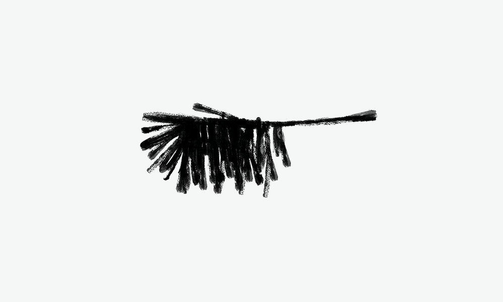
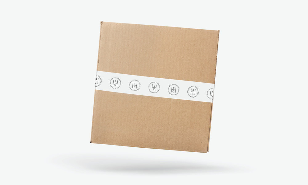
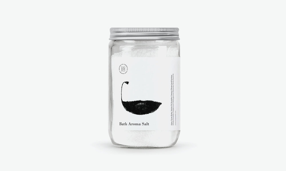
Snejana Hill Cosmetics uses a crisp white background with subtle, delicate illustrations. This gives it a light, airy feeling, allowing the consumer to feel like they’re simply enhancing their natural beauty. Images look like they’ve been drawn with charcoal or a thick pen, indicating that the products are carefully made by hand. The brand’s logo is a clever arrangement of the initials, and in a sans serif font it gives it a cutting edge vibe. Each product is described in a traditional serif font, contributing to the “inspired by nature” and down-to-earth approach.


The Inspired by Kyoto line features some of the gorgeous colors of Mount Fuji, giving each item a unique and vibrant personality. Consumers only get a peek of the overall image of the mountain, allowing imagination to spark. Bottles and jars remain white, just like the rest of the brand, keeping the overall look consistent.


Designed by: Suprematika
Art Director: Vladimir Lifanov
Client: Snejana Hill
Country: Russia
City: Moscow


