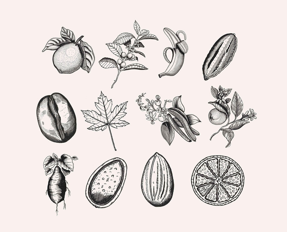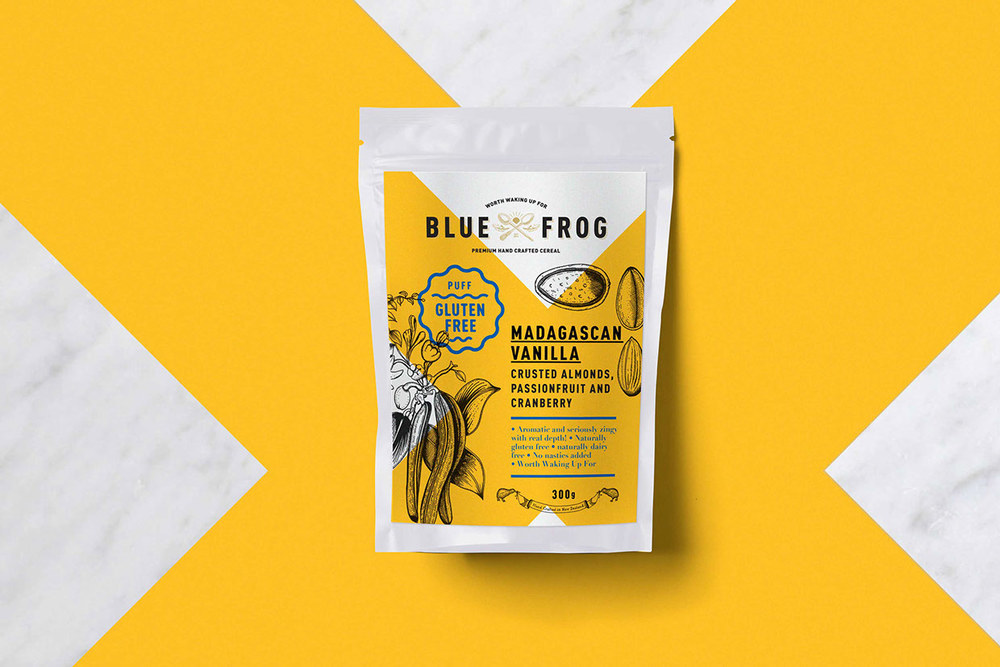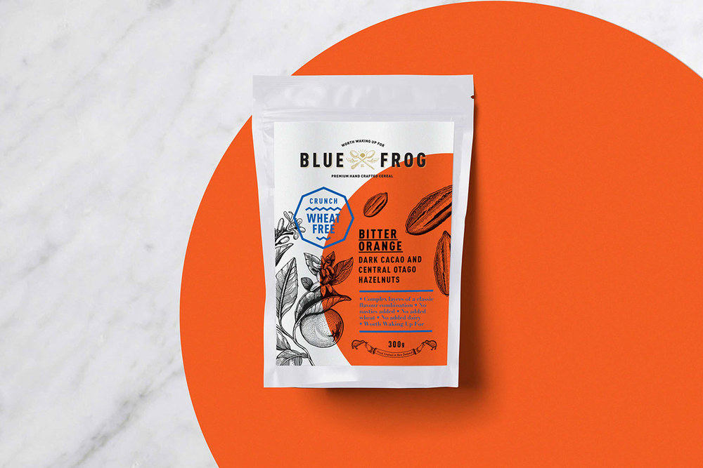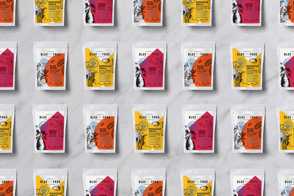
BLUE FROG offers delicious options for the most important meal of the day. From vegan, gluten-free, to certified paleo, specific diet needs can easily be met. Grain Creative designed the concept for the line of breakfast options, using traditional food illustrations and a minimal font paired with bold, distinct blocks of color.

“The project was to create a compelling brand identity for BLUE FROG® breakfast products. The challenge was to be bold, artistic and textural to cue bold taste and for the brand to make a statement, disrupt and force consideration.”

Careful planning went into the design, from the ingredient images to the brand and flavor variety color palettes. BLUE FROG appears to be a trusted, traditional brand that offers premium foods. Delicate illustrations grace the products, and a soothing lapis hue is used for valuable information about the product, including its specialty stamp on the front of the label.
To contemporize BLUE FROG, bright colors correspond to different flavor varieties, like goldenrod for Madagascar Vanilla and a sunny orange for Bitter Orange. These colors show up in different shapes on the front of the food packet, slightly off-center. Paired with elements like the finely drawn ingredient images, the brand clearly values using fresh foods to make their products but also value having a smart, modern audience.

Designer/Illustrator: Erica Halse
Creative Director: Jure Leko


