Left Field Wines
by Jenifer Tracy on 07/02/2015 | 1 Minute Read
What a whimsical and inventive brand story Aaron Pollock Design has created for the New Zealand wine Left Field. Left Field is an existing brand, a part of the Te Awa Collection, that didn’t have a clear voice or any defining personality to stand out in the market. It was time for a brand refresh. A perfect project for Aaron Pollock Design, known for their amazing brand identity work for lifestyle products. “The objective was to create a brand that doesn’t take itself too seriously. A brand that celebrates New Zealand’s freestyle approach to exploration, creativity and imagination inherent in the winemakers ethos.”
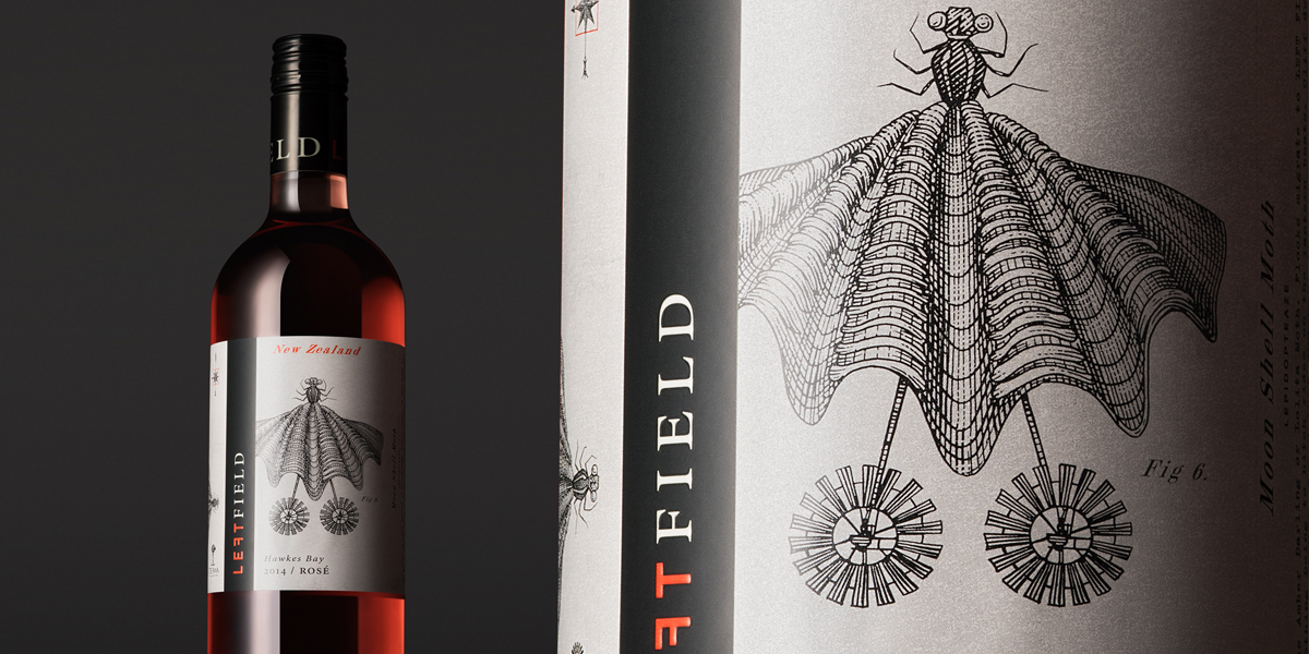
The task was to create a brand that would embody the left field spirit: challenging, freestyle and contemporary. It was also important for the brand to acknowledge its relationship with the Te Awa Collection and incorporate its iconic windmill into the new art direction. And, with this, Aaron Pollock Design moved forward with creating a brand that has a strong personality and sense of place within the market. “We seeded the idea that Left Field is the birthplace of the unexpected, the weird and wonderful, through moments of quirky humour and unexpected surprises.”Sitting at the bottom left corner of the Te Awa Estate, Left Field has a colorful past with stories of creatures, events and inventions that “possibly” occurred. These stories are told visually on the labels throughout the Left Field family of wines, and the artwork itself is exquisite and odd. Vintage etchings of archaeological mash-ups of creatures and contraptions, cut and pasted together to create bizarre and weird fictitious hybrids. There is more than your eye can take in and an imaginative story behind each illustration.
Let me tell you a little bit about my favorite creature found in Left Field, the “Flying Squidmill.” This critter is a combination of a fish and a squid, with large wing-like fins that allow it to fly. Attached at the base of this Siamese creature is a windmill (yes, the Te Awa Collection windmill) which is positioned just perfectly to assist with the task of flight. “Small enough to squeeze through a tooth-gap, the Flying Squidmill is a bash full creature. First discovered romping in the bedside-denture-soaking glass of spinster Anabell Poole, it ruffled more than its own feathers. Considered a pest by some, it has occasionally attempted to mate with human's eyebrows.”“Each bottle within the range has a different illustration for each varietal helping to tell a bigger story and keep the brand fresh and surprising.”
Just like a vintage etching, Aaron Pollock Design has worked with a predominately black and white color palette for the art direction. A lovely, bright coral is dropped in as an accent color in the word mark of the logo. With the “F” in Left positioned backwards, a little something is “off” there too. While each wine label features a single creature, the combination of these fantastical creations put together is striking (look at that website design!). The Hatchling Deer, a Flamingo Recluse, a Moon Shell moth – how can anyone walk past these bottles of wine in a store without their interest being piqued?A brand that started out without a clear voice or defining personality has been reinvented to tell the most creative stories of life on Left Field. I’m in awe of the work Aaron Pollock Design has developed for the Left Field wine brand. It’s going to be a stand out in the market, this I am sure of.
Creative Direction: Aaron Pollock
Design: Aaron Pollock, Mickey Smith
Illustrator: Aaron Pollock, Stephen Noble Printer: Adhesif
Designed by Aaron Pollock Design
Client: Villa Maria Wines New Zealand
Country: New Zealand
City: Auckland