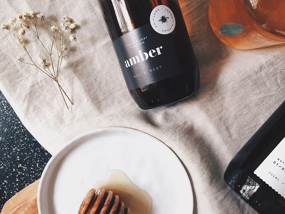
Some might call it honey, but Amber calls it “the raw revelation of a fine spirit from the wilds’ bee’s nest.” For the honey company’s new brand identity and bottle packaging, Oddds the New Anthropology created something that is a sweet combination of rustic folkish modernism. Using dark greys, whites, and yellowish browns, their new look is enticing in its simplicity and charm, making the honey one of life’s simple pleasures.

“The ideation behind it is extracted from the process of fossilisation and presented by using transparent labels. These label treatments includes the overlaying of the transparent label onto ‘almost’ still life objects onto a glass bottle; thus creating a see-through effect almost similar to translucent fossilised resin. Objects include herbs and botanical flora illustrating a coniferous tree and leaf.”
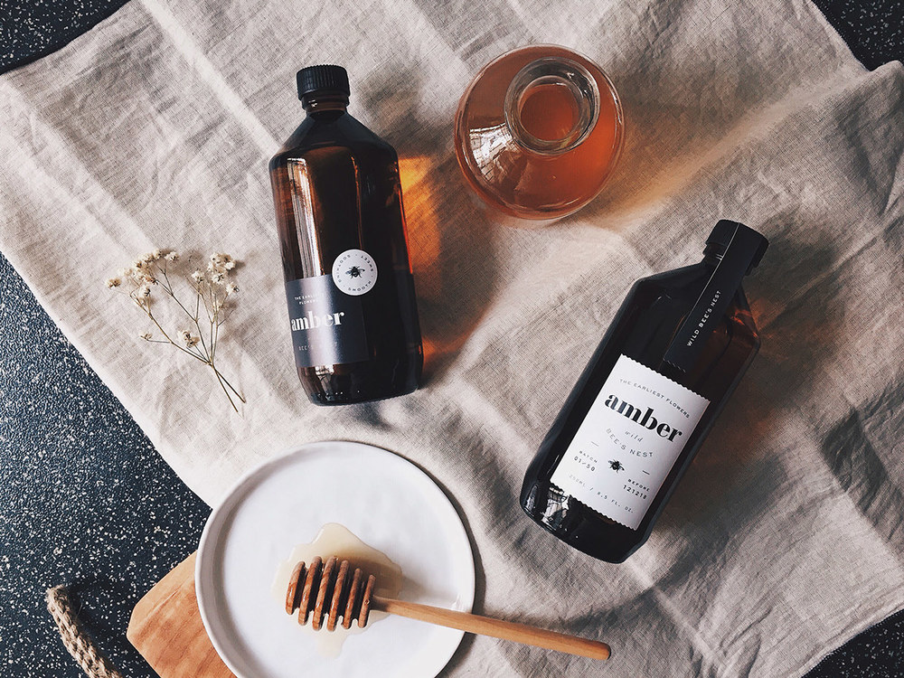
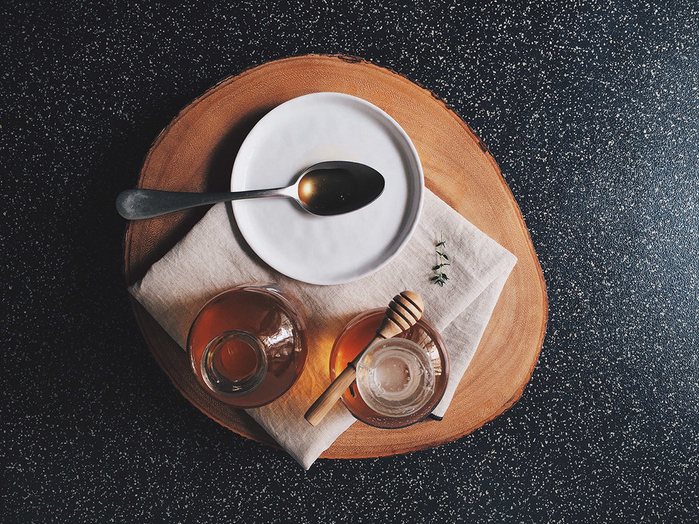
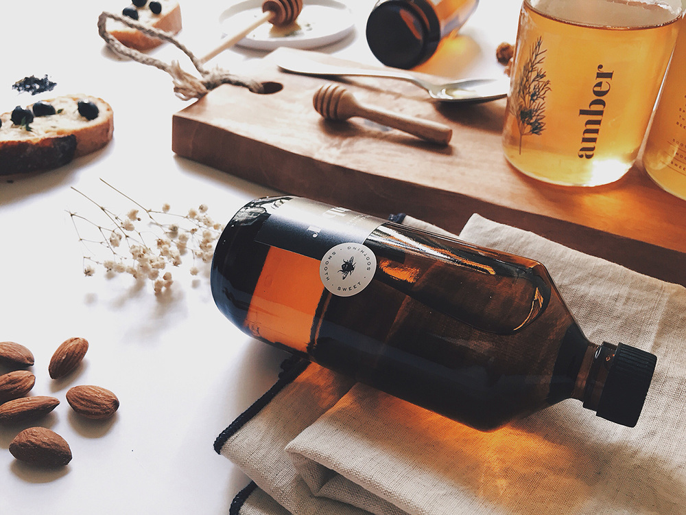

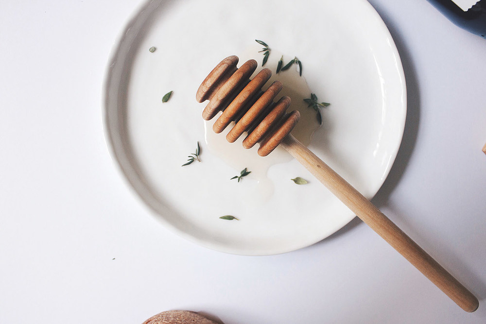
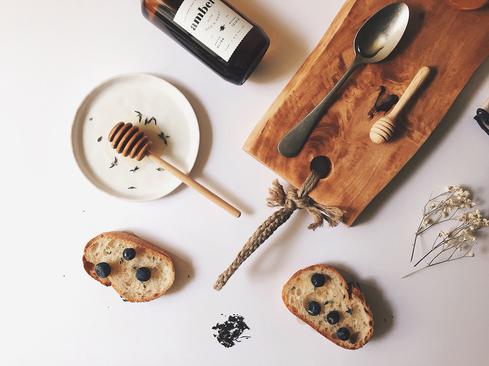
The label is minimal, with only the most vital of information included in thin, delicate fonts, and a small image of a bee rests beneath the logo. The amber bottles give a slight nod to the name but also represent actual amber, a limited, treasured resource similar to what we might view honey as today, considering the decline in the bee population. The bottles almost look like something you might see in a laboratory, encouraging the buyer to try it out with various foods. Oddds the New Anthropology experimented with different pairings with the honey for the brand image, resorting to some less common options like granola, caramelized ccrème brûlée popcorn, almonds, thyme, blueberries, and rustic Bâtard.