

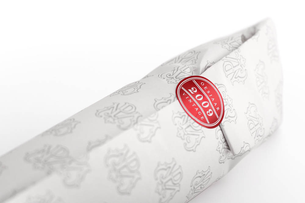
When you combine a passion for wine, a locally renowned name that sounds like two famous French Bordeaux, and a sense of humour, the result is something very special. Petrus Mouton is a limited edition range that plays on perception. Layers of mystery and meaning within a sophisticated box, beneath a wrap with specially developed PM monogram, reveal a masculine bottle with an exquisitely illustrated label.


Incorporating hidden details like the pigeon, angel and crown representing the Mouton family and their Karoo farm, the label is printed on uncoated paper and embellished with embossing and red foiling. The concept is just as textured. The sheep on the rock is the literal interpretation of Petrus meaning ‘rock’ and Mouton meaning ‘sheep’; but look a little deeper and the sheepish wolf in the foreground with his two bottles of Bordeaux reveals the cross-continental innuendo – an evocatively elegant execution of an ingeniously intricate idea.


Creative Director & Design: Thelmarie Brink
Ilustration: Tobie Beele
Designer: Marzanne Smith


