

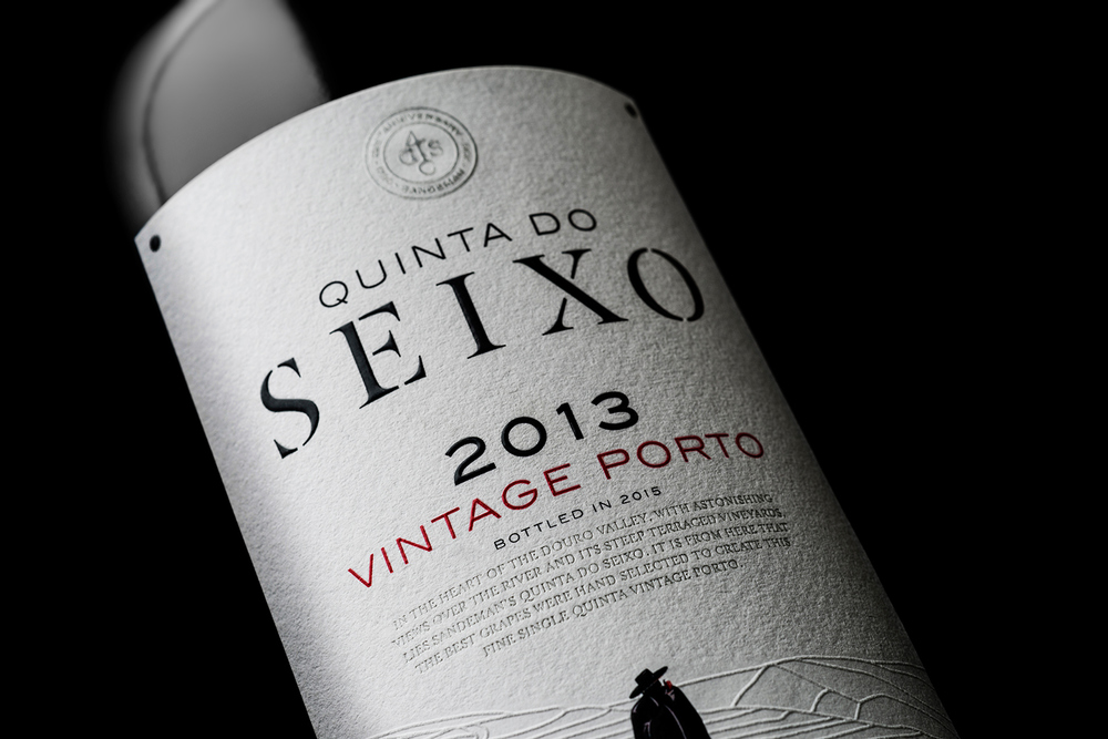
To celebrate their 225th Anniversary, Sandeman is releasing several new ports. Most recently, their 2013 Quinta do Seixo Single Quinta Vintage Porto came out, and it is a thing of beauty. VOLTA Branding & Digital Studio designed the label and packaging that is one part luxury, one part mysterious.
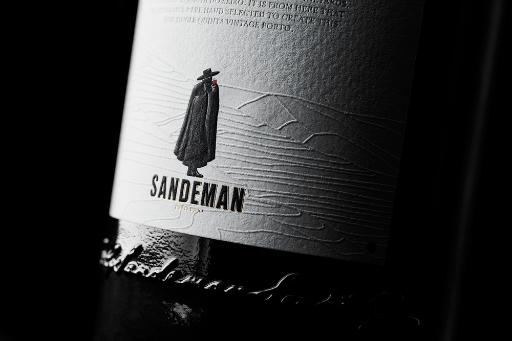

“VOLTA created a label that truly portrays the quality of this Porto wine, with its simplicity, balance, and timeless typography. The world famous Douro’s steep slopes are represented with a detailed emboss of Quinta do Seixo’s vineyards. Together with its wood box with sliding cover, our Quinta do Seixo Vintage Porto design is testament to the quality and heritage of Sandeman’s exquisite Porto wines.”
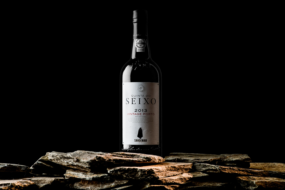
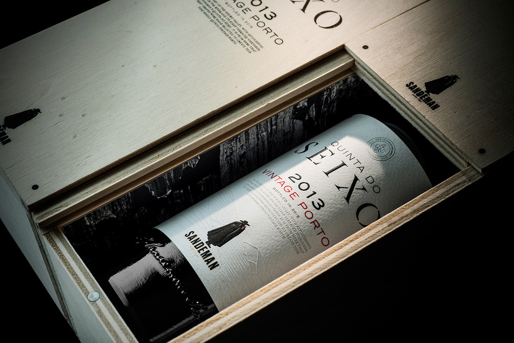
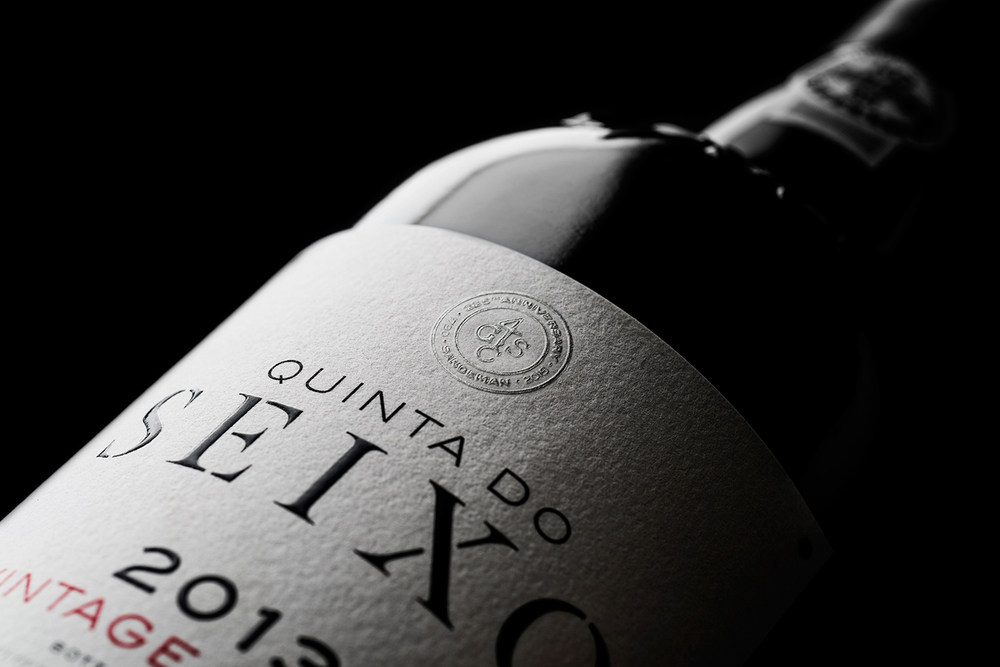


Port is the type of drink that is savored, and the packaging gives the same effect of being powerful without trying too hard. The wooden box acts as a sort of vault or treasure chest, keeping the port safely stored away. Against the black bottle, the white label with black text looks simple and traditional. The emboss of the vineyards and landscape adds texture and communicates Sandeman’s long history.


