In 2014, Orange Is The New Black’s actress Laverne Cox became the first openly transgender person to appear on the cover of TIME magazine. Meanwhile, LEGO launched the first-ever female scientist set after a public plea against sexist child marketing.
These examples, among many others, demonstrate the long overdue progress in our society towards the dismantling of traditional gender roles and increasing awareness of people outside of the traditional gender binary.
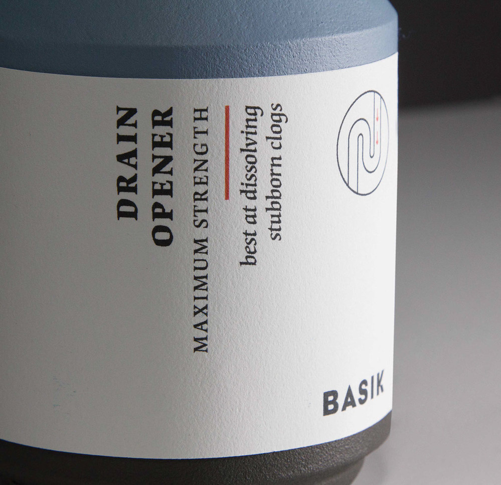
Despite this trend, most of the packaging for personal care and household products still perpetuates gender stereotypes. To address this issue, designer Saana Hellsten has created BASIK, a brand with gender-neutral packaging that markets household products and line of shaving kit.


The packaging for BASIK focuses on the function of the product itself rather than on the gender of the target consumer. Traditionally, we think of women shaving legs and men’s shaving their faces but times have changed and these stereotypes do not longer stand.
Saana Hellsten did research into the physical differences of razors targeted to women’s and men’s and , she says “I learned that there, in fact are physical differences in the razors for men and women. Though, these differences are related only to the function of the product, which isn’t always related to the gender of the consumer. For example, the blades are different for shaving beard than for shaving legs, but this doesn’t mean that they should be marketed only towards one gender”.

Razors will be sold through a clever website will ask customers what they will use their razor for and will change the shape of the handle and the blade based on their responses. The razor’s colors can also be customized.

The same design was used for a line of household products which usually rely on gendered packaging to communicate messages about the products. “Strong and powerful products need to communicate their effectiveness and this is achieved by using masculine visual language”. “Soft and sensitive products instead use the feminine visual language.”
This packaging fills a big gap in the market and it is elegant and contemporary, using matte textures in a very good colour palette of teal, mint green, black and light blue. The illustrations are a great additional touch to an exceptional piece of work.


