
Today, the team and I are in Boston for The Dieline’s 4th annual package design conference at HOW Design Live. We couldn’t be more excited!
This year, I have the honor of presenting a keynote session in front of all 5 HOW Design Live conferences. In my session, A Celebration of Authenticity: What Ive Learned About Brand Minimalism, I will be sharing my personal journey on how The Dieline came to be in the context of my life, and the world as a whole. Most importantly, I will be sharing all of my major life lessons as well as design lessons I have learned along the way. For those of you able to attend, you’re in for some fun!
For those of you not able to make it, I thought it would be fun to take a look back at The Dieline’s past, and our journey through out the years and up to today.
As a follow up to Reintroducing: The Dieline, we look back at the history of The Dieline website and logo design from its inception to today. For the first time, I’ll share the version of the logo that we were about to run with before we worked with Pearlfisher. I’ll also share some of the branding applications of the new identity that we have created since.
So lets take a look at The Dieline’s past!
WEBSITE EVOLUTION
2007
The very first version of The Dieline in 2007, when I was 22 years old. “Dieline Blue” was born.
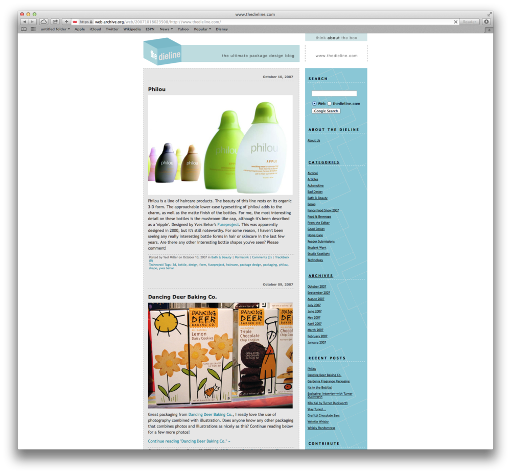
The very first post on The Dieline, more than 7 years ago. The Dieline was perceived, from the beginning, as an industry defining resource. It was the first of its kind.
2008
The infamous “folding” logo. This logo and website design lasted the shortest.
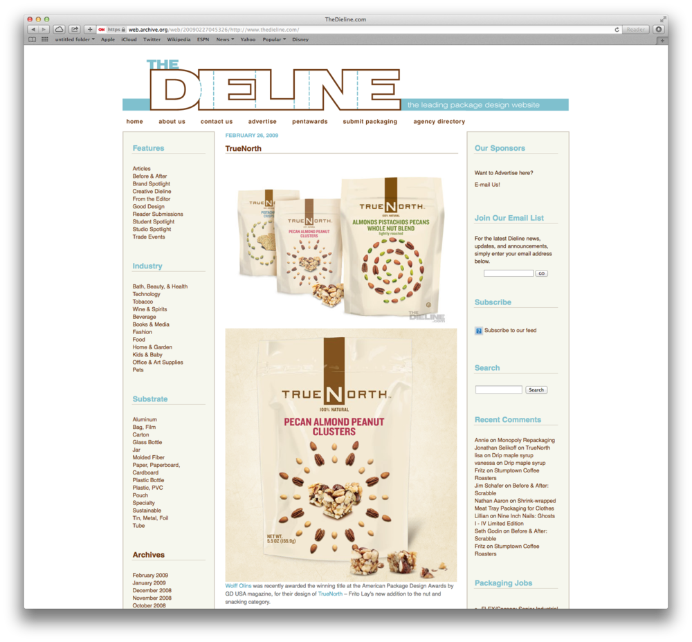
2009
2009 marked the launch of our most used, and most loved version of our logo. The website was cleaned up and reorganized.
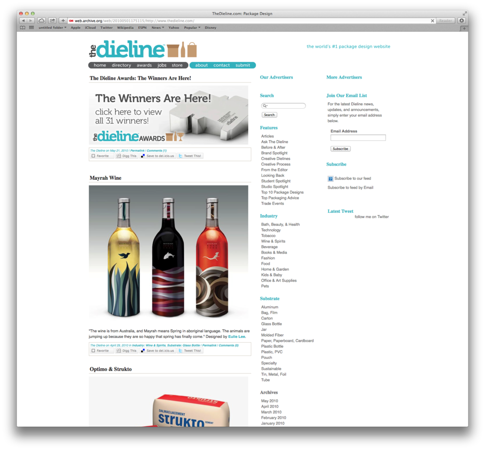
2010
2010 the website continued to evolve.
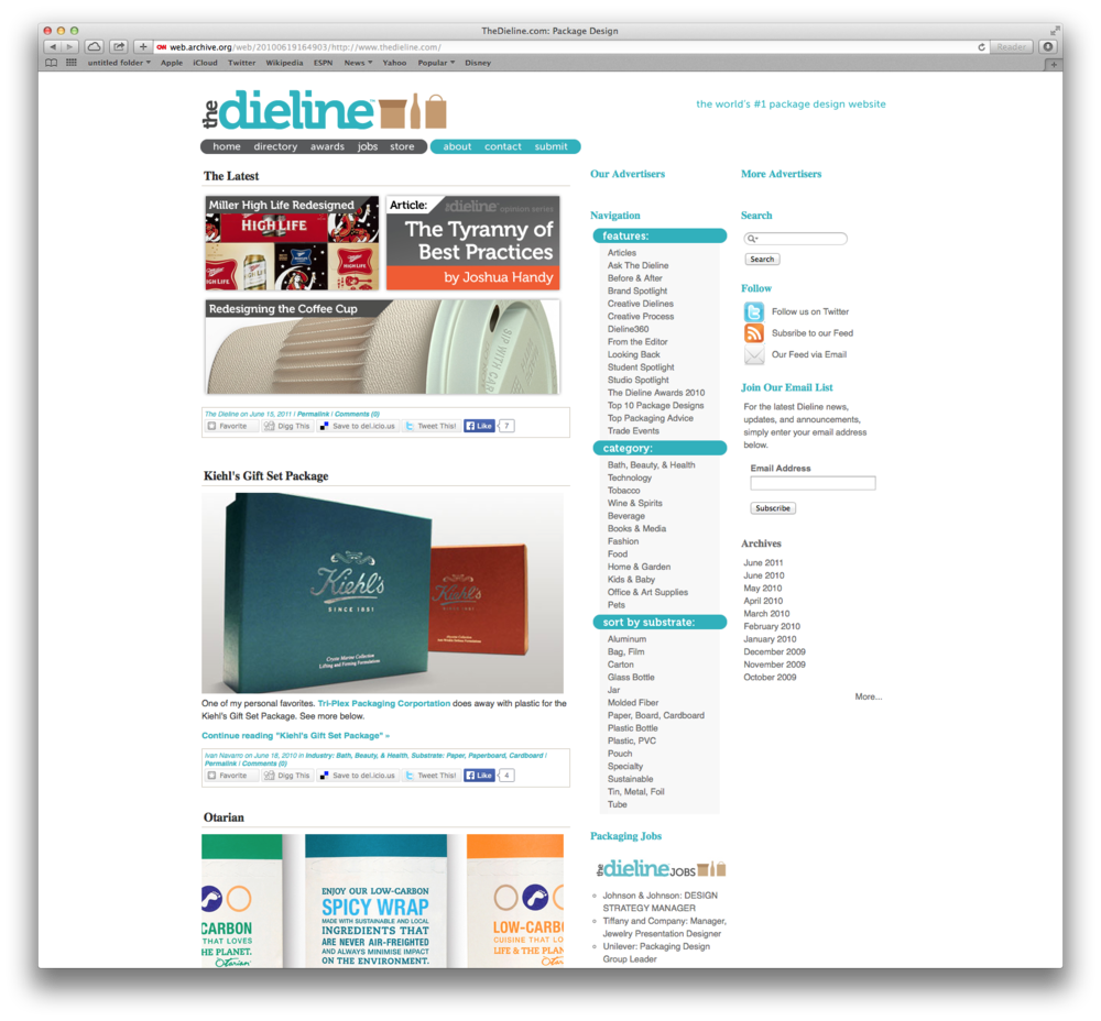
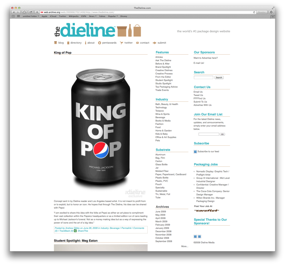
2011
Holy shadows! 2011-2013 marked a big transitional period, a period of major growth for The Dieline. This is the time with The Dieline Awards, and The Dieline Conference launched.
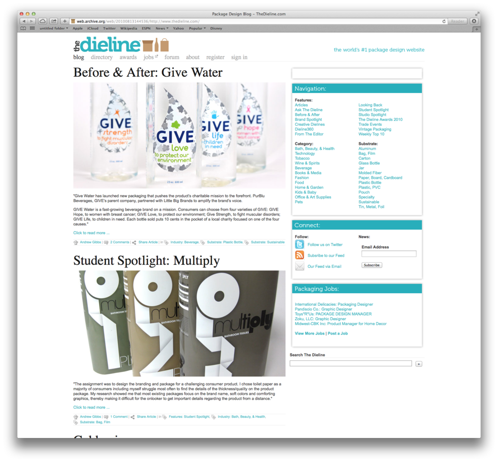
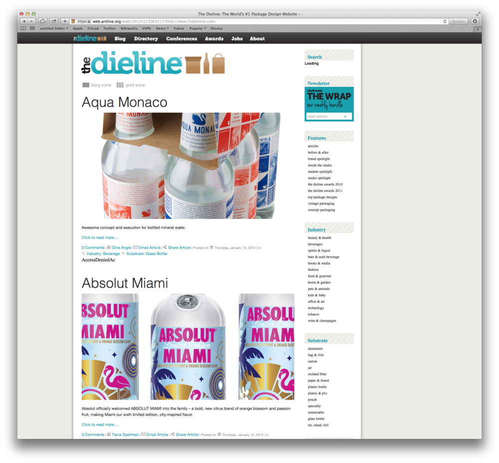
2012
In 2012, The Dieline was redesigned to the version that most of you are most familiar with, with minor tweaks leading into 2013.
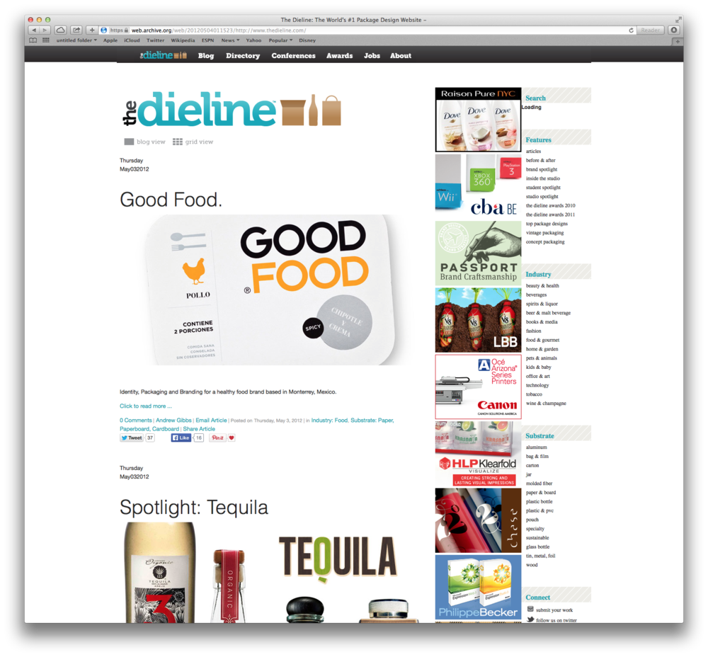
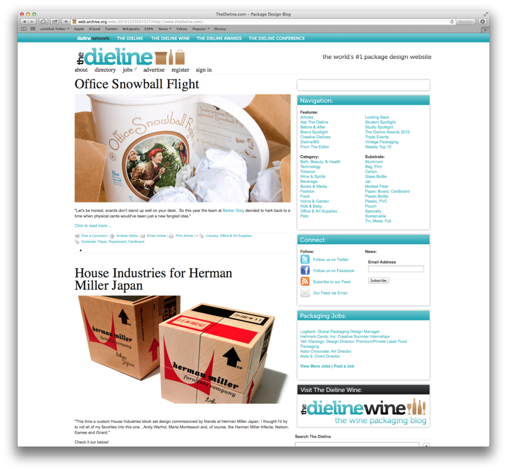
2013
In 2013 the website received minor tweaks and clean up. Behind the scenes, we had begun to completely redesign the identity and website design. As we had experienced such massive growth between 2011-2013, we no longer felt that the identity and look represented what The Dieline had become.
2014
The brand new The Dieline.
LOGO EVOLUTION
2007
The Dieline’s first logo, awwww! A building block of what was to come.
2008
Our second, and most short lived logo. Major readability issues!
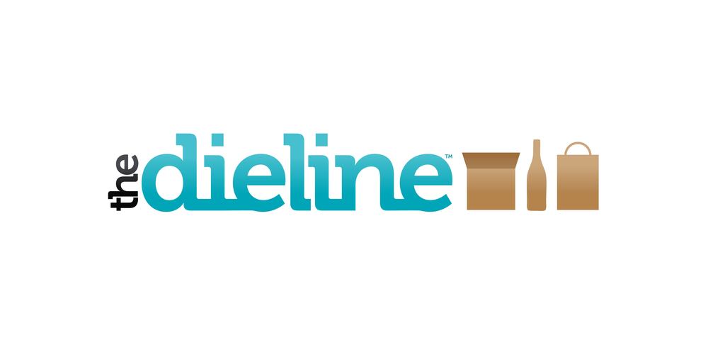
2009 – 2011
The logo we are most known for. The icons came were inspired by the name of our first book, Box, Bottle, Bag.
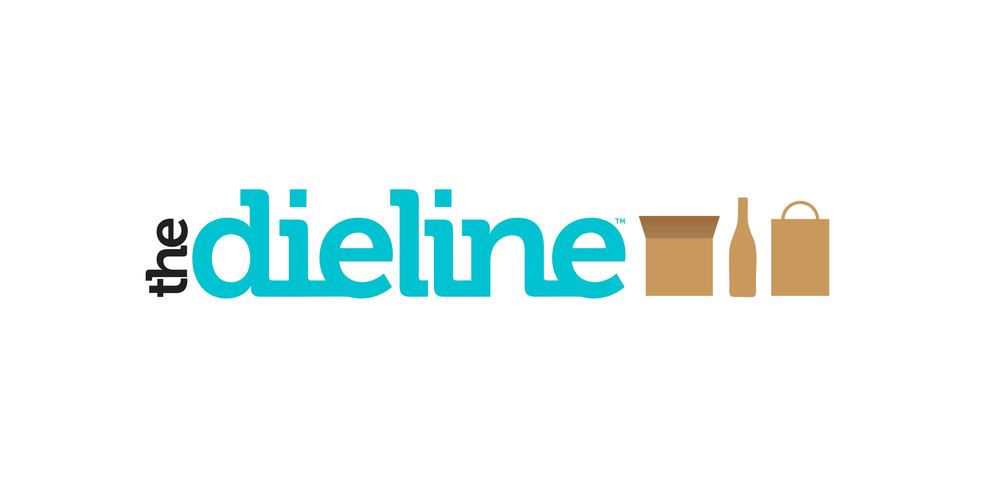
2012 – 2013
Cleaned up, the icons eventually became iconic to The Dieline.
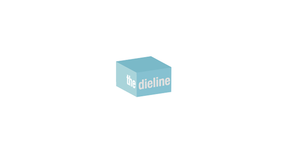
2014
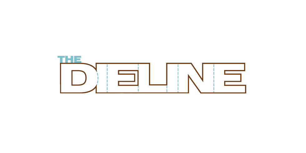
The Logo That Never Was
The previous logo was dated, and didn’t reflect The Dieline’s growth. We were now much more than a blog. I wanted the new identity to be simplified, purified if you will. I had grown so tired of the icons, I was ready for something new. We kicked off the biggest redesign in our history, and we got to this solution that we were all initially really happy with. It was simple, and felt similar, yet new. We began integrating the branding in our upcoming slate of projects. We were so excited!
In the midst of redesigning the website, I had read an article that Hamish Campbell, Creative Director of Pearlfisher wrote for The Dieline. By the time I was done reading the article, I knew that that logo was wrong, it was all wrong. It had been stripped of any soul. I knew I had to start over.
2014
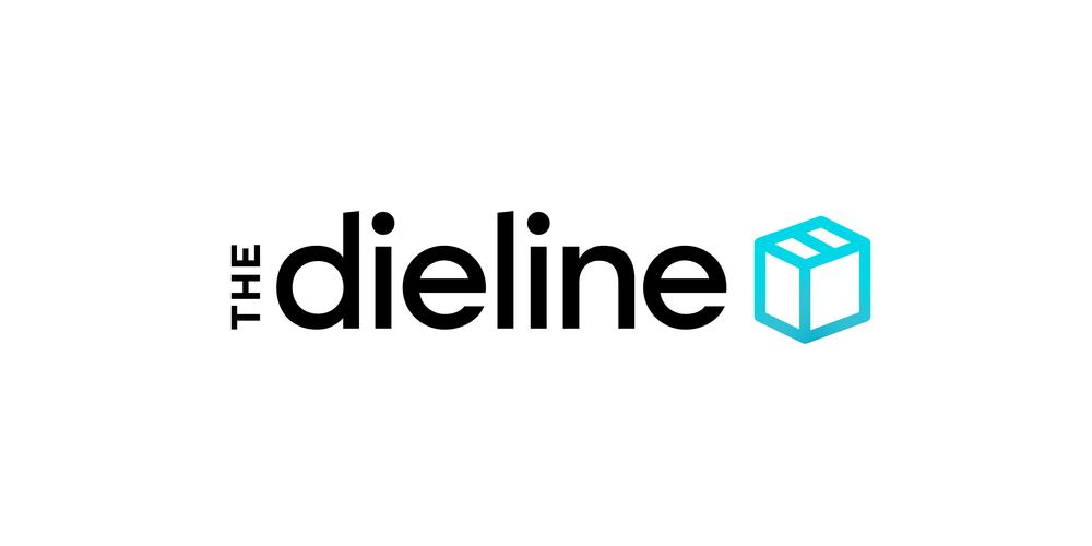
Pearlfisher Takes on The Dieline
In January of this year, we unveiled a brand new identity created by Pearlfisher, and and all new website design.
Read more on the logo redesign process in the original article, Reintroducing: The Dieline.
2014
and Beyond
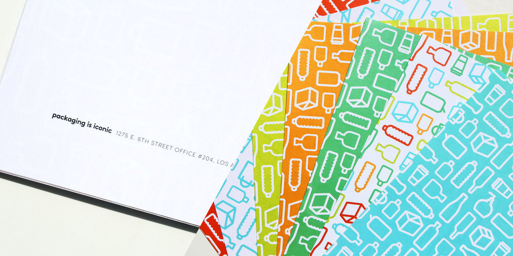
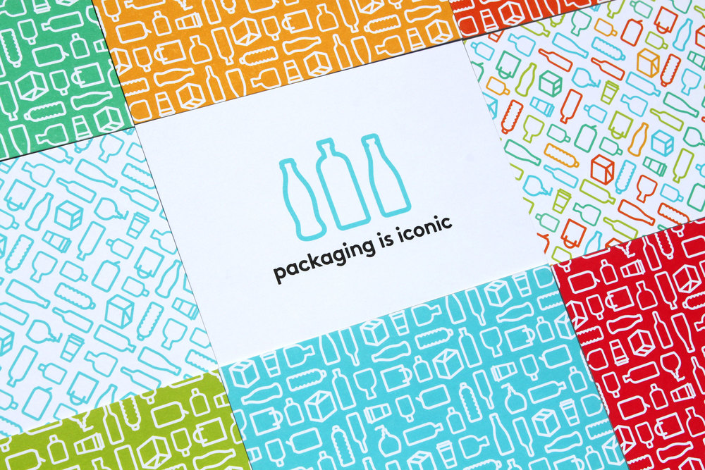
With the help of Miller, (who created additional icons, patterns, and branding applications) we applied the new branding and colors to the full suite of MOO Luxe products.
Printing all our new collateral on MOO Luxe was such an amazing experience. From the quality of the paper stock to the variety and ability to print multiple back designs, it really fit well with our new branding. For the first time, we introduced secondary brand colors other than “Dieline blue”, and this allowed us to show of the new colors in a fun way.
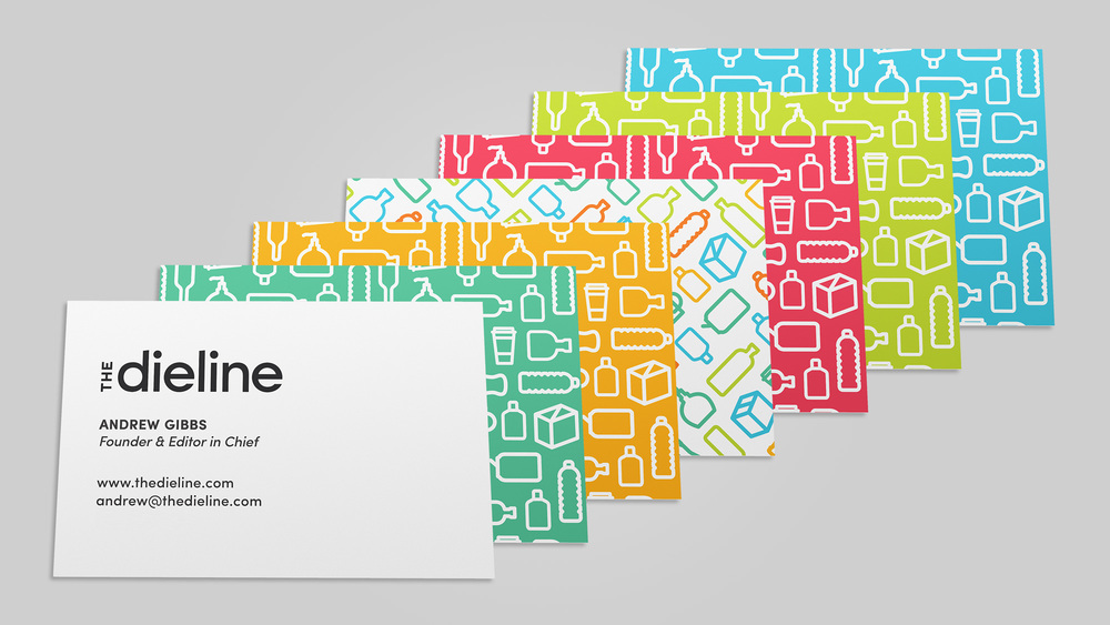
MOO Luxe Business Cards
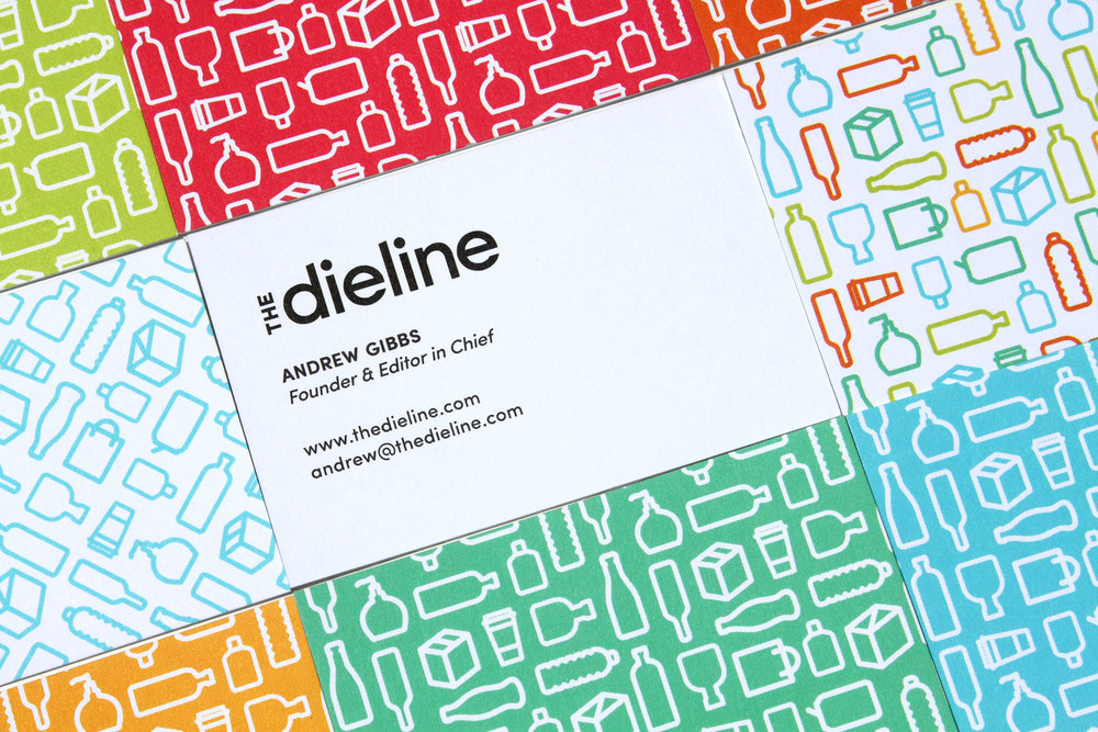
We were able to print all our brand colors and patterns, giving us a wide variety of cards! My favorite part about the new cards are letting people choose what color and design they want. Its fun to see who picks what.
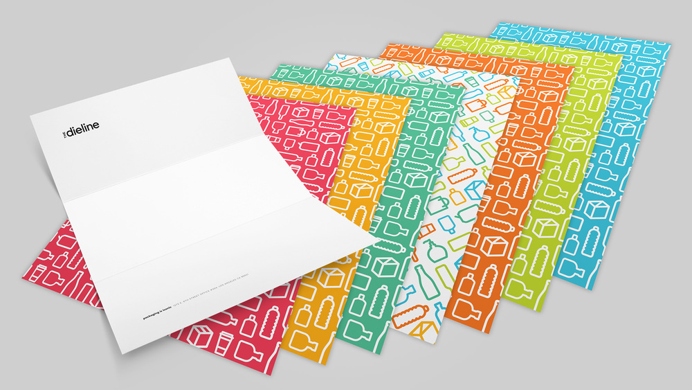
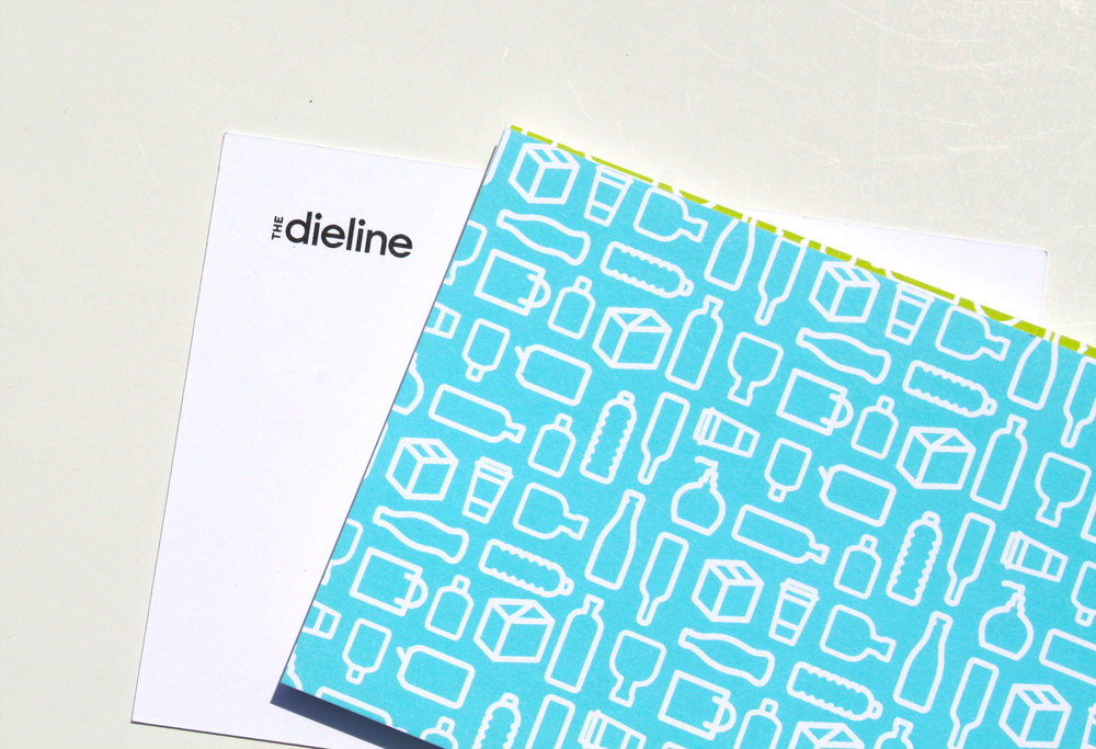
MOO Luxe Letterhead
We have the coolest letterhead.
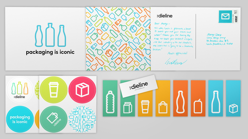
Postcards, stickers, and mini-cards help us extend The Dieline brand in new ways.
Our new MOO Luxe postcards make mailing fun!


