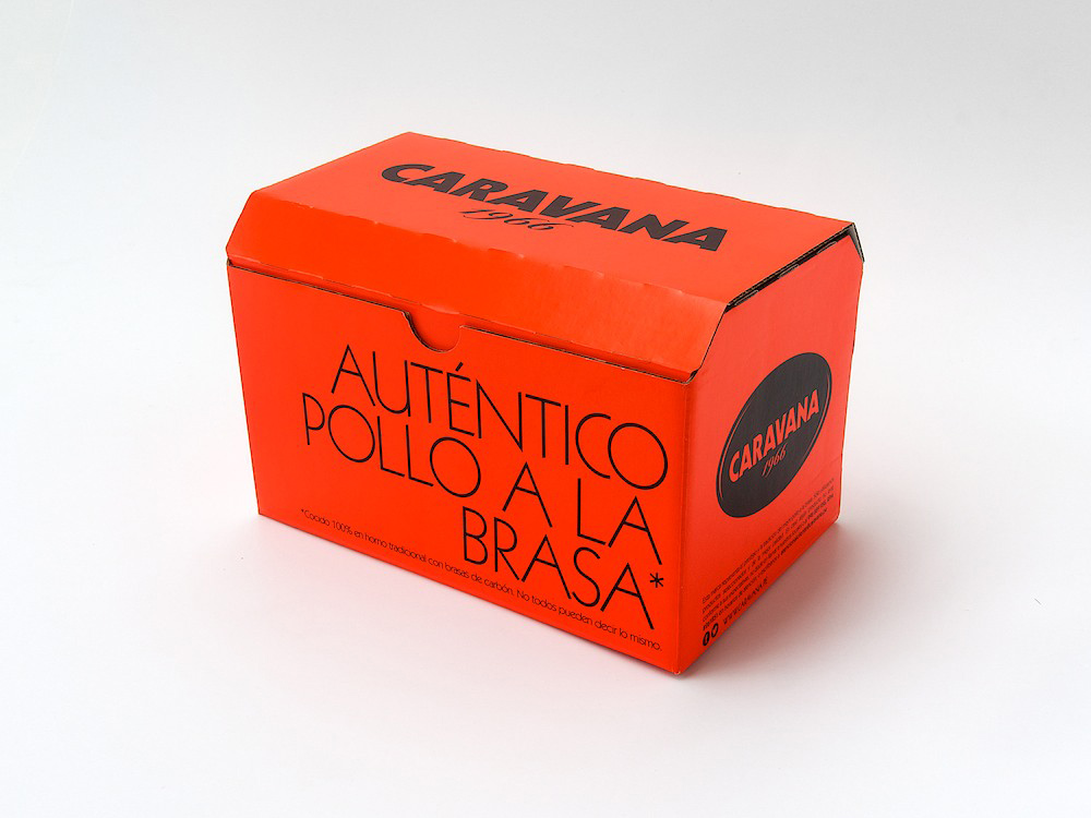
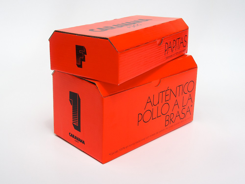
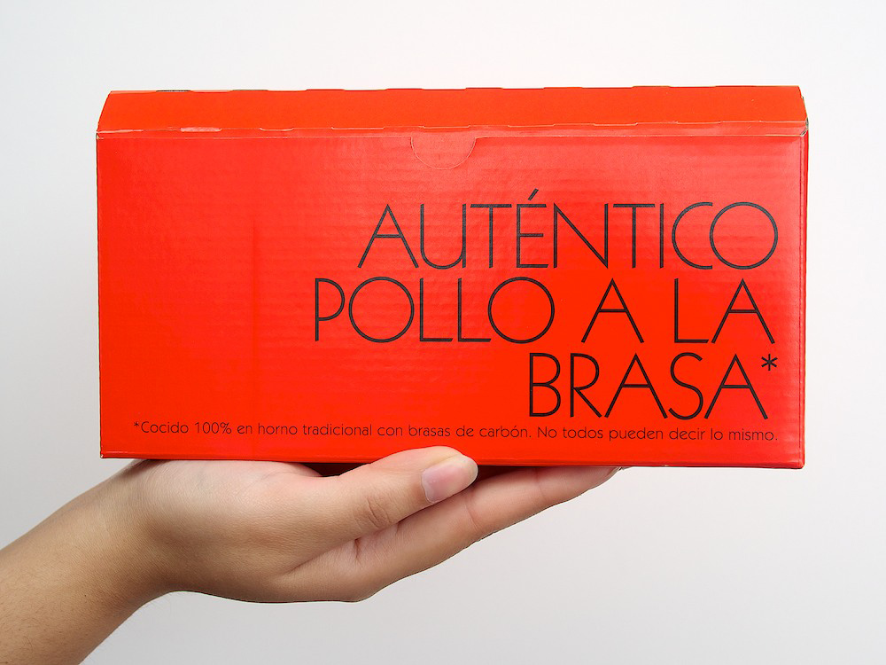
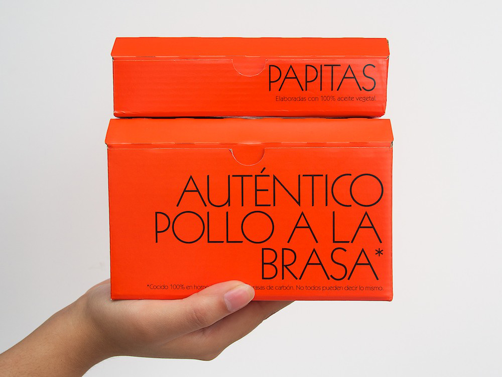
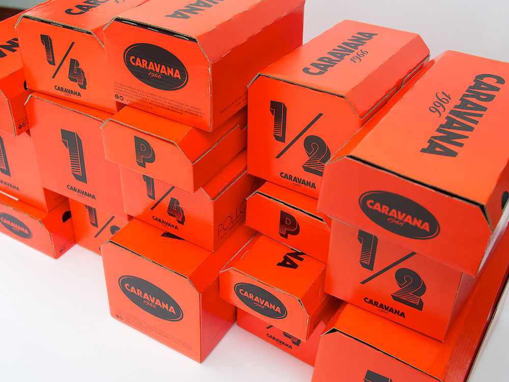
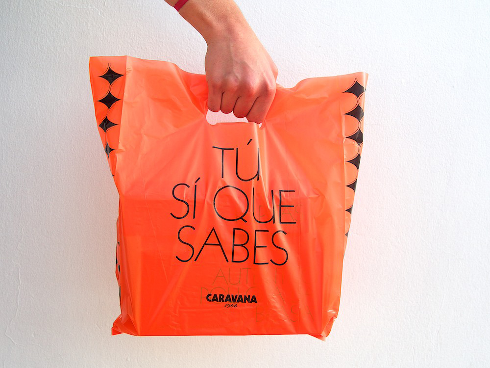
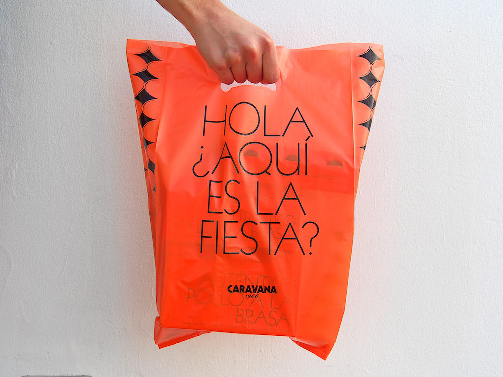
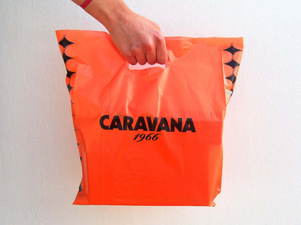
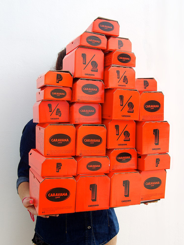
IS Creative Studio revamps identity and packaging design for CARAVANA rotisserie chicken. The new design focuses on the simple positive vivid energy of the soul of the brand, a live coal. With strong simple typography and bold orange and black color on the new cardboard boxes, the brand stands out amounts other rotisserie chicken market and ready for any ‘FIESTA’
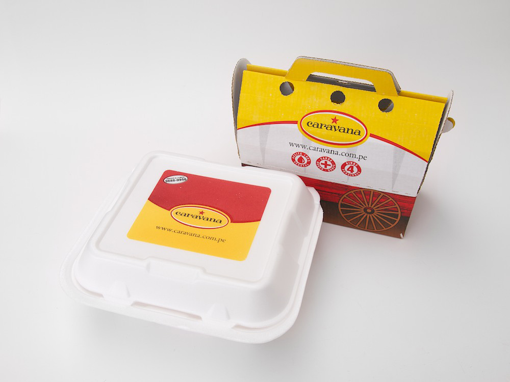
BEFORE
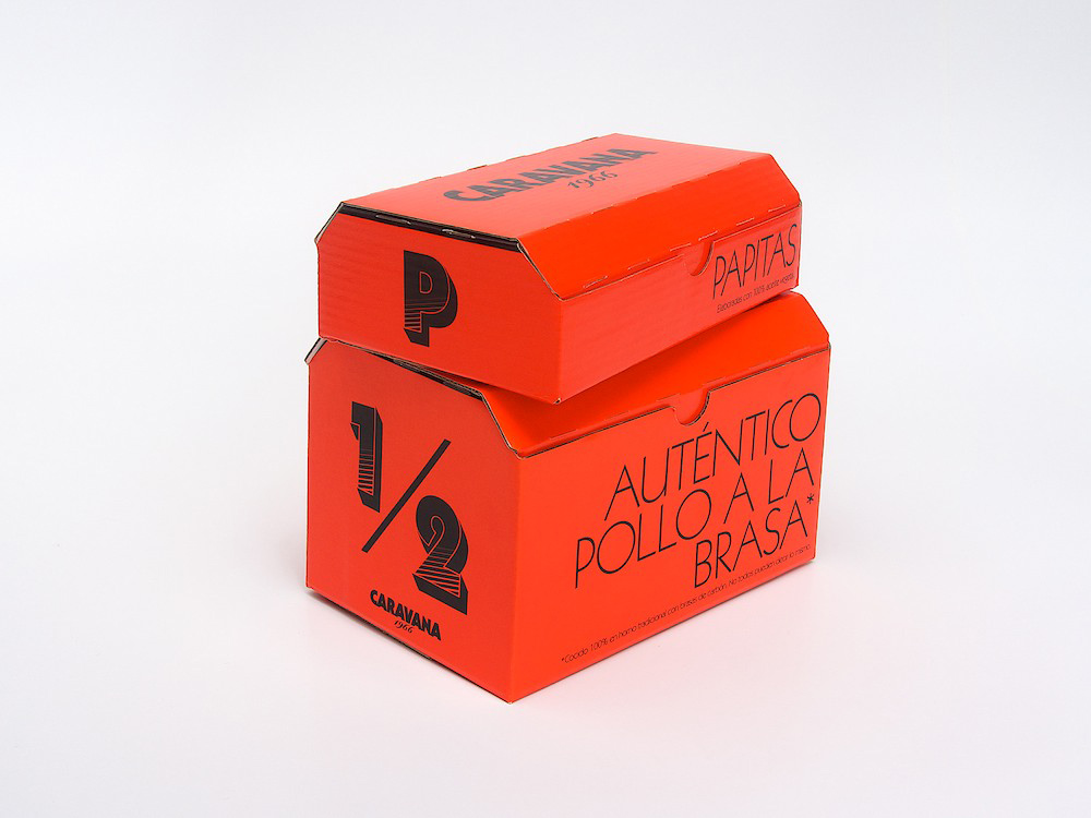
AFTER
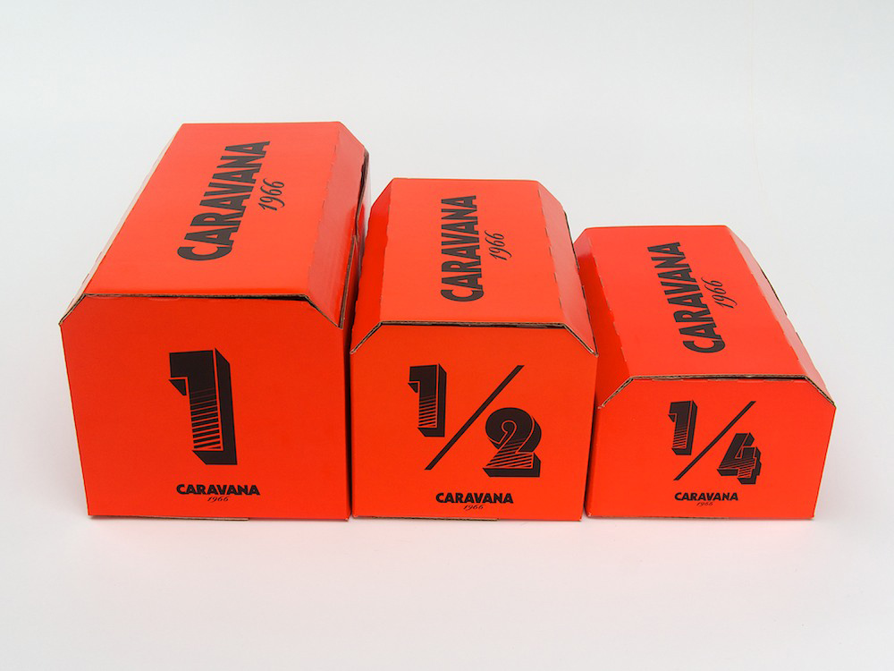
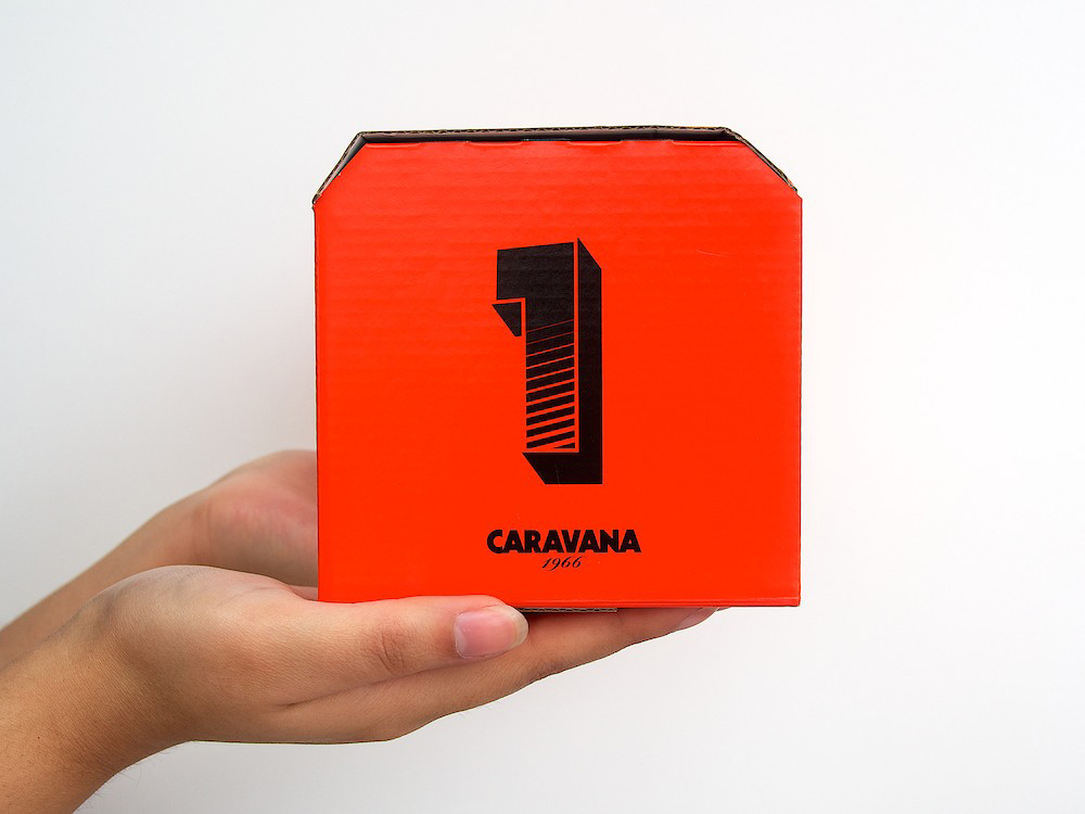
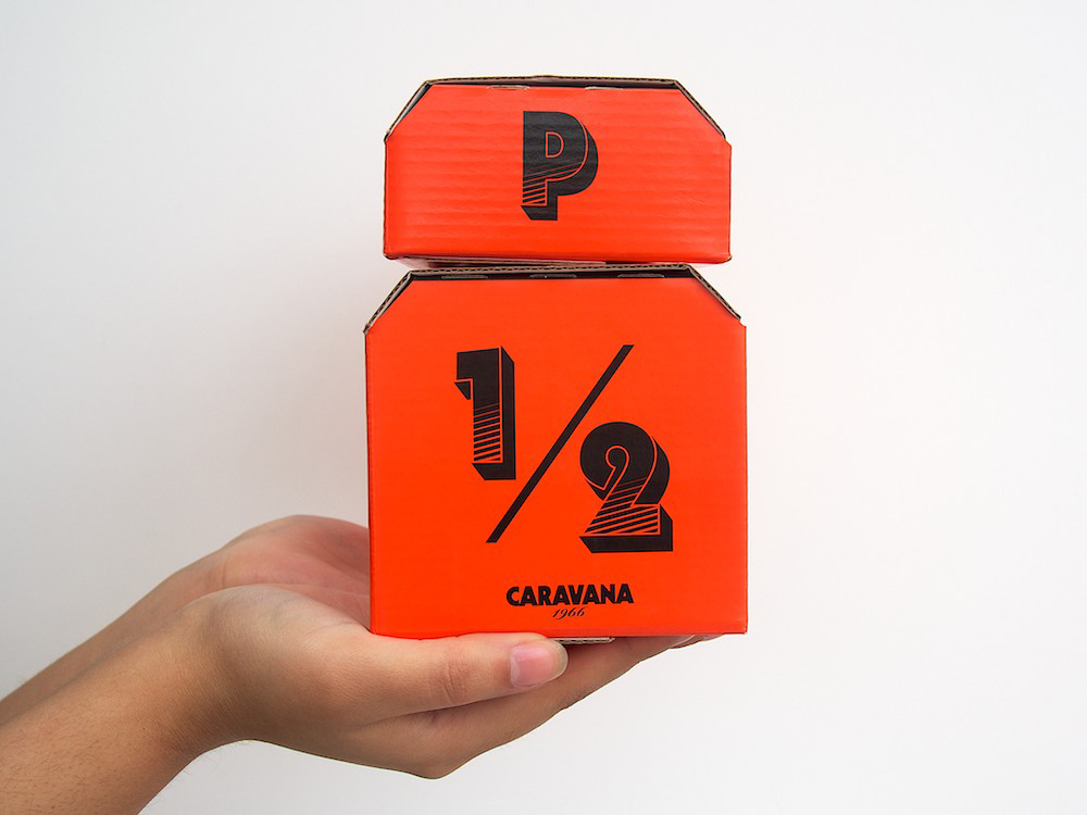
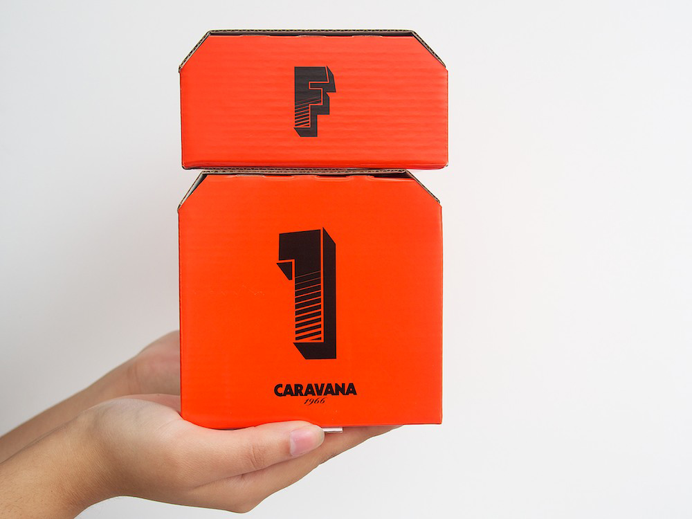
We love how the designers took their iconic Caravan cart and reduced it down to a simple shape that still resembles the Caravan cubby. Big bold numbers and letter on the side indicates the content of the box, whether it’s full, half, quarter chicken, or chips.
Designed by IS Creative Studio
City: Madrid
Country: Spain