It’s friday which means we have a fresh round-up of concepts we wish were real! From Zuc Organic Juice to One Percent’s unconventional way of packaging shoes, we have collected a few of our favorite concept and student package designs! Have a great weekend!
STUDENT
Hozfaller Beer


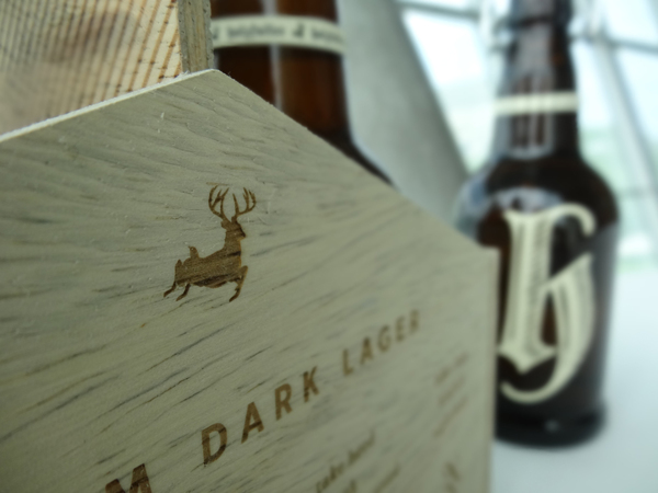


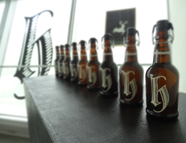
Graphic design student Zara Gerson collaborated with writer Claire Arkin to create a fairy tale student design project that lures beer drinkers into Holzfaller’s dark brew.
Holzfaller, or woodsman in German, is a beer branding project inspired by Germanic folklore. Such folklore often warns of dangers and wonders within the forest, so the packaging took this a step further with an accompanying poem that reads:
“Before you taste, drinker, take heed.
This brew is not for the weak. It holds wonders
for those not bound by greed. But may swallow
they who too often seek.
So if you favor danger, drink and lose yourself
in a spell well cast. But if you tread beyond the
brink this sip might just be your last.
Drinker, beware.”
The rustic, medieval logotype and container design emulate woods and trees, making us wonder–does cracking open a bottle of Holzfaller lead to run-ins with elves, forest fairies and magical wolves?
ZUC Organic Juice
STUDENT

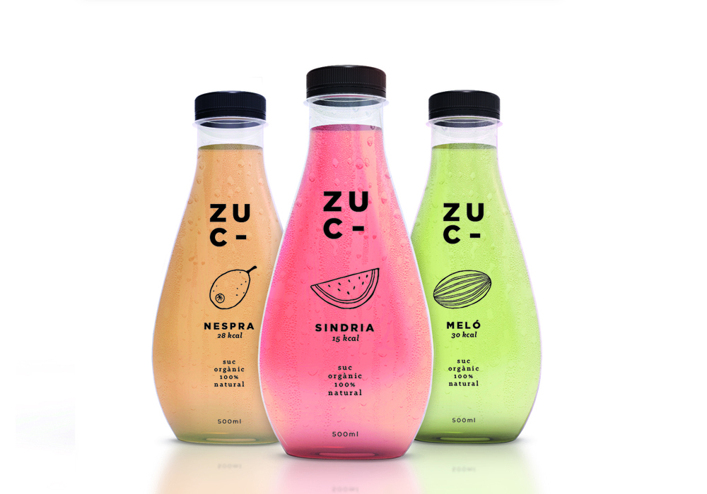


ZUC is a beautiful display of simplistic one color design. Letting the color of the juice speak for itself against the bold typography. The target audience for this juice concept are young girls, which I think would find the fruit illustrations fun and appealing!
“The purpose of this project was to create a brand identity, graphic and packaging design range for different flavors.
Zuc is a new brand for Organic fruit juice, a healthy and refreshing way in summer for young girls. We choose fruit with low calories, watermelon, melon and loquat.”
Designed:
Miriam Vilaplana
Country: Spain
One Percent
CONCEPT


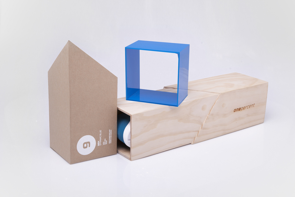


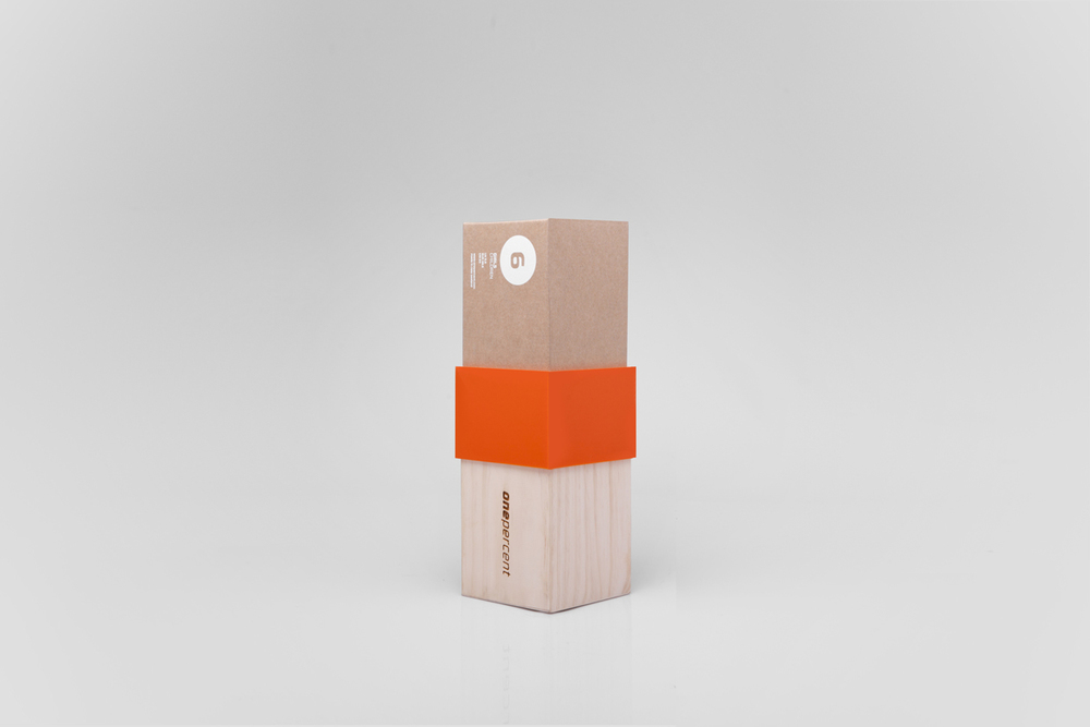


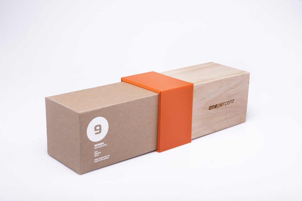
Here’s another beautiful concept created by Ryan Romanes; an unconventional way to package shoes. The design is 2 pieces where each shoe has its own designated container. The design is made with 2 types of wood, one soft cardboard, and the other ply, which are two common industrial materials. The woods are cut with a triangle tip and fitted together to form a rectangular prism. The point of connection is bound with a bold colored plastic band that once slipped off and the pieces are slowly pulled apart, forms a chevron symbol.
Classic Aquavit
CONCEPT


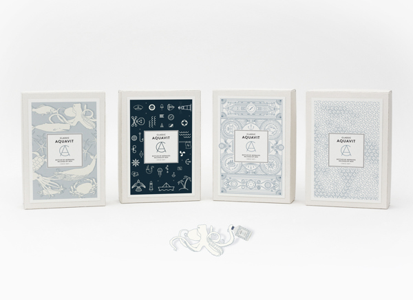

A beautiful concept display of branding and packaging by Nina Brandt from Behance.
“This seafaring limited edition symbolizes what goodlife is all about! Navigating through life, fighting the wild & enjoying good moments. Classic Aquavit – Bottled by mermaids, relished by men!”
Designed by:
Nina Brandt
Marco Heß
Country: Germany
What if’s
CONCEPT


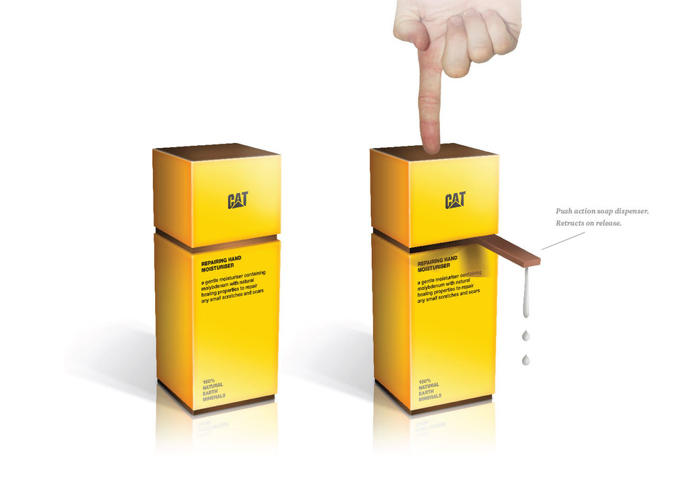


This concept design by Grain Creative offers an unusual way to package products with their opposites. Does it work? What do you think? It makes you do a double take that’s for sure.
For example, inspired by CAT construction, instead of focusing on the fact that Caterpillar’s moisturizer is made with 100% natural earth minerals and designing the box with an earthy color palette, they went with a alarming yellow and black representing the action of exfoliation with tough minerals.
These concepts extremely creative, and for the rest of us offers an example of how inspiration can be drawn from anywhere and how odd combinations can work in your favor to develop innovative and fun packaging.
Taste of Country
CONCEPT


The Taste of Country concept design is a slick black bottle that can be made into a fun gift set. The idea is to have each bottle represent a country the alcoholic beverage that country is known for. If this concept were real it would make for a fun gift to someone who would want to taste different types of beverages from all over the world.
Concept that I titled “Taste of the Country”. The idea is simple: Country and its alcoholic drink by association. Scotland – whiskey, Armenia – cognac, etc. The concept can be supplemented with different «countries». It can be implemented as an unusual gift set.
Designed by: Tyurin Sergey
MAZE Champagne
CONCEPT

Gold, gold,gold. This packaging for MAZE Champagne by Maison D’ldee makes this product a necessity to reserve for extra-special occasions. The bottle is completely drenched in gold from head to toe, leaving no part unmarked. The beverage is branded with the name and sealed with a circular black image of a maze.
Designed by Maison D’ldee
Client: MAZE
Country: Czech Republic
City: Prague
ProSno
CONCEPT


ProSno is a range of premium protein ice-cream packs from Simon Spring of Speicher, Switzerland. The design makes prominent use of black and white, incorporating color to differentiate flavor. In keeping with a clean Swiss design aesthetic, the packaging is stripped back to include the information that is most important and not much else.
Design by Simon Spring
Country: Switzerland


