
Pearlfisher creates the new Viagra brand strategy and packaging for the Russian market. Viagra is know for its iconic “blue pill” and is one of the most well-known pharmaceutical drugs out there. Pearlfisher has taken these iconic elements into Viagra’s re-brand and packaging strategy. The concept behind the branding is to create a story that communicates the products’ effect rather than the problem. Which is highlighted in the packaging and Viagra’s logo with the “V” and “A.”

Previous Design

“Our opportunity was to resolve the tension between Viagra’s medical expertise and consumer aspirations, releasing the brand’s iconic potential and using the packaging as a platform to communicate the product’s effect rather than the problem. One of our key insights was that consumers had on average 10-seconds between purchasing the product and consuming it, and so a key consideration was to create a product experience that would be as impactful and memorable as possible. The new design and structure unlocks Viagra’s iconic equities for the first time, emphasising its premium credentials whilst creating an impact and encouraging consumer engagement.”

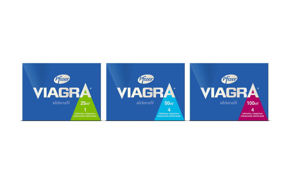
“Our objective was to move the Viagra brand forward whilst highlighting what makes it unique and special. The new brand expression and packaging design is powerful and dynamic, communicating performance and power in a modern and emotive way. We took inspiration from the trusted colour and shape of the Viagra brand, removed the pharmaceutical filter and reinterpreted it with a fresh lifestyle-led execution. The ‘V’ of the iconic brand name is subtly highlighted with a spot varnish and used as a vehicle to represent the problem of erectile dysfunction. At the same time, the A of the identity has become the focal point of communication, putting the spotlight on the solution and is the mark of confidence and reassurance.”

Designed by: Pearlfisher
Founding Partner & Chief Creative Officer: Jonathan Ford
Design Director: Dan Gladden
Brand Strategy Director: Rory Fegan
Account Director: Nicci Cooper
Join the conversation:
@thedieline @pearlfisherlive #designingforthefuture
Country: London


