BORBA approached The Yellow Loft to create branding and packaging for a line of drinkable skincare products.
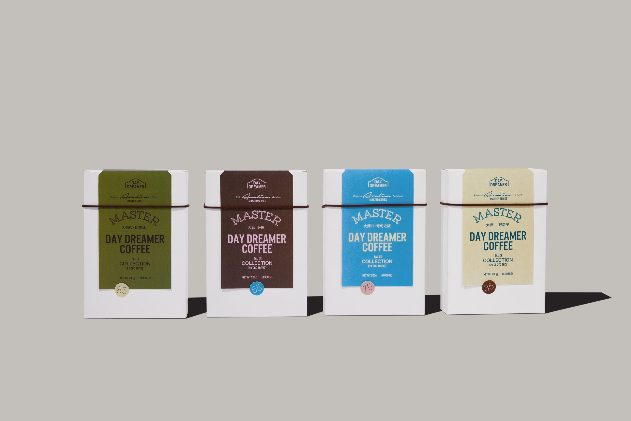
“We designed the branding to exude a clean, good for you, high-end image. The labels were embossed in a unique stipple texture and given a rectangular die cut, both to provide a tactile quality for the consumer and to elevate the unique branding and packaging from market competitors. The powder drink mix rigid boxes were inspired by the vertical die-cut shapes. All text and graphics were intentionally placed on the right side, leaving the left side bare and clean.”
