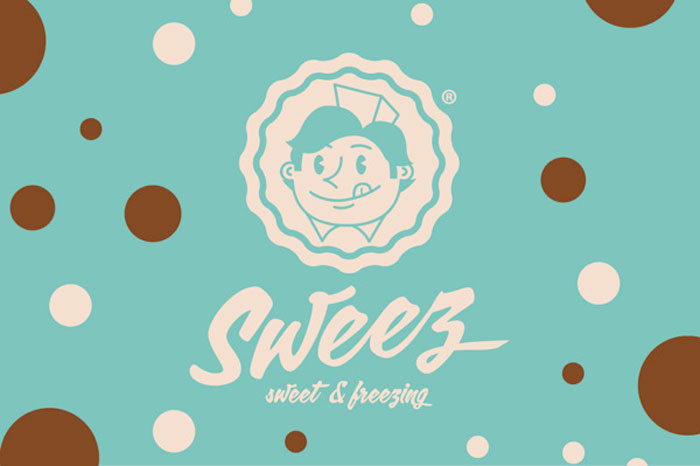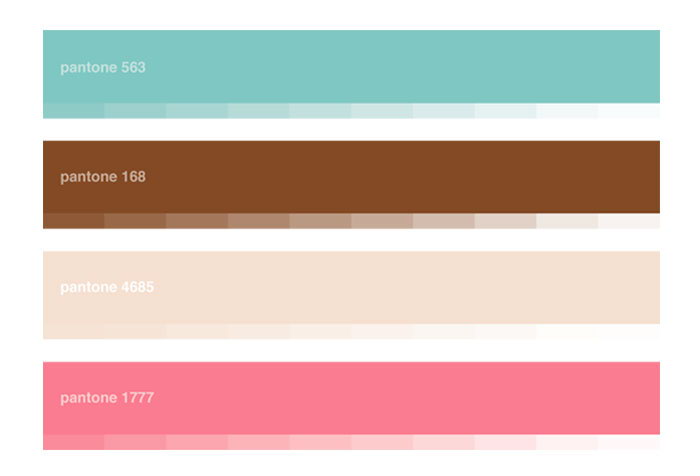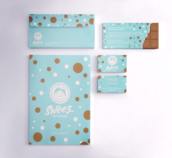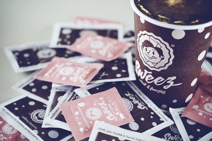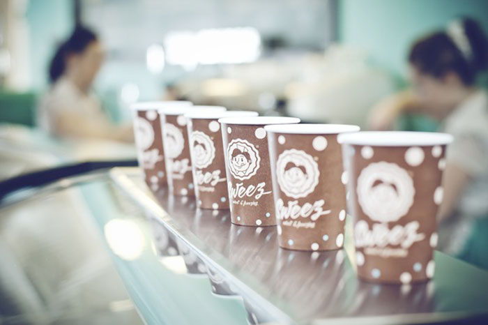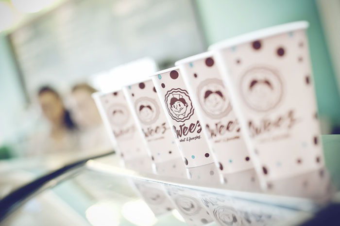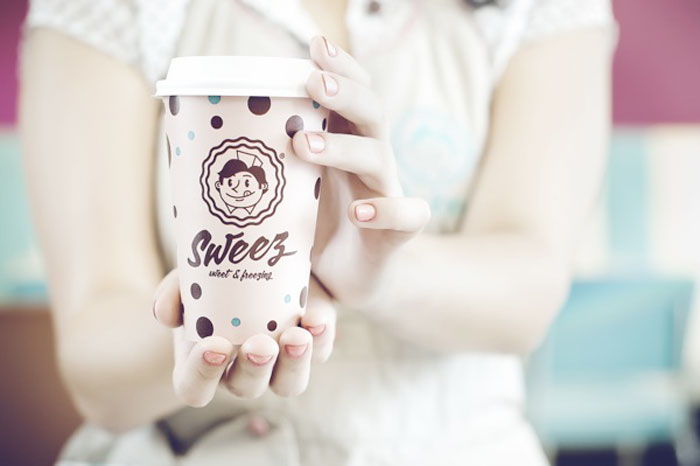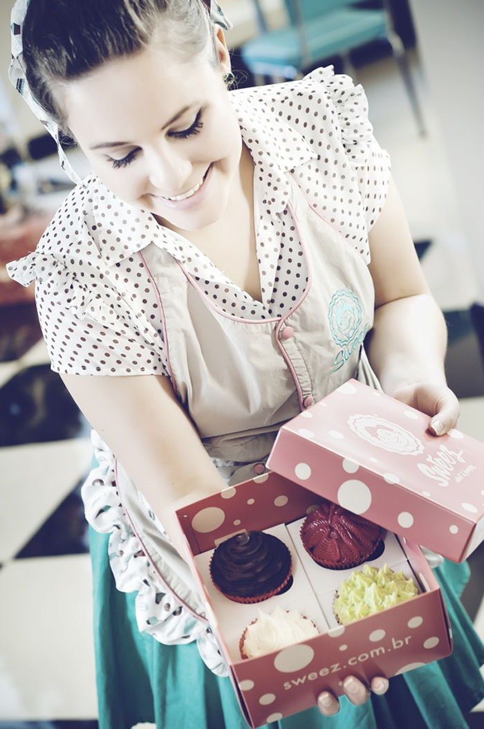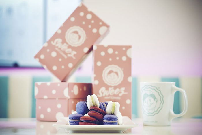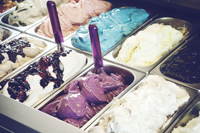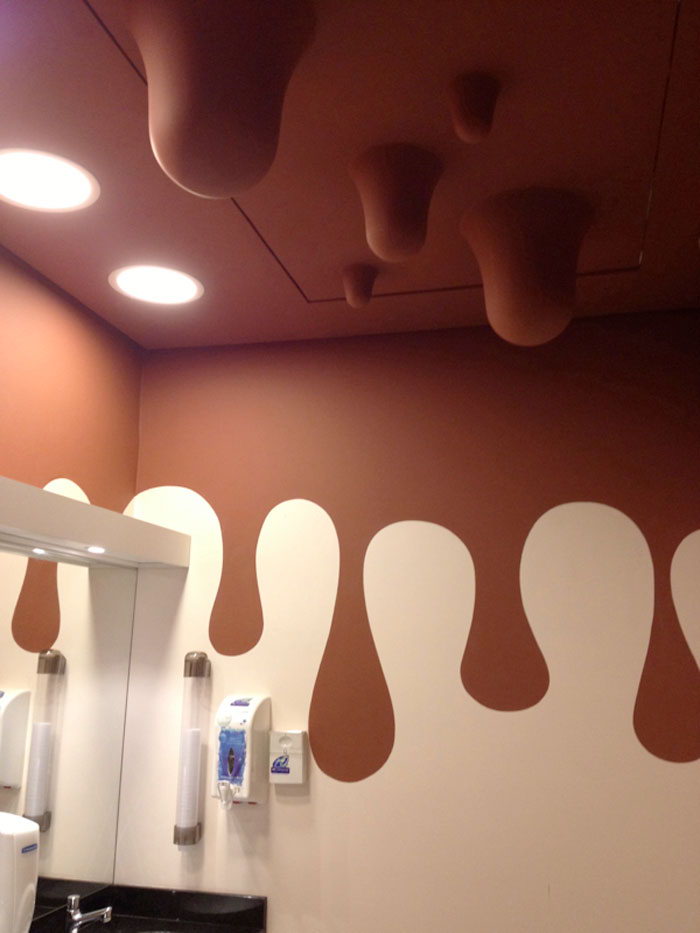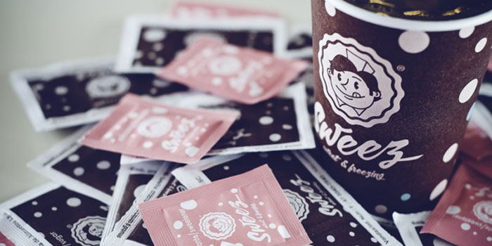
Brazilian Designer Mauricio Cardoso created branding and packaging design for Sweez, a 50s inspired ice-cream and sweet shop.
“Open a modern business, that allied gastronomy and redemption of weakened values. This is the idea behind Sweez. From decor to uniforms, everything is allusive to the nostalgic 1950’s in Sweez, name originated at the junction of two words: sweet and freezing. A place where this retro vocation and some modern touches coexists harmoniously, especially in the visual compositions and service configuration.
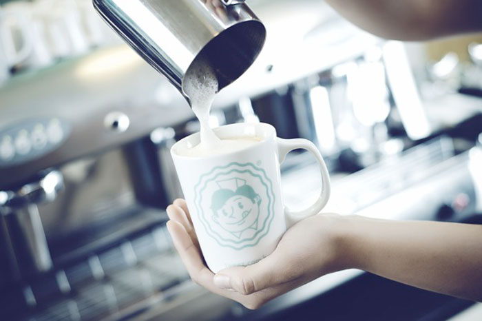
Inspired by the concept behind the establishment, I tried to portrait graphically and fun this special decade. In my first studies, I realized the need to create a character that symbolizes the values and the good humor that the project wanted to convey. Neither the mascot, which is the attendant, resists the delights offered by Sweez, because it’s visibly salivating.
One of the points I really like about this project is the fact that the owners only began to put form to the establishment after the presentation and approval of the graphic material. By the way, was the job with the faster return ever in all my career as a designer.
Sweez is located in Caxias do Sul, Rio Grande do Sul – Brazil.”
