
Chocolate Books is a new range of high quality chocolates – prepared by hand in small factories using traditional recipes and no artificial colors, flavors or preservatives – created by ‘globe-trotter’ Linvard Bo Lapp and ‘experimental chef’ Ephraim Fao, under their German delicatessen brand Lapp & Fao.
‘ <http://partner.googleadservices.com/gampad/google_service.js’>>
GS_googleAddAdSenseService(“ca-pub-3860711577872988”);
GS_googleEnableAllServices();
GA_googleAddSlot(“ca-pub-3860711577872988”, “incontent1”);
GA_googleAddSlot(“ca-pub-3860711577872988”, “incontent2”);
GA_googleFetchAds();
GA_googleFillSlot(“incontent1”);
GA_googleFillSlot(“incontent2”);
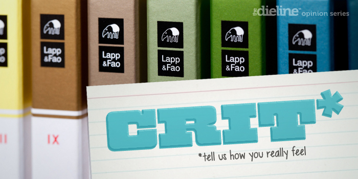
The range’s packaging, created by Hamburg-based interdisciplinary design studio of Nils R. Zimmermann, utilises fine illustrative detail by Andreas Klammt within the context of an unusual but distinctive multi-coloured journal aesthetic to convey the themes of exploration, provenance and craft as well as the bold, distinctive flavour and mixed texture of the chocloate.
“Task – The story behind Linvard Bo Lapp and his partner Ephraim Fao is full of discoveries. When they are off traveling the globe curious to discover sweet delicacies from far-away places, they like to sit down at the end of a long and eventful day and record their thoughts and experiences in a diary – it is these pages that later provide them with valuable inspiration for their unusual chocolate creations. Solution – These records are now available in the form of the Lapp & Fao Chocolate Books. This process is visualised strikingly by the new look of the chocolate packaging. Each bar is designed to look like a diary and contains the essence of Lapp & Fao’s travels – each bar is a delicious souvenir.”
– Taken from the Only For The Future Website
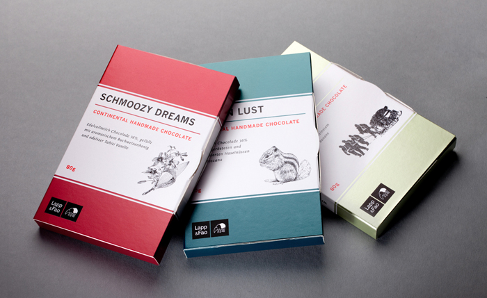
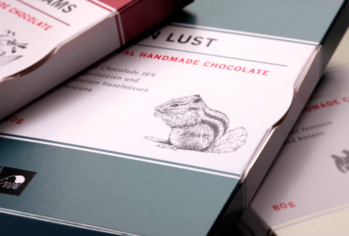
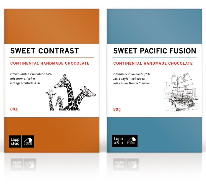
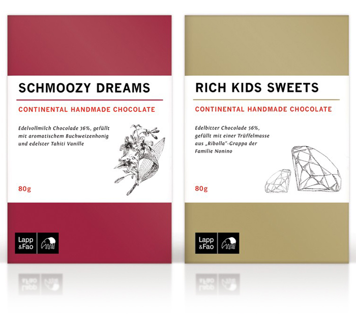
The illustrations – a broad mix of fauna, flora, travel and regional history – have been really well rendered with a solid use of texture, shade, depth and fine line work that have a very clear crafted sensibility but also the accuracy that could perhaps be compared to 18th and 19th century scientific expeditionary sketches. They feel both personal and professional, convey an attention to detail, a sense of in-depth research conducted by a knowledgable mind, cues that resonate well with the experience and passion expetected of a chocolatier, their chocolate and the ingredients they source.
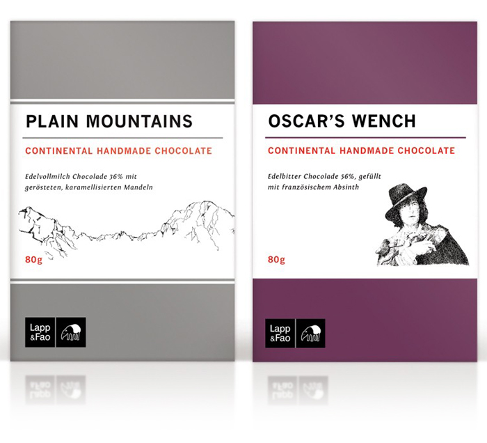
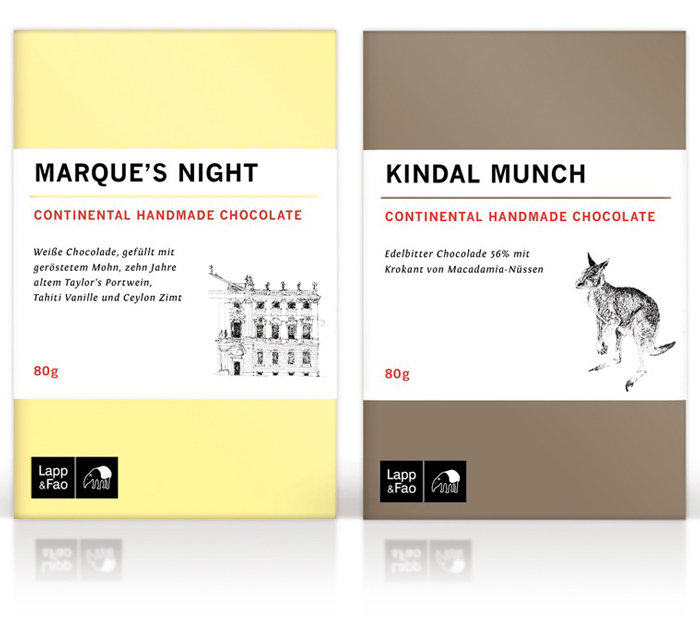
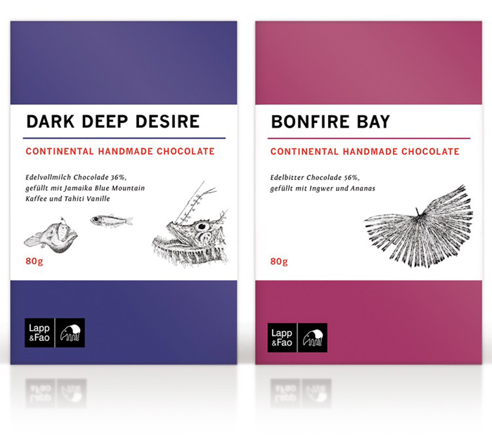
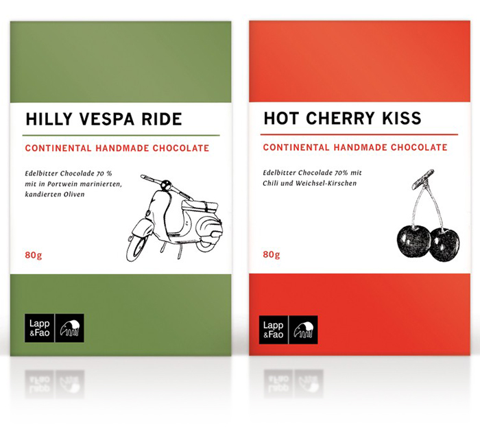
The loose hand-drawn qualities of the illustrations are juxtaposed alongside the ‘standardisation’, neutrality and utility of an uppercase geomtric sans serif – perhaps a reference to the commoditised nature of chocolate – and the subtle narrative feel of a light italic choice while the roman numerals on the spine introduce a catalogue-like research and reference sensibility that reinforces the journal concept.
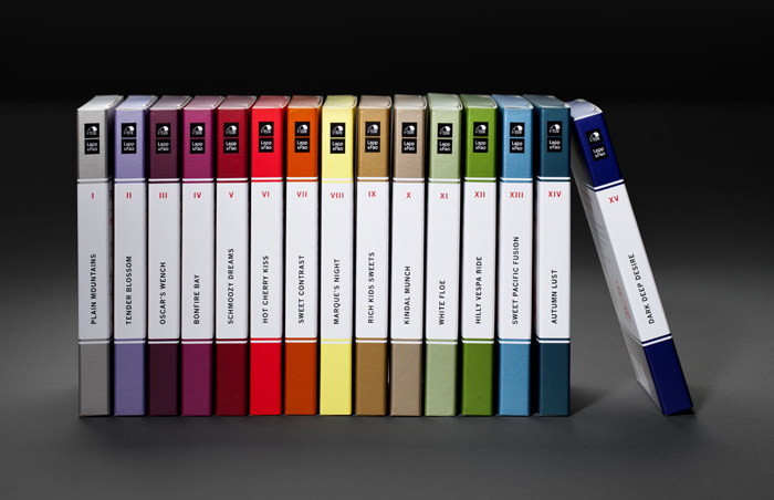
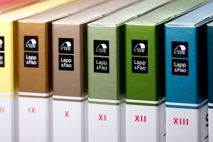
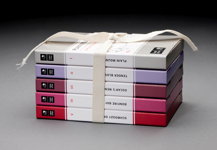
A practical monochromatic and spot colour combination – reflecting the significant flavour but natural quality of ingredients and philosophy of the brand – are individually distinctive but collectively complimentary, moving between low and high saturation values with a subtle metallic shine that appropriately conveys quality but avoids premium conventions. The solid block colour in conjunction with the light, organic, illustrative detail effectively reflects both the bold flavour and fine texture of the chocolate but also shares the aesthetic of calssic Penguin paperbacks – enhanced by the white band through the centre – appearing thoughtful, educated and a touch reverential.
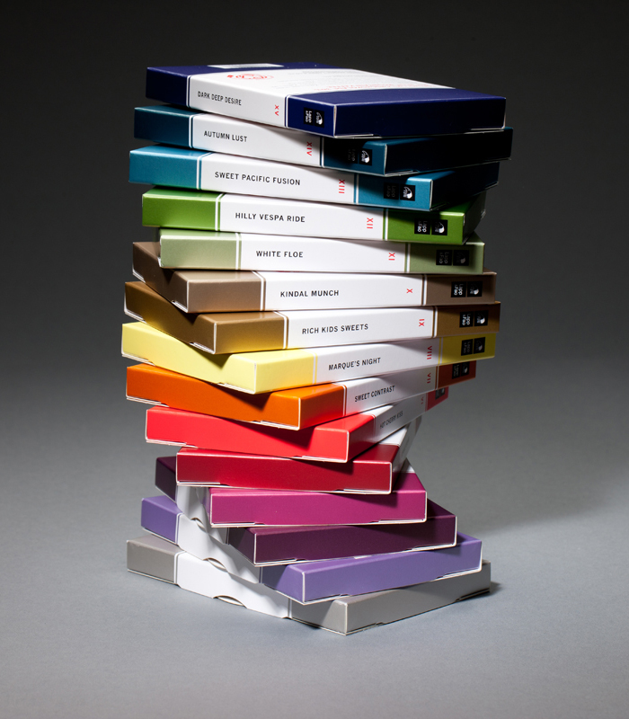
It is an usual combination of utility, individuality and subtle narrative that works well to communicate the journey of the creators, the provenance (and increased commodity) of the ingredients and a sense of ‘discovery’ – an idea that is shared by creator and hopefully consumer. It does deviate from industry convention and could be perceived as a little gimmicky but its layered with relevance and conceptual depth that relates to product, brand and the personal experiences of Lapp & Fao, reduced to simple, modular components and rich pencil detail that together appear distinctive and unique.

Richard Baird
Richard is a British freelance design consultant and writer who specialises in logos, branding and packaging. He has written for Brand New and Design Week, featured in Computer Arts magazine, Logology, Los Logos, Logolounge, The Big Book of Packaging and runs the blogs BP&O and Design Survival.
Twitter:@richbaird
Blog: BP&O
Portfolio:richardbaird.co.uk


