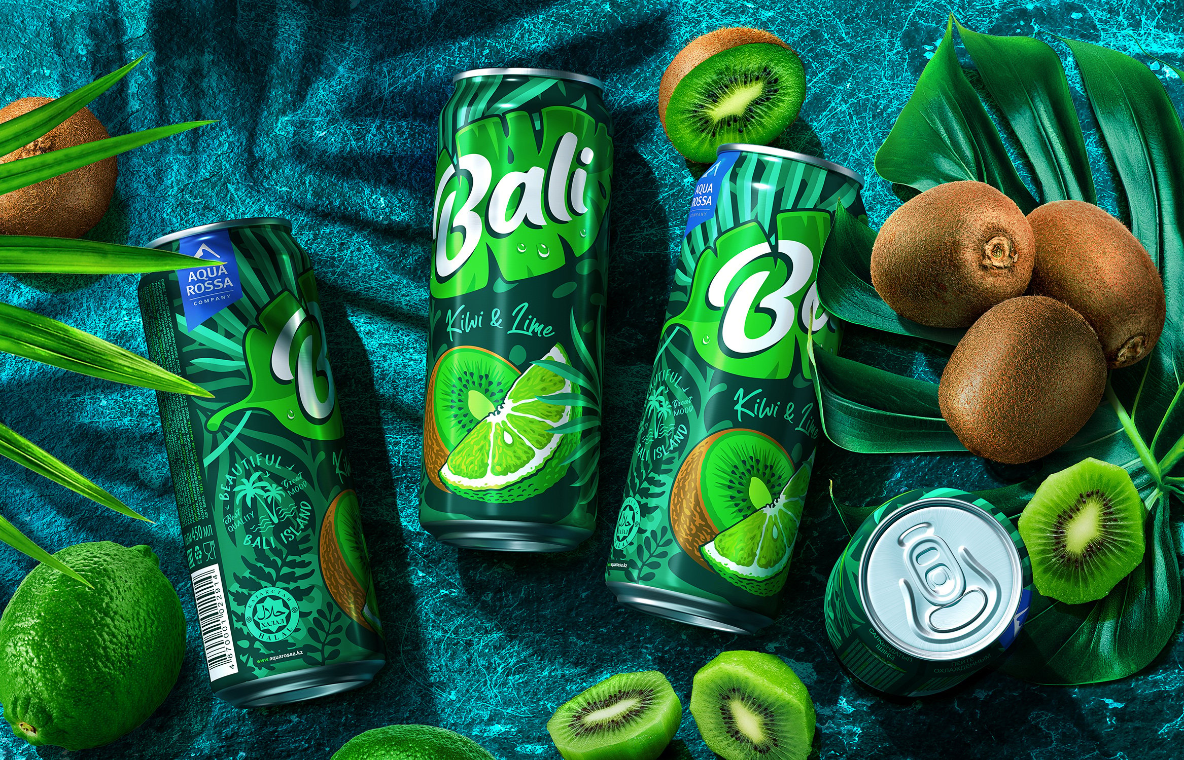
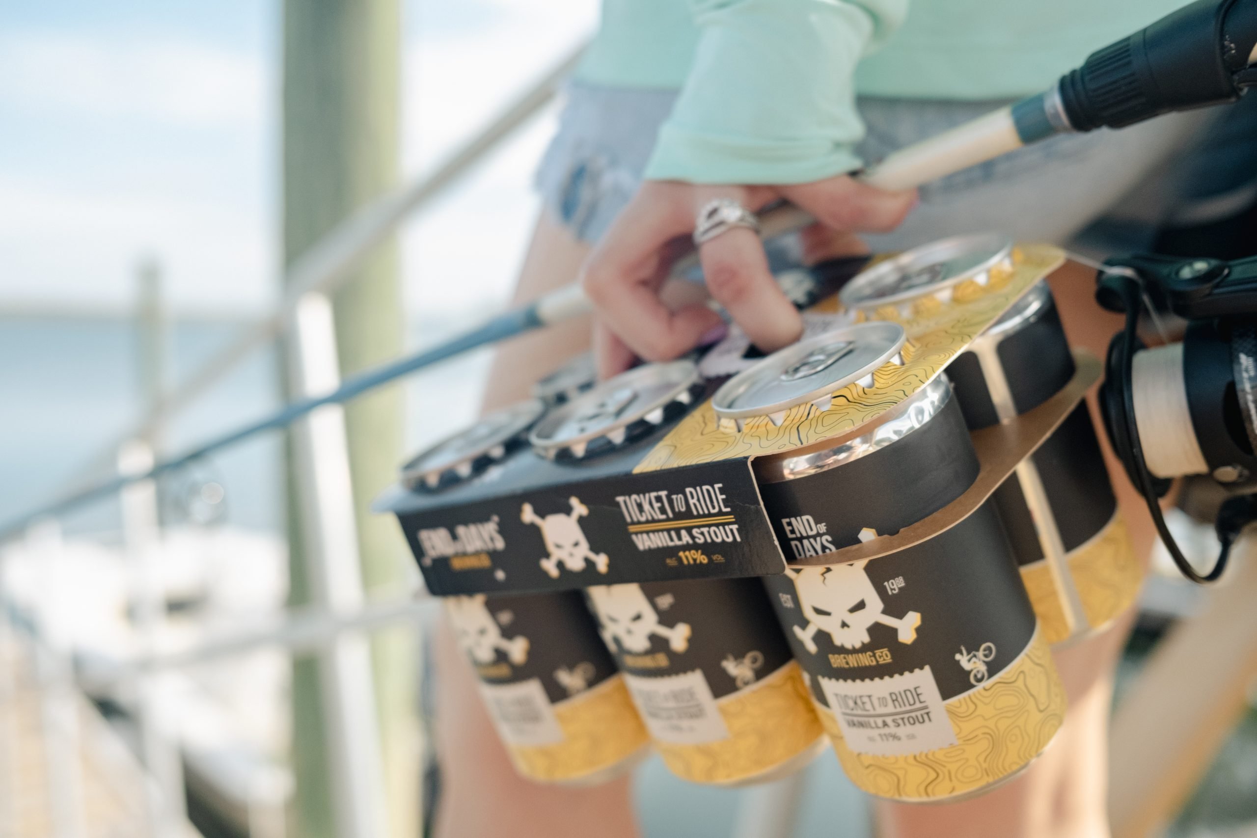
“Quick Chek, a family-operated chain of more than 100 convenience stores in New Jersey and New York, needed to reposition itself to build a more compelling and relevant relationship with today’s customers.”
Credits
Add project credits with Dieline PRO | Log in
Explore more
Category
Substrate
This placeholder is removed when the ad slot is configured.
This placeholder is removed when the ad slot is configured.
This placeholder is removed when the ad slot is configured.
This placeholder is removed when the ad slot is configured.
This placeholder is removed when the ad slot is configured.
This placeholder is removed when the ad slot is configured.
