
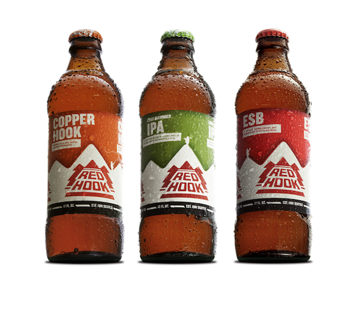
Redhook recently re-vamped its beer packaging in order to “get back to its roots”:”After some soul-searching over a few beers, Redhook decided it needed its exterior to match its personality.”
“The new look includes:
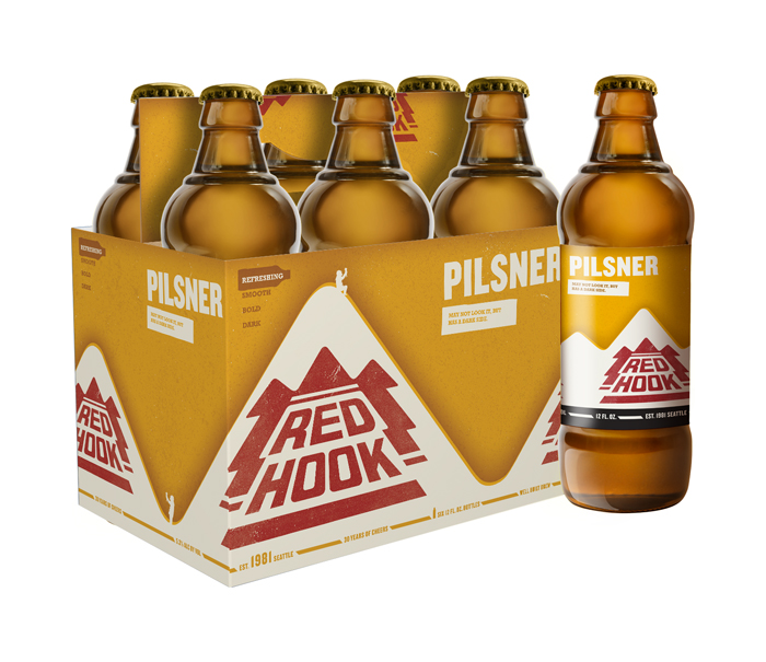
Packaging/Labels: Easy-to-spot labels and packaging across all Redhook beers helps consumers quickly grab and go in the beer aisle. Every beer style is identified by a unique color scheme and Redhook’s simple beer-o-meter on the side helps pick between refreshing, smooth, bold, or dark.
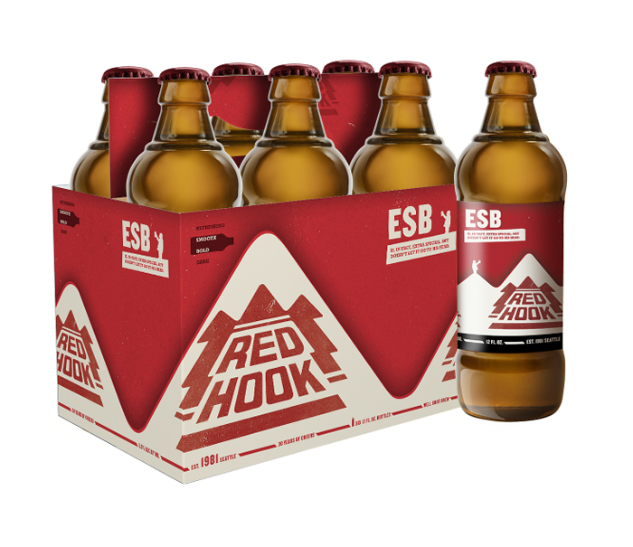
Bottle/Bottle Caps: To go back to basics, Redhook created a no-frills bottle, while the bottle caps all depict iconic images and phrases of Redhook’s colorful 30-year history, so you can drink while you reminisce. Genius.”
More after the jump.
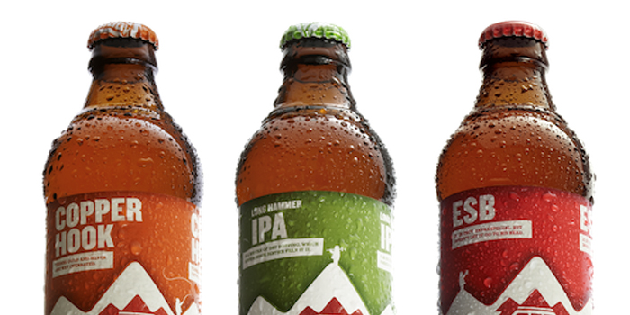
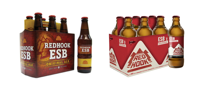 The before is to the left.


