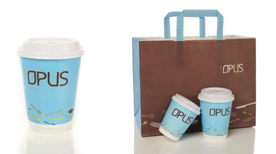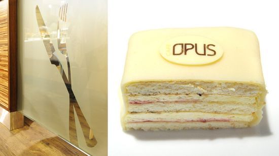

One more project from Norway based Sukker Design:
“Cafè Opus is known as a family friendly café concept with traditional Norwegian food. The shopping centre culture in Norway has developed rapidly the last 5 years and the competition between the different chains is increasing. Café Opus needed to meet the market with a lighter and more modern identity, making them the most attractive choice – both for the consumers and for the centre owners. Sukker has made the new identity for Opus, making the graphic expression and the interior light and clean. It was important to keep the Norwegian identity and this is expressed throughout the use of natural materials, as well as in the menu and food concept. Some graphic elements such as the two patterns is integrated in the interior, as wallpapers and decals on glass surfaces. One pattern is inspired by cutlery, and the other pattern is made of the “O” in the logo gathered in waves. This is done both to work as profile elements and as a representation of the smell of good food.”